MYHIKE
Context
A five week long final project for an interface design course. A concept of a casual hiking application with the unique niche of fostering people’s hobby of snapping photographs of their adventures.
My role
I worked with a team of interaction designers to develop this application. While we shared the same responsibilities, I had a greater role in conceptualizing and wireframing the interaction flow and interface of the app, as well as synthesizing research data. Figma, RealtimeBoard and InVision were used to conceptualize and prototype the application.
User Study
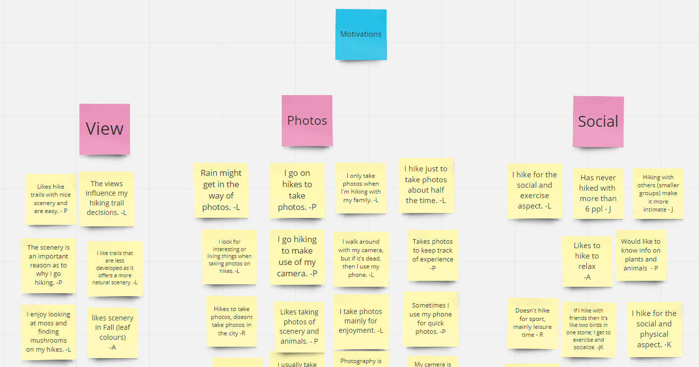
We first conducted interviews to understand the habits of our target demographic. I interviewed extreme cases in particular, such as those who live in areas where hiking trails are not as accessible, in order to acquire varied data. Afterwards, we compiled the information into an affinity diagram to better visualize the traits of our interviewees.
Conceptualization
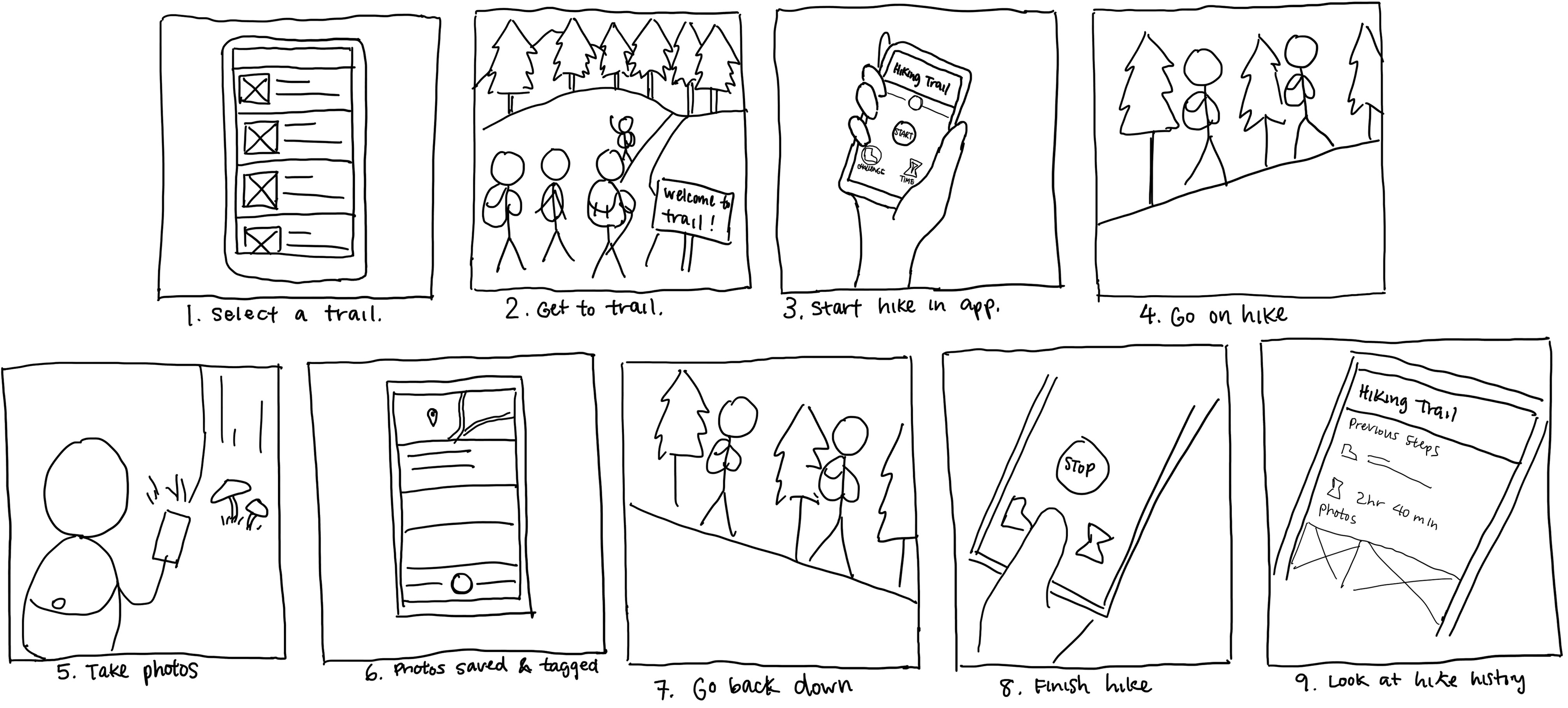
From our findings, we identified common pain points shared between our interviewees. Using this information, each member sketched out low fidelity storyboards to draft potential user interactions. Next, important considerations from each storyboard were combined and was then redrawn in a higher quality digital version.
Wireframing
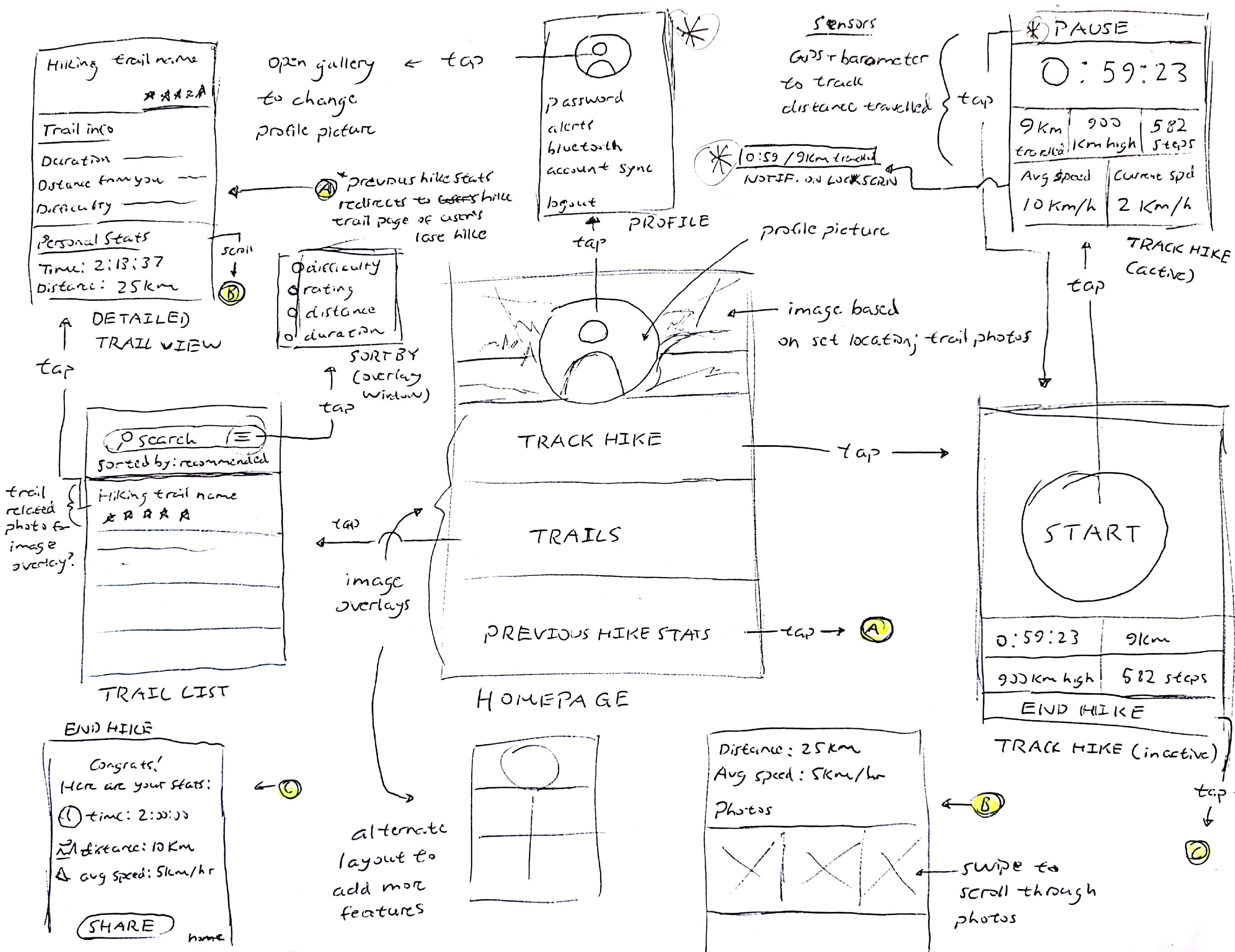
With the storyboard in mind, my team then began to wireframe interaction paths and graphical interfaces individually. I looked up dissimilar applications in order to present possible visual alternatives, such as a homepage dashboard and image overlays for navigation to contrast with visuals found in contemporary hiking apps, such as navigation bars and the heavy use of flat design and icons.
Initial Prototype
My team then came back together to assess, combine and improve ideas from our wireframes, such as my concepts on the explore and progress tracking pages. These would then be implemented into an initial wireframe done in Figma.
For the next phase of our design process, we conducted a round of user tests to determine strengths to capitalize on and weaknesses to address within our final prototype.
Final Prototype
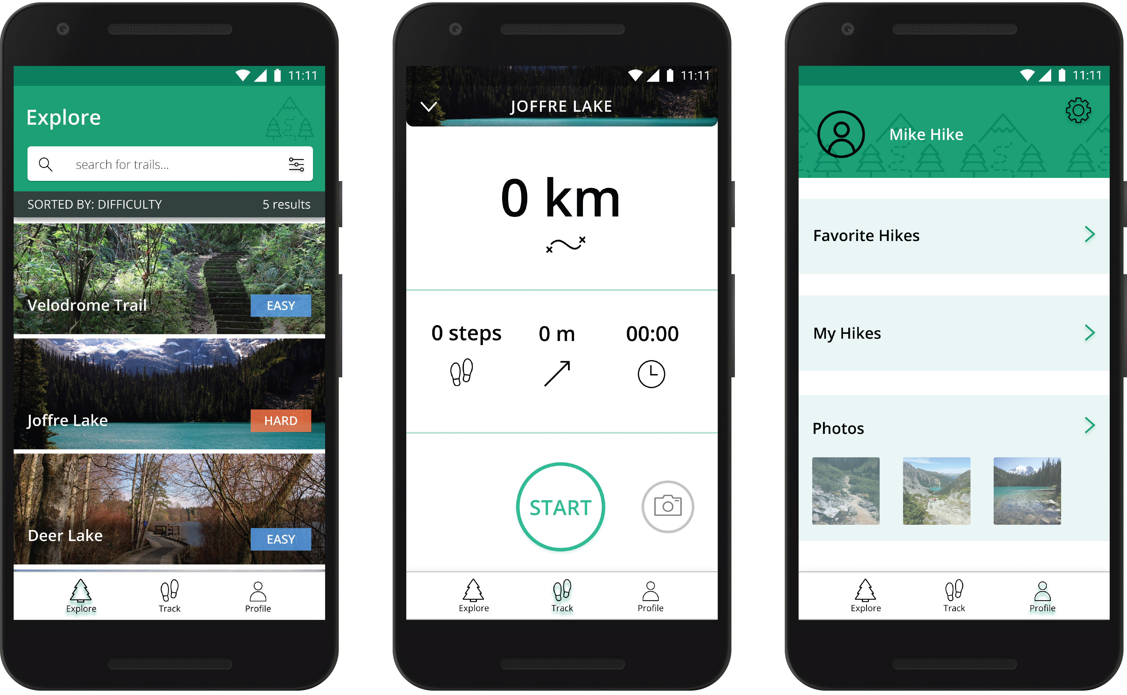
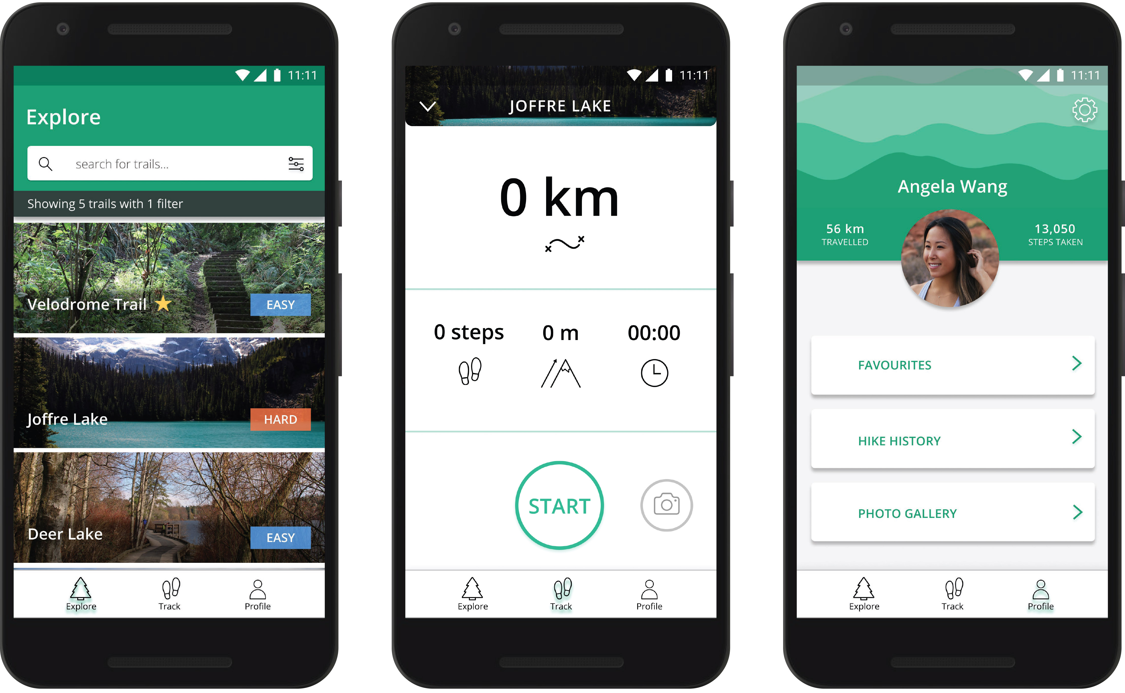
Several confusing elements were identified from the data that I synthesized, such as the meanings of certain terms and icons, as well as the interactions of certain elements. Using the test results to inform our revisions, numerous changes were made, including the use of a different elevation icon to improve clarity and modifying the 'sorted by' message on the explore page to reduce decision making time.
Final Thoughts
Working on this project had allowed me to put design and research concepts such as affinity diagrams, interaction mapping and usability tests into practice, which had helped a ton with the concept development. While my lack of prior experience meant that I had a rough start with using these design concepts, I now understand their values and intend to implement them in future projects.
On the other hand, when looking back upon my process, I believe that the user studies portion of the project is an area that needs improvement. While the data my team had collected is adequate, I feel that gathering the thoughts of more people, especially extreme cases, could have revealed unique insights that could contribute to the design concept.