LIGHTHOUSE
Experience with Interface Design

About the Project
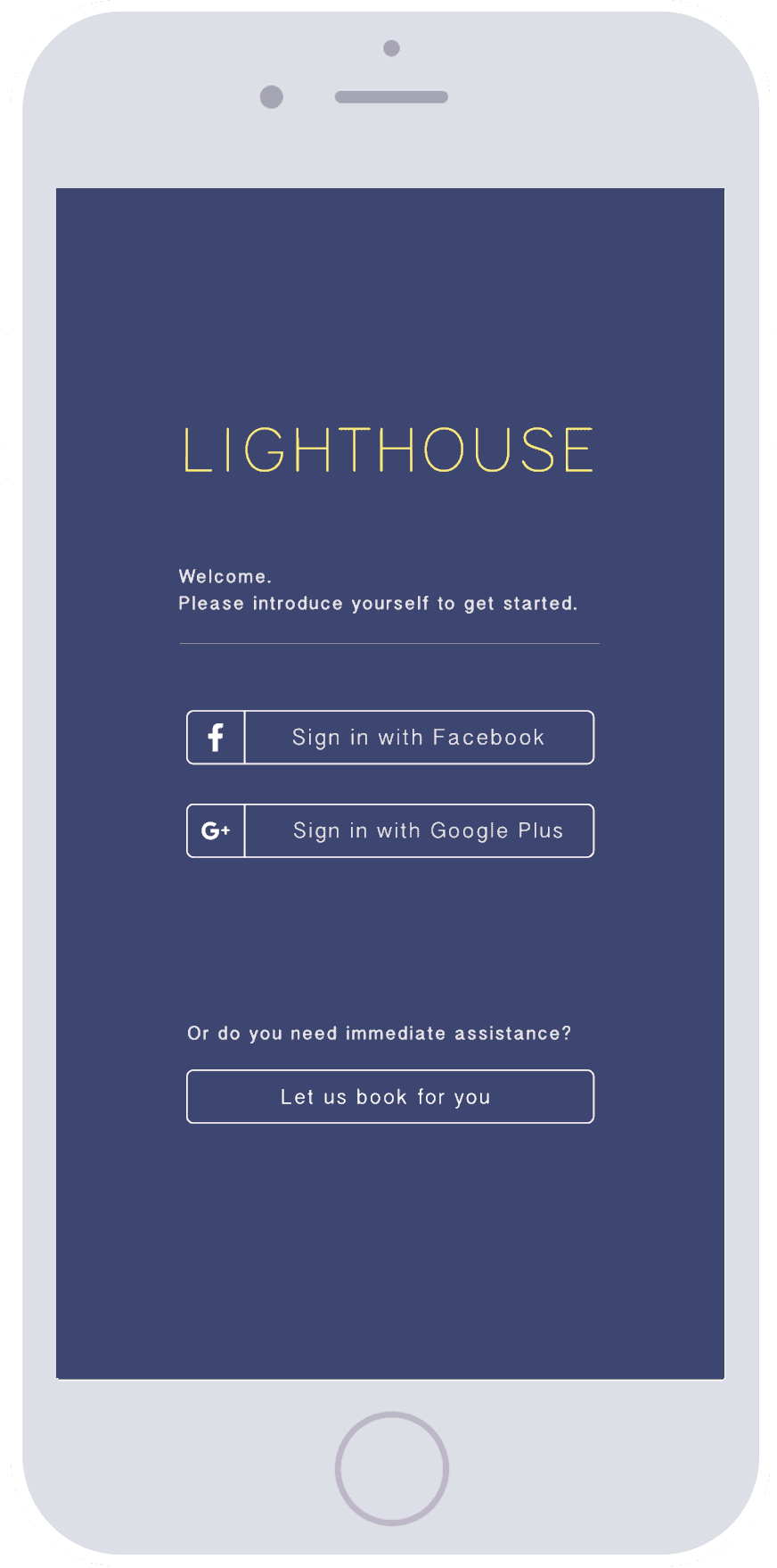
This application was created from IAT 334, a course primarily focused on visual interfaces. With this project, my team and I decided to create a user-content generated application where users can sign up to be safe houses for troubled lgbtqa+ youth, and youth who want to seek out these safehouses if they need refuge.
Skills Gained
- wireframing & prototyping
- user research
- ui & ux design


Process
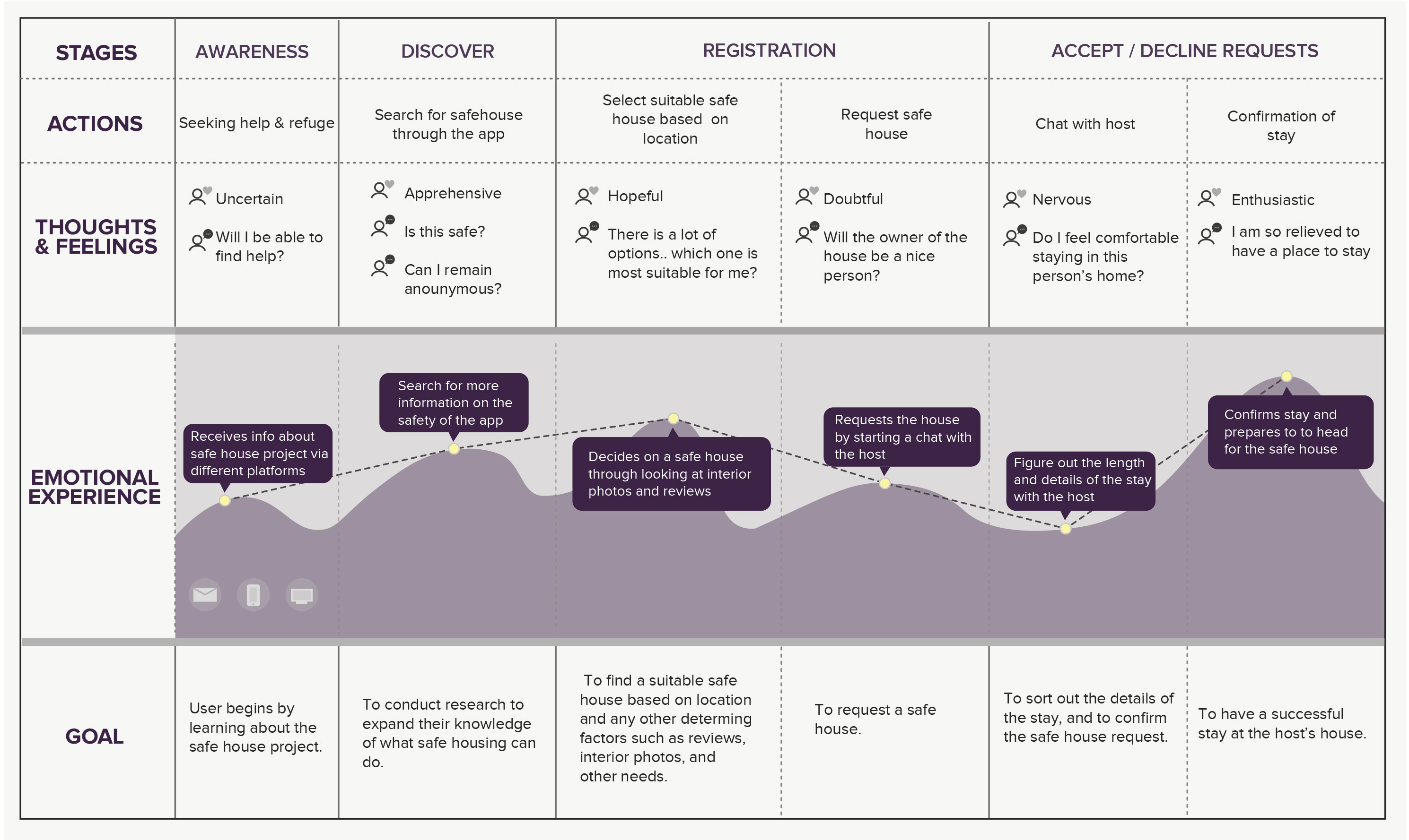
I was responsible for creating a site map for the seeker (See Journey Framework Image). It was mainly used to help the team visualize how to design for the user flow and it was used to highlight possible experiences, actions, thoughts, and as well as how the user would achieve their goal.
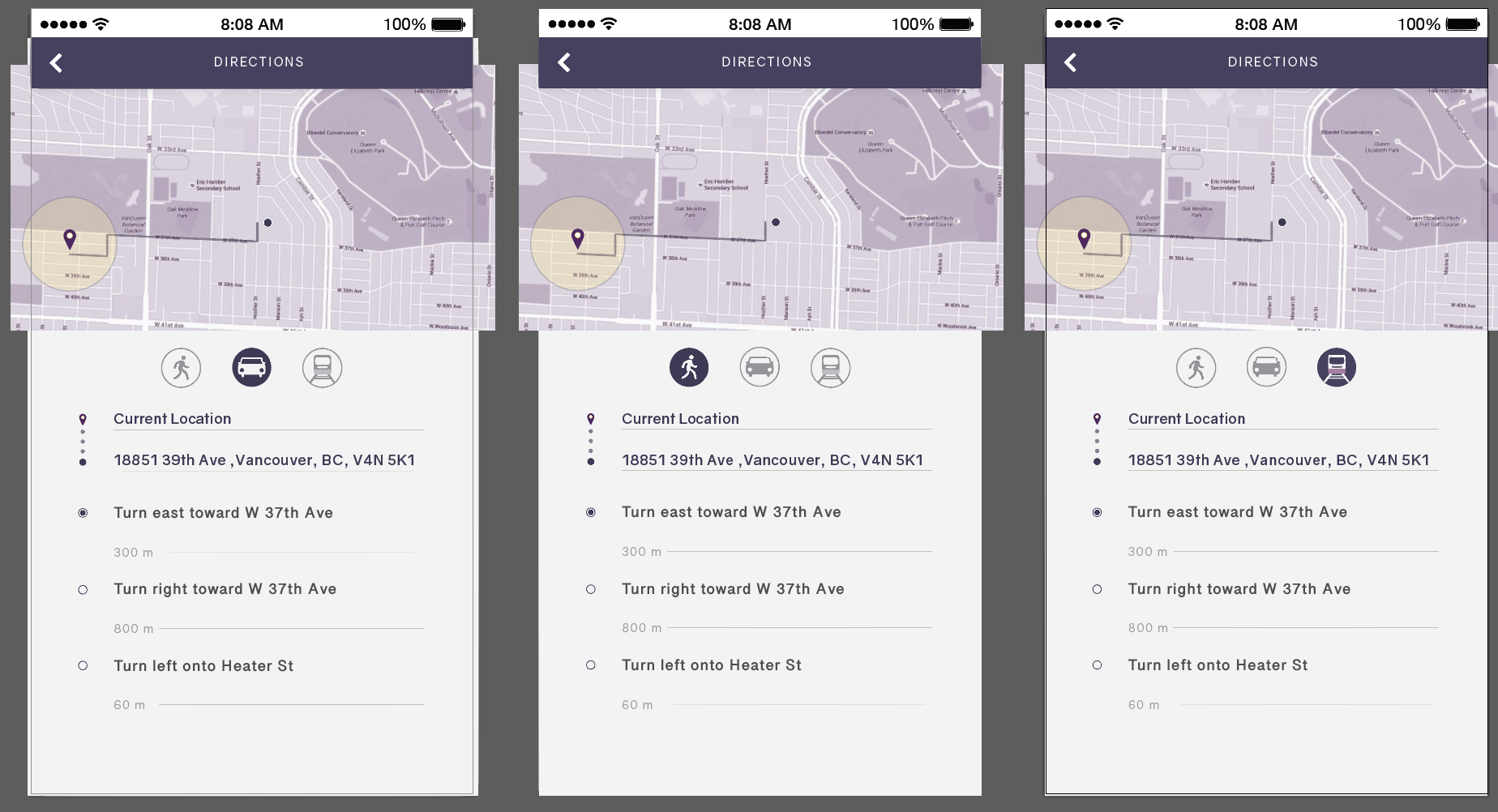
Once the team refined the main user flow, I was then responsible for creating some mockups of the user interface. For example, I created the directions section of the app. For this section, I designed the interface to have the user easily follow simple directions to get to their destination and produced main icons of transportaion for the seeker to choose from to accomodate them in their travels (See Mockups of Directions Interface). I was also responsible for animating the filters process to exhibit how the filter process would work after logging in the app (See below). Animating the filtering process helped in observing what the user will experience and to test if the main interfaces is effective. Overall, this Lighthouse project has helped me learn to focus on designing for the user and practice not to design for myself.
