SCENARIO
Gregory Santiago is an 18 year old high school student. He is graduating this year and has decided start a horomonal transition from biological male to female before star ting university. Gregory isn’t entirely comfortable with his transition just yet, and only few people know that he has begun horomones. Among these few people, Gregory has told his parents and a few close friends.
Gregory’s aunt is coming into town two weeks from now and they have never been able to get along in the past. He does not want to associate with her during her stay, so his parents are okay with him leaving for a few days before she leaves. However, that choice is up to him.
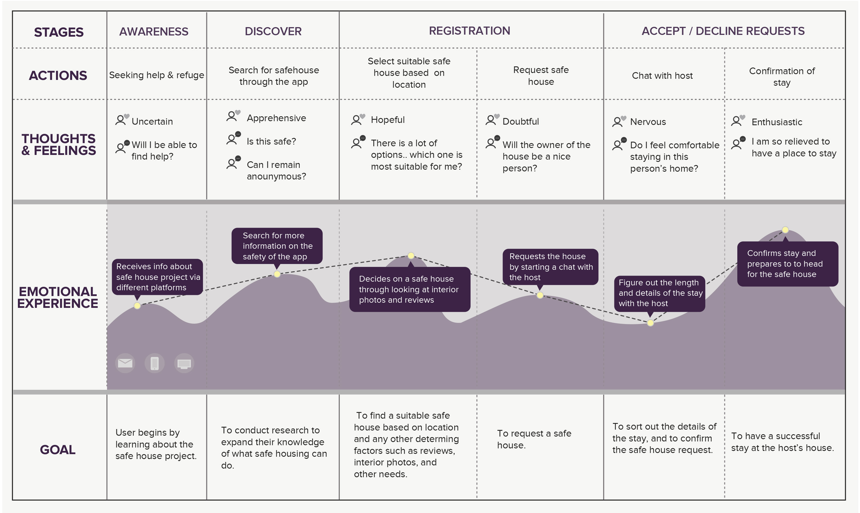
Here, we created a map showing Greg’s process through the app, highlighting his possible experience, actions, and thoughts, as well as how he would achieve his goals.
Solutions
To address this problem of enhancing safety and security for the users we came up with the following solutions:
01. External screening - In order to ensure the user is as safe as possible, apart from a review system, we also decided to partner with local youth clinics for the screening of the host.
02. Hostel route- This route uses a digital check in and confirmation for users who are uncomfortable staying with someone unfamiliar.
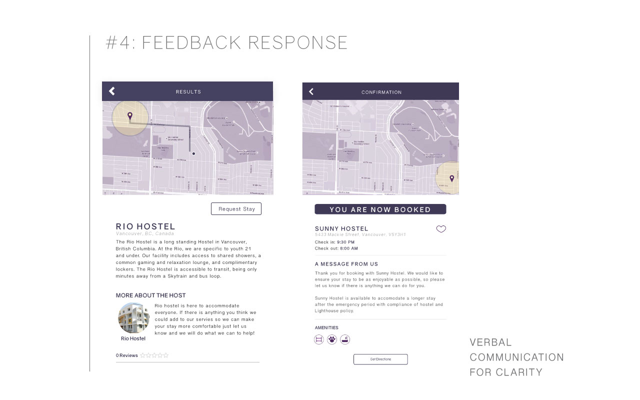
03. Chat system - The address of the host isn’t revealed until they confirmed the stay request.
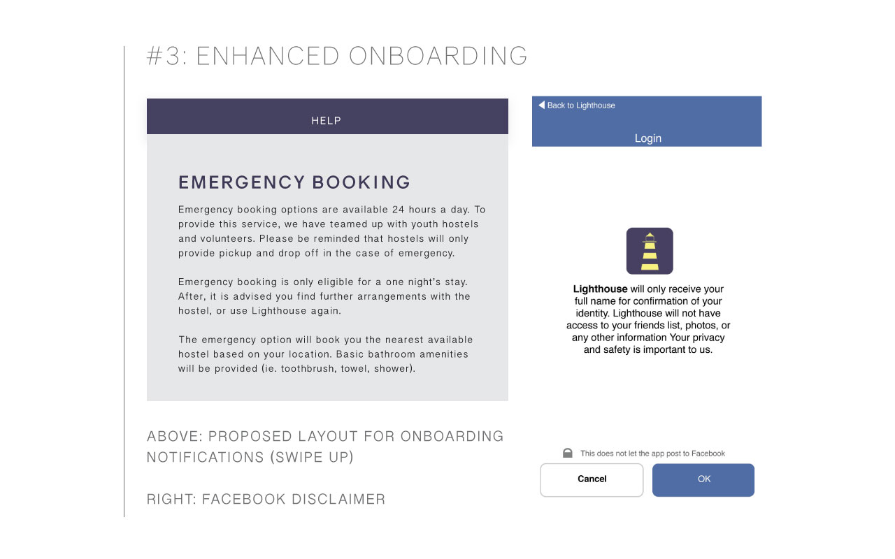
04. Facebook link - In order to identify the user as a real person, we decided our app would link anonymously to the user’s Facebook account, further ensuring the safety of the host
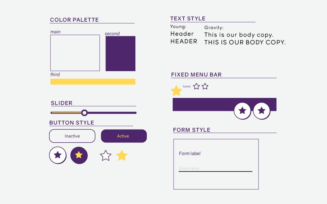
STYLE
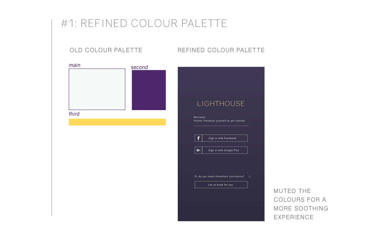
Because of the urgent nature of the user’s situations, we decided to design primarily for ios, and designed for a flat, clean interface. We chose muted colours that look soothing, while conveying the “lighthouse” theme of our app. We also made sure that the language throughout our application is conversational and calming for anxious youths in any situations.
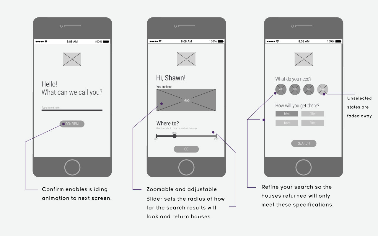
WIREFRAMES
Our design process started with creating grey box wireframes to get an idea of the flow of our app, as well as the placement of our content an menus. We refined these wireframes over the course of 2 weeks to achieve high fidelity mockups that we showed our users for our user testing.
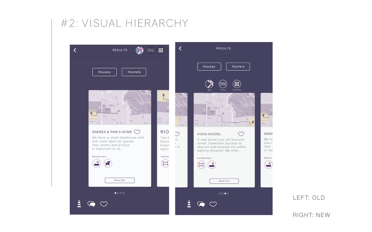
USER TESTING + REFINEMENTS
We selected our users from a pool of youths and youths who identify as LGBTQA+. What we didn't realize as adult designers was that youths would have a different idea of what would be clear visual hierarchy. Here are some of the main concerns our users had and how we found solutions to them.