BCCIE co-op project
Tools Used: Adobe Photoshop, Adobe Illustrator
Duration: 4-5 weeks
As a part of BCCIE’s communication team, I was the lead designer, in charge of creating the logo and visual identity for BCCIE’s 2015 Summer Seminar. BCCIE’s Summer Seminar is an annual international education conference that takes place in BC and gathers over 300 international education professionals from BC, Canada and abroad. The 2015 Summer Seminar theme was Global Responsibility and Institutional Mandate: Opportunity for Innovation.
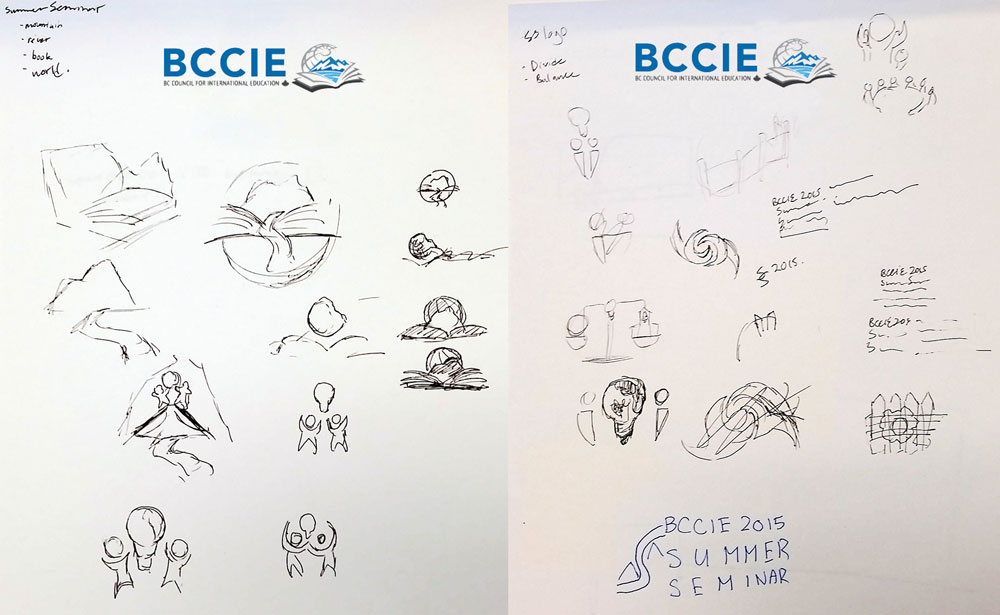
Ideation ProcessGiven this year’s conference theme and some requirements regarding text and imagery, I discussed with the BCCIE communications team possible images for the logo that would match the conference theme. Since the location for the 2015 Summer Seminar was Whistler, I wanted the location of the Seminar to be noticed in the logo. The objects that I listed as possible elements of the logo were mountains, books, river and the world; based on the conference theme, the concepts that I wanted to portray through the interaction of these elements were division and balance. One of the most emphasized ideas, a fence, couldn’t make it to the final product – I explained to the BCCIE staff that due to the size of the logo, the fence will be unidentifiable – but, as an alternative, let a path cutting through the image represent division.
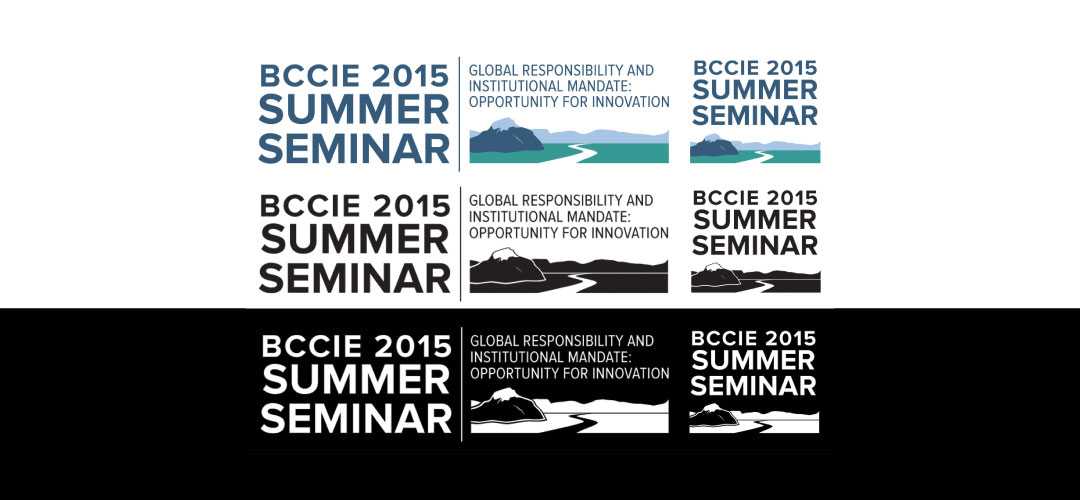
When designing the logo in Adobe Illustrator, I realized that the amount of text on the logo was making the logo very wide and was going to limit how small the logo can shrink without making the text illegible. I decided to create another version of the logo that was more compact and had less text.
Colour and FontsThe colours I chose were based on the event location and BCCIE’s logo. I also created variations of the logo – a black version and white version – to be placed on dark and light coloured backgrounds. The font used was Proxima Nova and Proxima Nova Condensed because I wanted a san serif font that could be bold and noticeable but also subtle.
Visual IdentityReceiving positive feedback regarding the final logo, I moved onto creating the design guide that my teammates would be using to create web and print materials for the conference. In creating the design guide I used BCCIE’s own design guides as examples.
I kept updating the design guide while my team and I designed materials for the conference, because when we were applying the guide we were finding areas for improvement. Some of the things that were updated at a later date were the expansion of the colour palette and a list of imagery to represent the conference.
Implementing Logo and Design GuideUsing the design guide I created, I also designed many conference materials, including:
- A web version of the conference program guide (View one of the first drafts here)
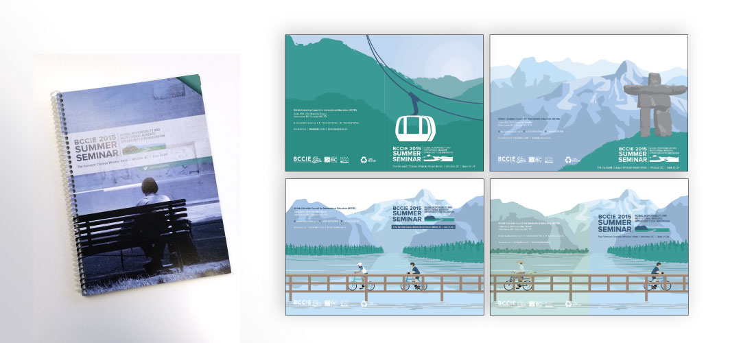
- Front cover of the print version of the program guide
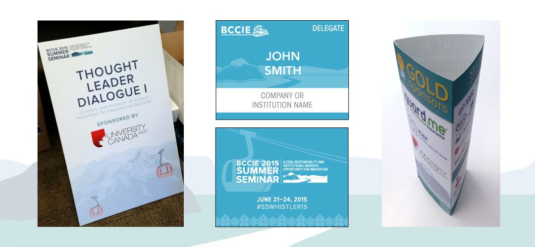
- Conference name badges
- Table tent cards
- Conference foamcore signage
- Website sidebar ad
- Countdown photos for the social media campaign (Gallery can be found at BCCIE's Facebook page)
This project as well as the other conference projects gave me the opportunity to share my ideas and receive feedback from different perspectives. Being open to and understanding of the ideas of others allowed me to quickly redesign drafts. I found that sketching out ideas, no matter how rough they are, helps me visualize and share my ideas better, and that I enjoyed creating illustrations with Adobe Illustrator.
Final printed program guide for BCCIE's 2015 Summer Seminar


