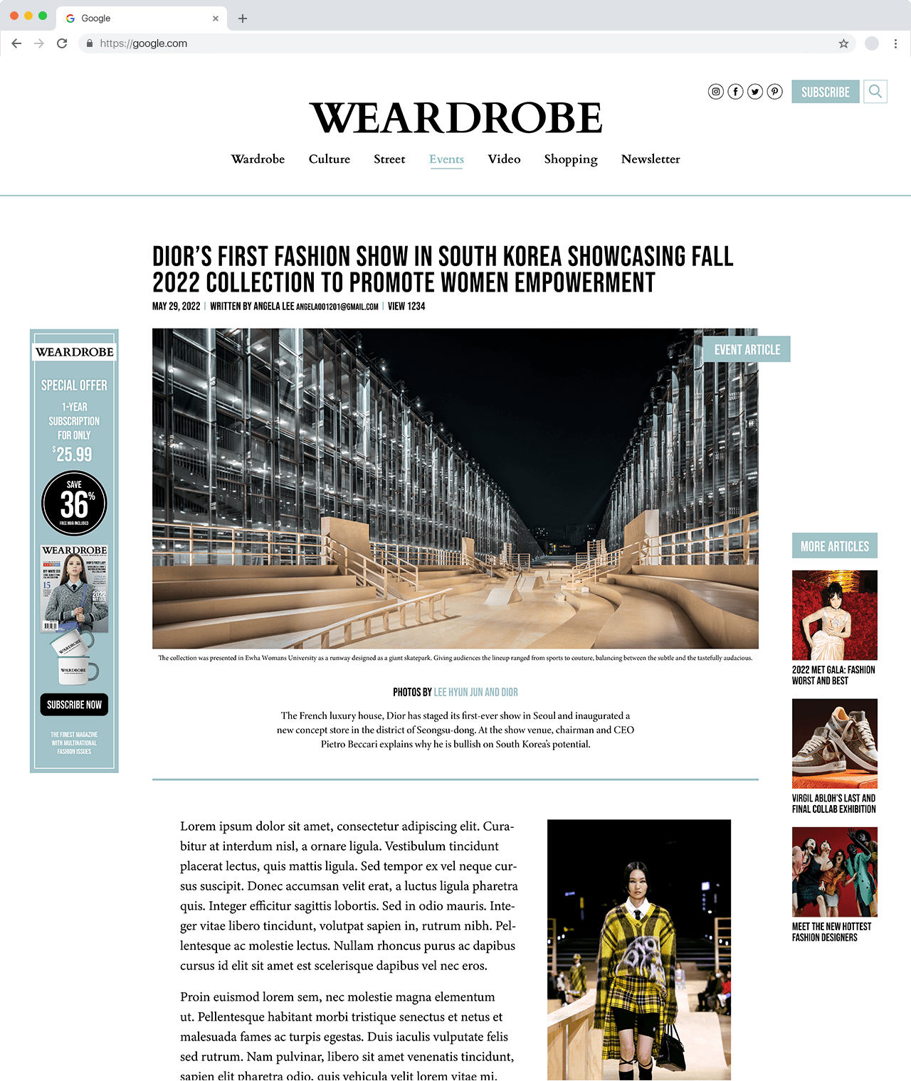
Weardrobe cover

Key Highlight

An individual final project that received a 95% grade for all parts, the highest in the course. The branding was spot-on for the concept, memorable, distinctive, and owned a realistic readership.


Context

Finding the Target Readership

The process began researching a specific target readership and defining an editorial mandate to establish a distinctive enterprise branding. With that, I have developed an editorial lineup for 40 pages of editorial content according to the conducted research. Three different projects to create the overall magazine branding and learn industry standard.

VIEW READERSHIP MANDATE >
magazine-readership-reserach

Early Design Process

Ideation and conceptualizating the publication

For the early design concept, I visioned the magazine to use the brand's signature color, #a1c3c9, while forming a visual impact through large typography and image in the editorial opening spread and featuring more content in the following pages. The cover page features a photograph of the same model with the editorial opening, Blackpink Jisoo.

magazine-initial-design

Final Takeaway

Overall branding of Weardrobe

Following the initial design, the overall project utilizes the same branding color and line segments/boxes to allow more guidance in the reader's eyes. The fundamental aesthetic and layout formed in the initial phase allowed other projects to come along more quickly. The main takeaway was the cover page. I wanted to emphasize the “WE” on the logo, being a cultural/global enterprise and tried several approaches. However, all the designs made the logo look unnatural if they were separate words. Thus, I kept it simple and minimal by only kerning the two letters to be connected.