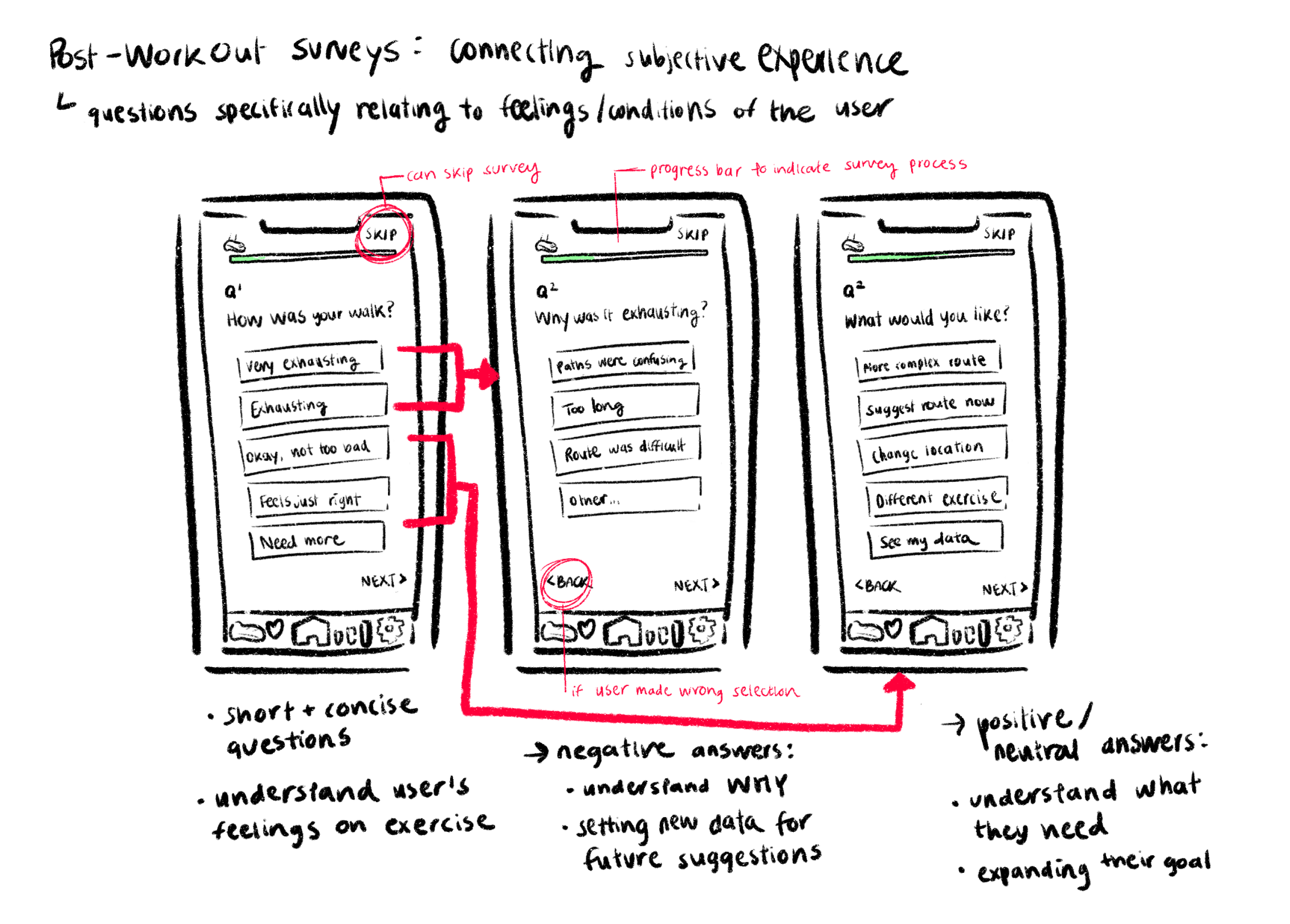
Weardrobe cover

Key Highlight

My research insights guided our team in identifying key design interventions and shaping the solution:providing accurate information based on users' needs to prevent overexertion. Additional contributions were made in empathizing with the users to design the interface and prototype the user flow.


Context

Identifying a new opportunity for a domain

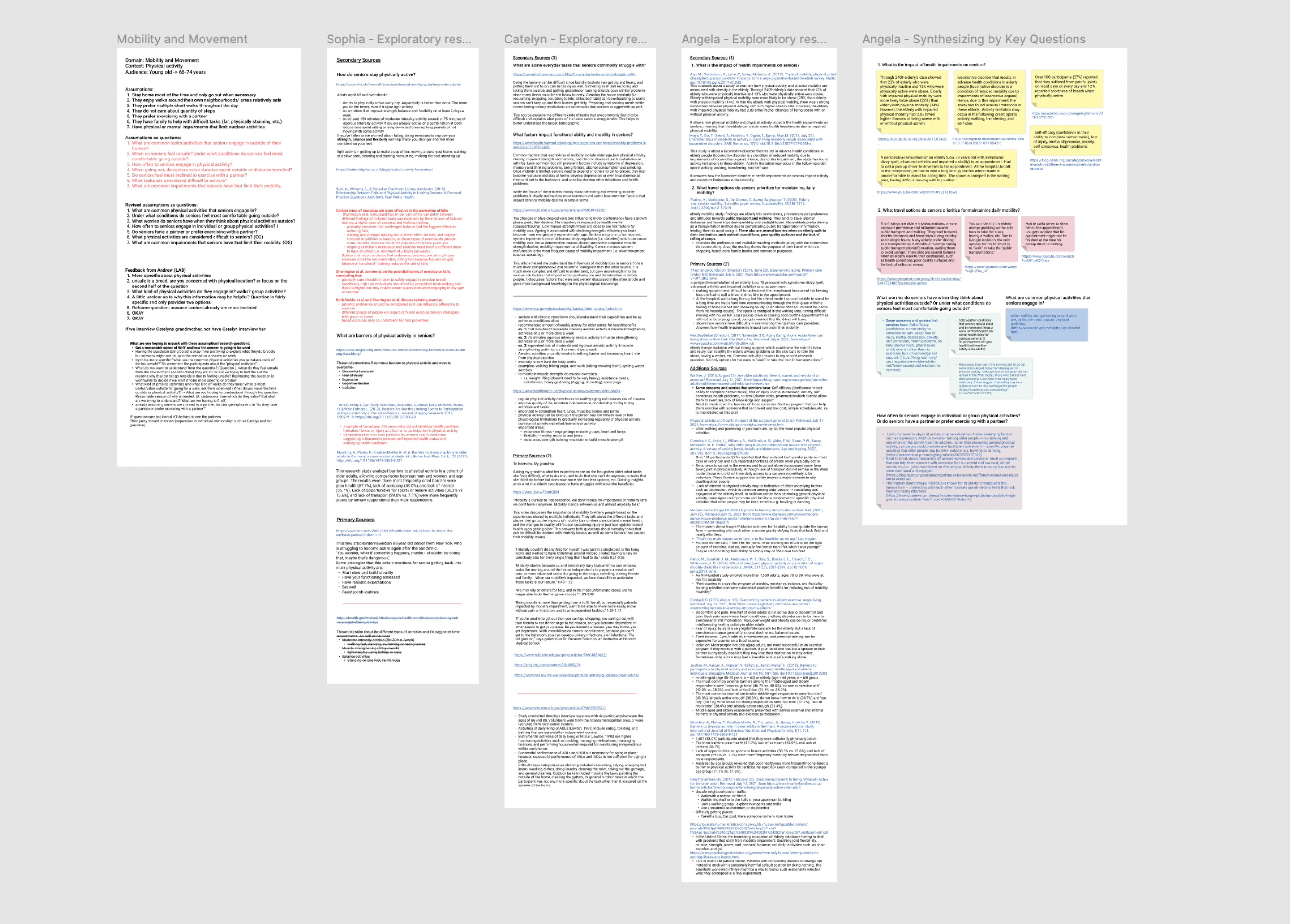
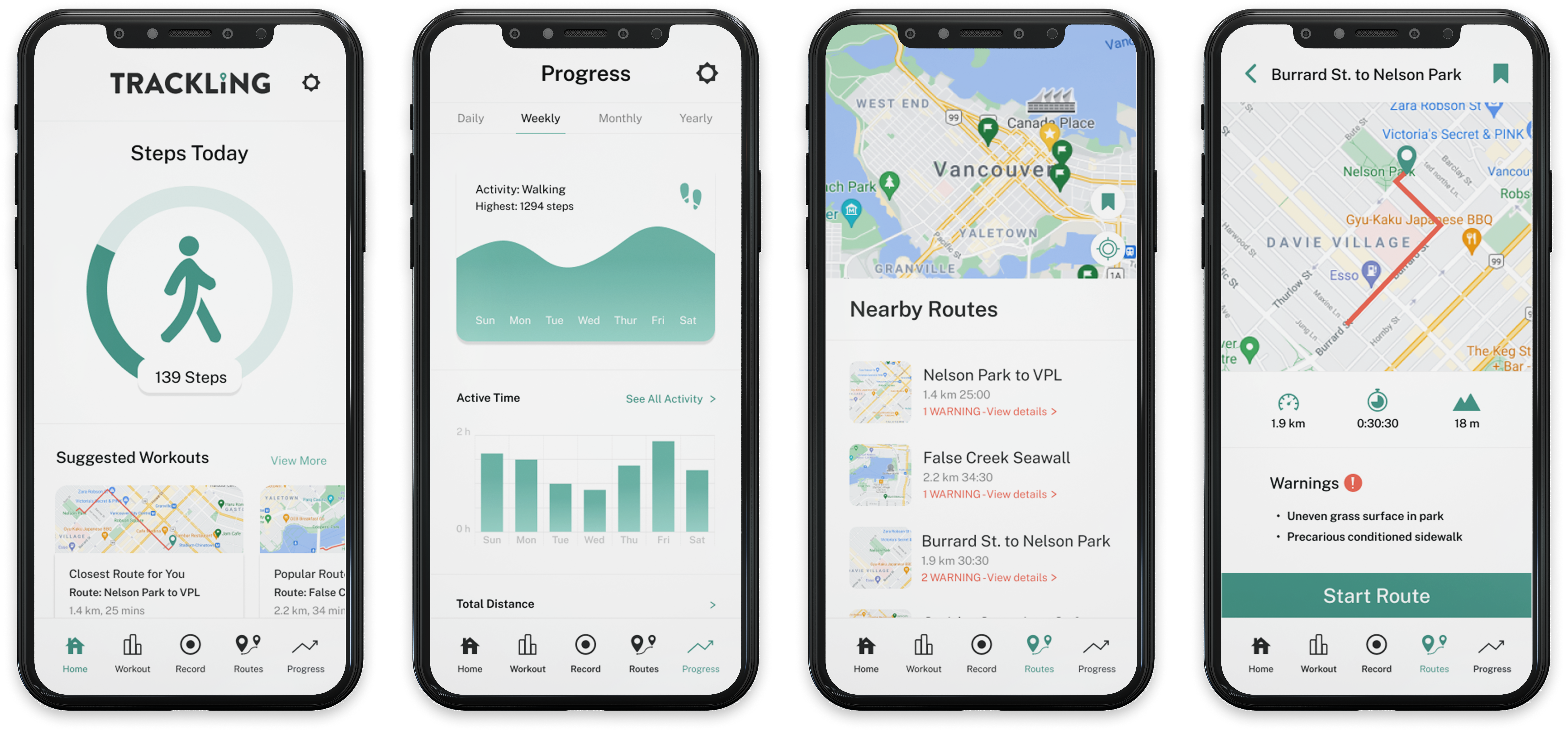
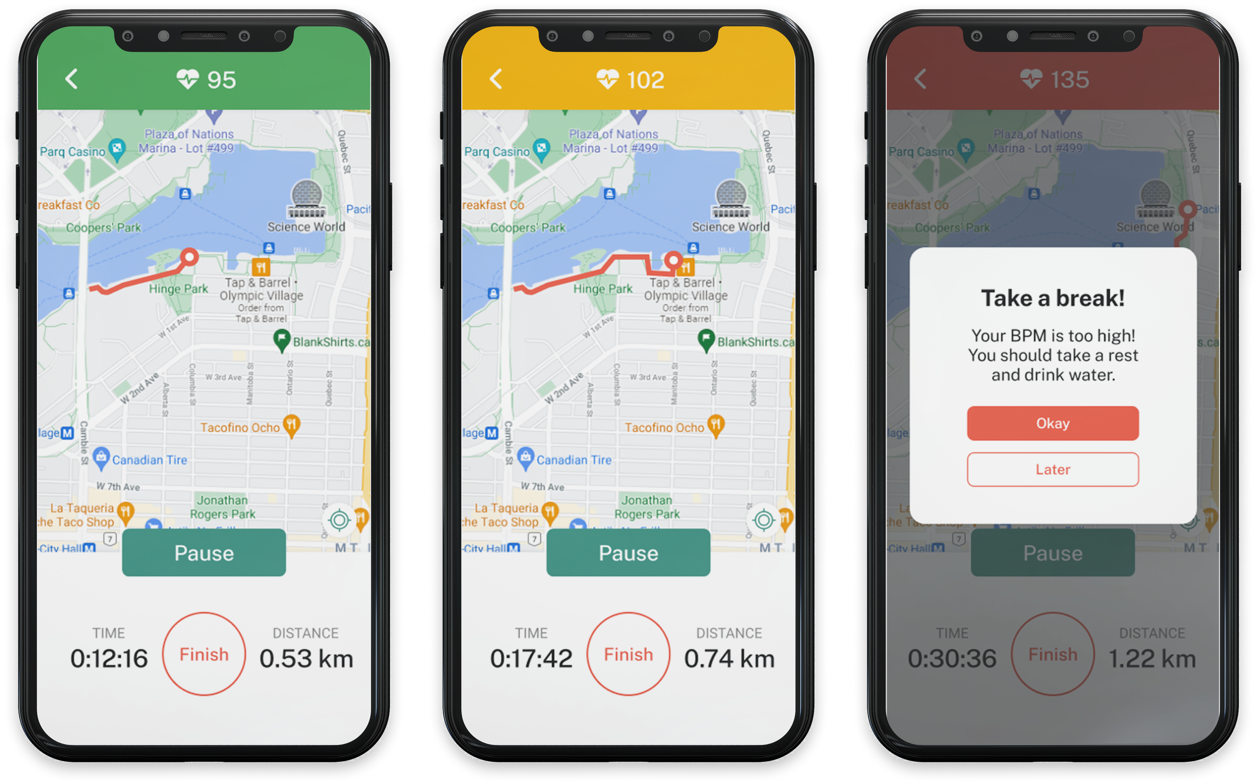
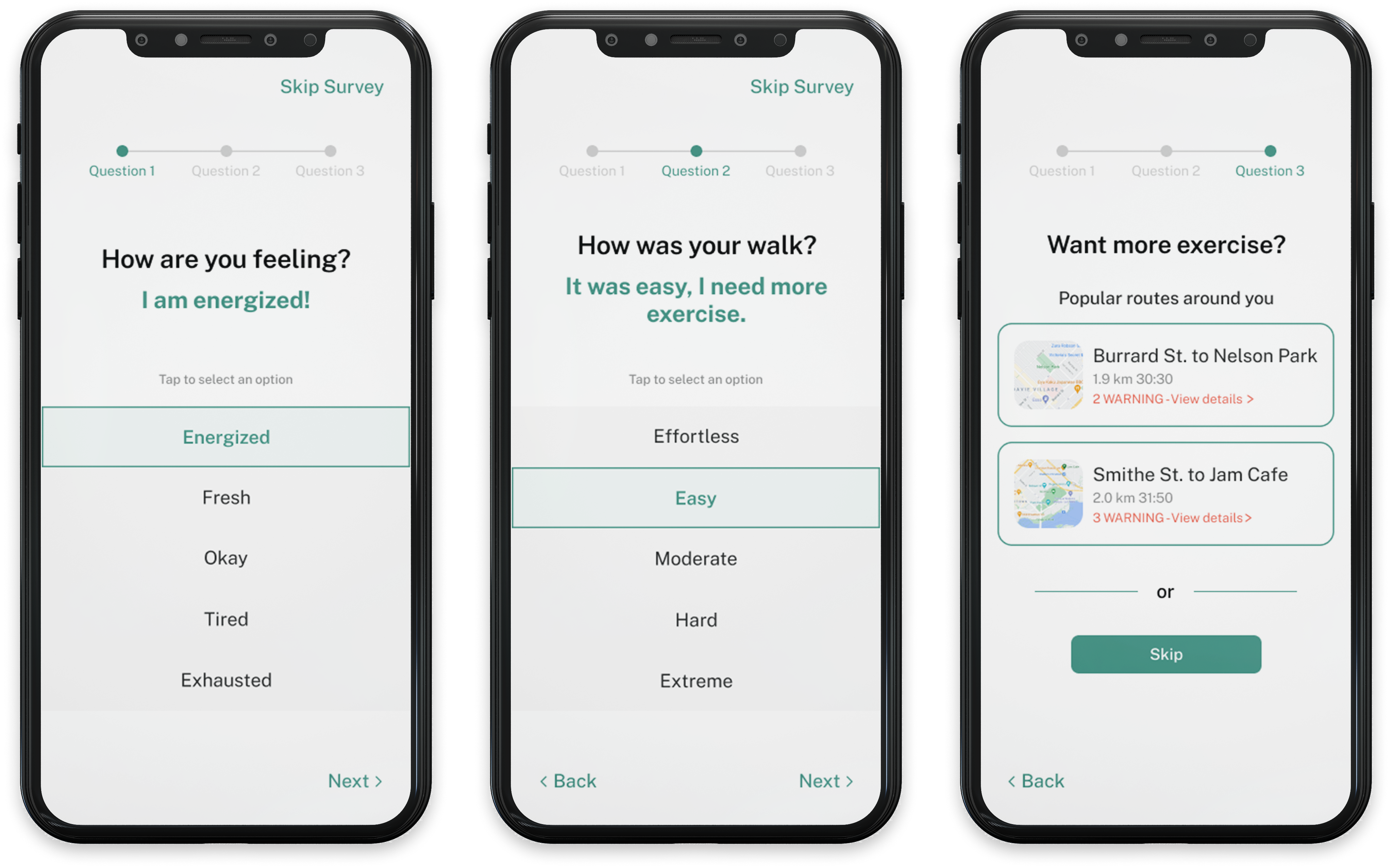
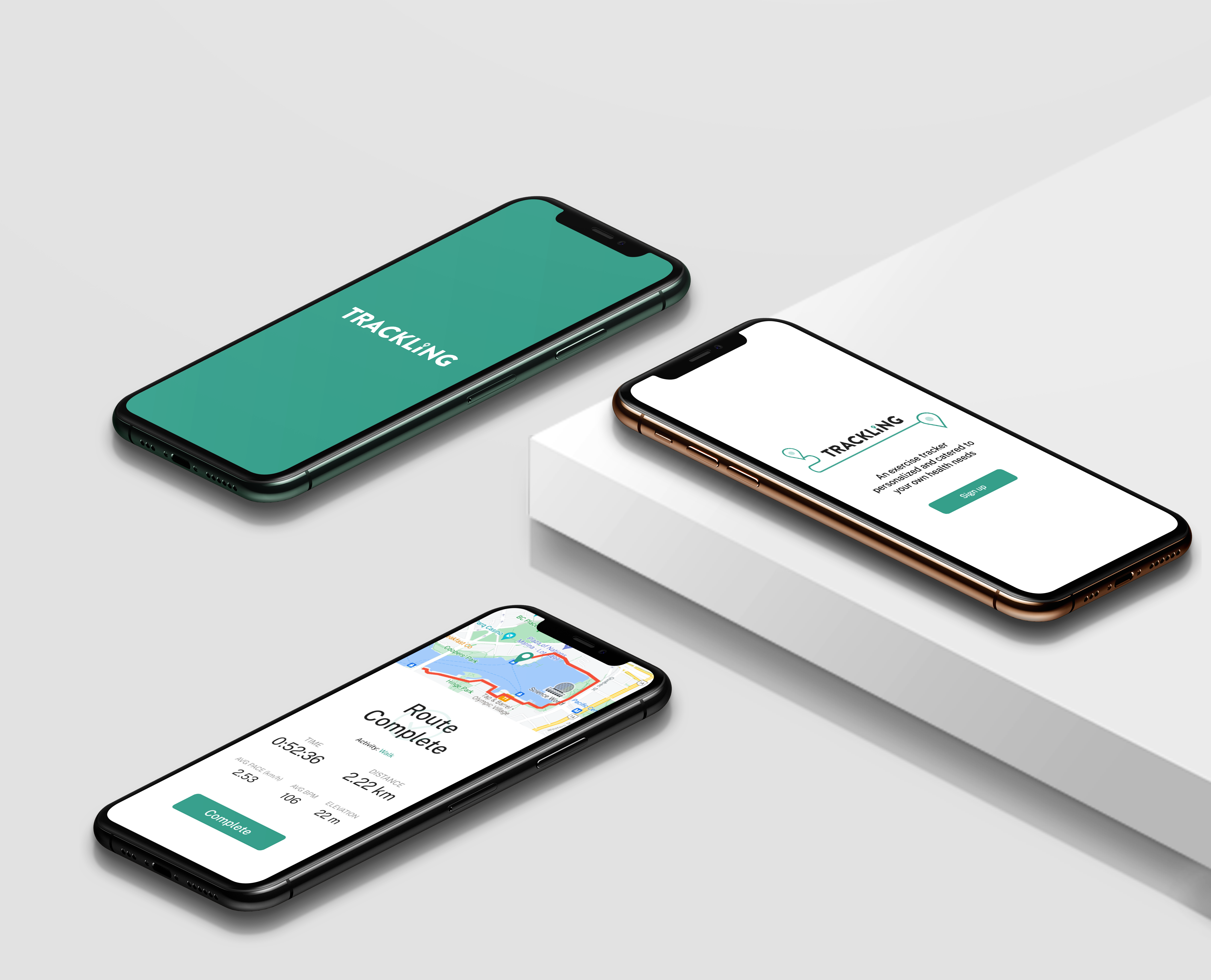
As the COVID-19 pandemic compels individuals to stay indoors, our team recognized mobility and movmement as a crucial domain within the context of physical activity for seniors aged 64 and 74. This recognition prompted us to delve further into formulating exploratory research questions based on initial assumptions to propel our study forward, as listed below, with those in bold and italic representing my area of research.

  1. How do seniors stay physically active?
  2. What are barriers of physical activity in seniors?
  3. What are some everyday tasks that seniors commonly struggle with?
  4. What factors impact functional ability and mobility in seniors?
  5. What is the impact of health impairments on seniors?
  6. What travel options do seniors prioritize for maintaining daily mobility?

User Reserach

Synthesizing the findings for design interventions

"You wonder, what if something happens, maybe I shouldn't be doing that, maybe that's dangerous."
— Alice Herb (88-years-old), Kaiser Health News

After conducting research and three user interviews, the team synthesized the findings on Miro and settled on the design interventions of reducing dependence and enhancing physical awareness. This decision stems from my research, which revealed that seniors face mobility issues primarily due to physical impairments, leading to a lack of confidence and increased dependence on others. The pandemic further exacerbated these challenges by isolating seniors, discouraging them from venturing out independently.

VIEW DESIGN PROPOSAL >
Screenshot of Overall Reserach based on Exploratory Questions

Competitor Reserach

Ideating and conceptualizing the interface

"How can I create a feasible experience for seniors unfamiliar with mobile smartphones and provide accurate suggestions?"
— My train of thought 🧠

In our chosen domain, walking emerged as a key exercise for seniors due to its low impact. Prior to brainstorming, the team researched three existing fitness apps: MapMyWalk, MyFitnessPal, and Strava, to understand current solutions and distinguish ours. Following individual brainstorming, two potential solutions were developed by each team member, with two of my ideas emerging as core functionalities.

  1. Solution A expands existing solutions to provide pre-walking information on environmental details, such as potential hazards or obstacles along the route, helping seniors become aware of any challenges before their walk.
  2. Solution B integrates a live BPM (beats per minute) service, improving upon existing solutions by notifying users of their level and intensity within BPM, aiding seniors in monitoring and understanding their physical limits.
  3. Solution C enables seniors to update their information seamlessly through a quick post-activity survey, eliminating the need for manual data input and navigation, unlike existing solutions.

Visual Direction + Initial Prototype

Designing the optimal user flow

With a clear intervention and domain, the team concentrated on visual direction and concise copywriting, primarily aiming to enhance accessibility for seniors. Therefore, the interface utilizes a high-contrast color scheme and large standard typeface sizing suitable for the target users, along with straightforward terminology to avoid jargon and confusion. Within a week, the team generated initial prototype showcasing the core functionalities, including onboarding, landing, route information, walking, and survey screens.

Initial Prototype with Visual Direction

Usability Testing + Heuristic Evaluation

Identifying the potential issues

"I like all information but the text is too small and the survey ends kind of abruptly."
— User B (68)

Using Jakob Nielsen's 10 Usability Heuristics, our team conducted a heuristic evaluation to identify potential errors and violations on our initial prototype. Then, we conducted two rounds of usability testing remotely via Figma, which revealed challenges with route information visibility, small font size, and low contrast, as well as confusion with survey questions and checkbox options. After testing, the team refined and created new pages to enhance the overall experience. I independently designed and prototyped all landing pages, the navigation bar, and route information screens. Additionally, I assisted a teammate in designing and finalizing the prototype for the survey screens.

Usability Testing findings

Final Takeaway

High-fidelity prototype of Trackling

The final output of Trackling not only provides exercises tailored to individual health conditions but also aims to rebuild seniors' confidence, addressing crucial mobility issues. However, catering to seniors with varying technological proficiency posed a challenge in managing extensive health information to ensure comprehensibility. Due to limited time, viable design decisions were primarily focused on route, exercise, and survey pages, while other areas received less attention.

VIEW FINAL PROTOTYPE >