Parkaid
Mobile App Design/Prototype (UX/UI)

For this project, our team started by brainstorming what type of topic we want to tackle. We want to create something for problems that all Vancouverites faces. After doing multiple research sessions, we were able to land on parking; since parking in Vancouver has been harder and harder, and we think there is a great business opportunity within the parking industry.

My task was mainly on the UI design element of the project. After understanding what my team wants, I started by creating wireframes of what each feature should be located at. This part is very short and fast because I wanted to provide as many wireframes as possible to receive more feedback from both the instructor and our user testers.
After having a clear understanding of what features work and what doesn't, I continued by creating a general style guide for the project. This includes the font that we will be using, the visual languages, the sizes for different situations (heading, paragraph), and also the spacing. I also tasked myself to create some of the icons and logos that we might be using in the project.
After having a clear understanding of what features work and what doesn't, I continued by creating a general style guide for the project. This includes the font that we will be using, the visual languages, the sizes for different situations (heading, paragraph), and also the spacing. I also tasked myself to create some of the icons and logos that we might be using in the project.

We had multiple discussion about the style guide, and when everyone was happy about it. I continued by designing a higher fidelity version of the application. This time I focused on making it look more native to the iOS system. However, it was looking too close to Google Map and after receiving critiques from our tester base, I moved onto the last stage of the project.
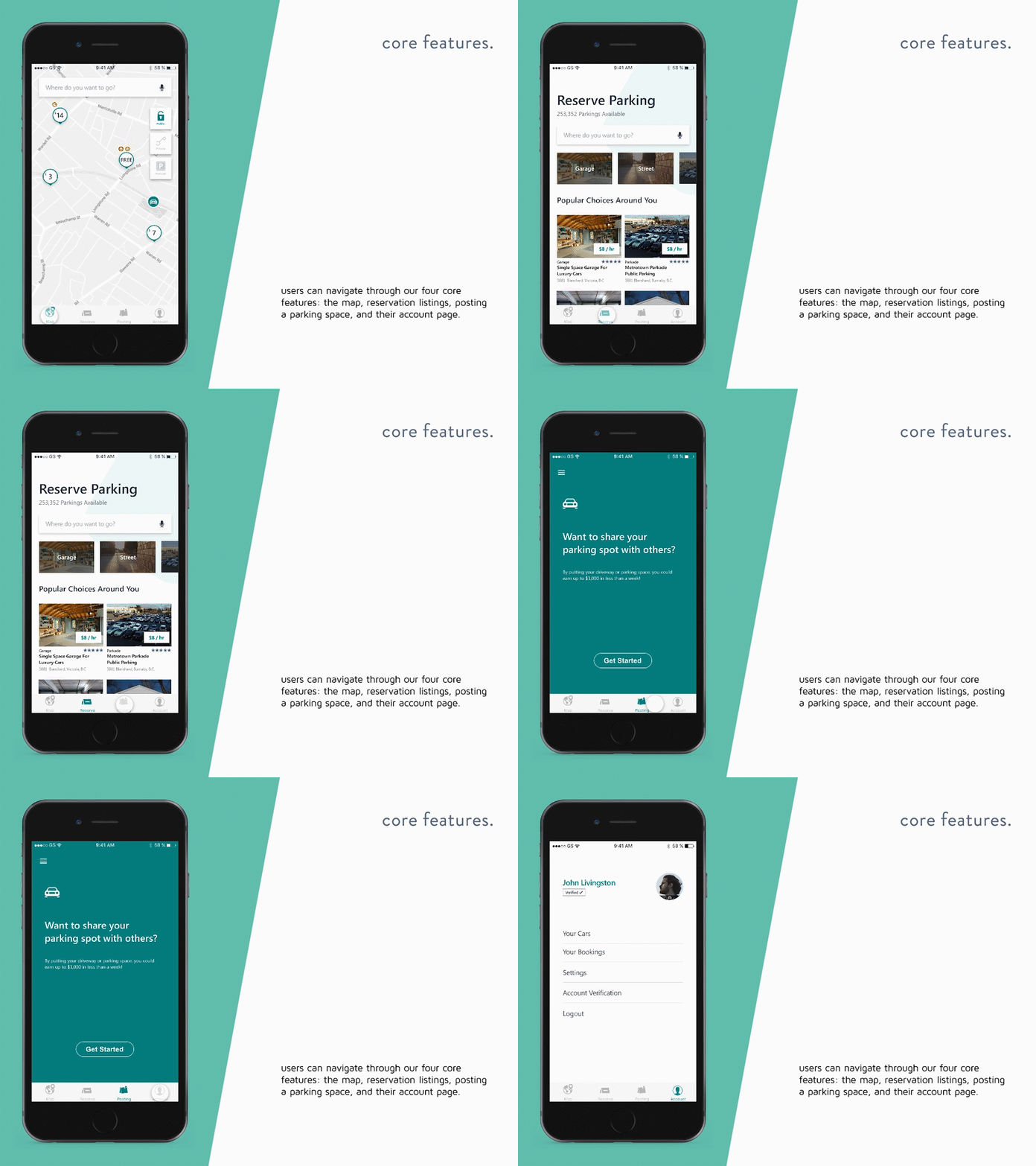
At the end of the project, I redesigned the application once again to create a more unique and interesting interface specifically cater to our application. Afterward, I linked them into a prototype and completed my task. Within this project, I was able to learn a lot about both UI and UX element of the design process (since we also have to do many types of research and interviews). Overall, I enjoyed the experience, and the whole project took around 2 months to complete.
At the end of the project, I redesigned the application once again to create a more unique and interesting interface specifically cater to our application. Afterward, I linked them into a prototype and completed my task. Within this project, I was able to learn a lot about both UI and UX element of the design process (since we also have to do many types of research and interviews). Overall, I enjoyed the experience, and the whole project took around 2 months to complete.