Age 3+ Up
Mobile Application Design (UX/UI)

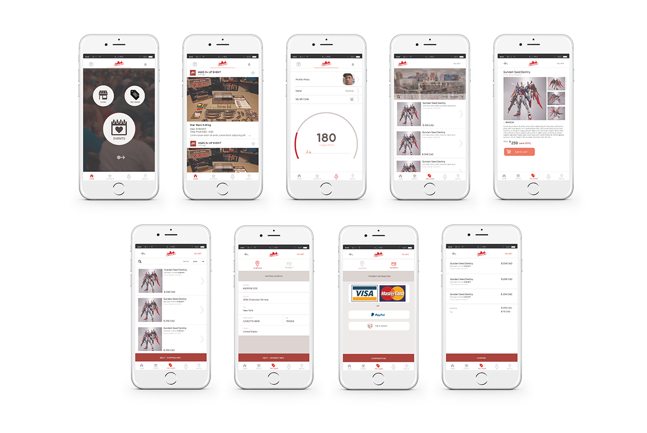
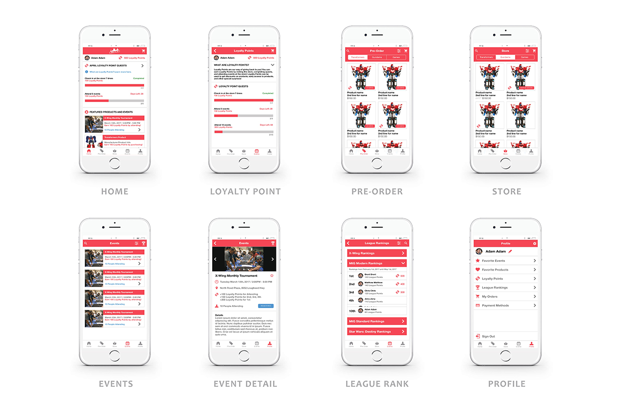
Ages 3+ Up app encourages online customers to visit the Ages 3+ Up physical store location by not only providing a sophisticated event system with leagues and ranking, but also a loyalty point system that rewards customers for attending events, visiting the store, and for the competitive minded, even prizes for winning events! These features together help to promote the community driven aspects of Ages 3+ Up, by encouraging the demographic of online customers to come to the store and grow the community while making new friends!

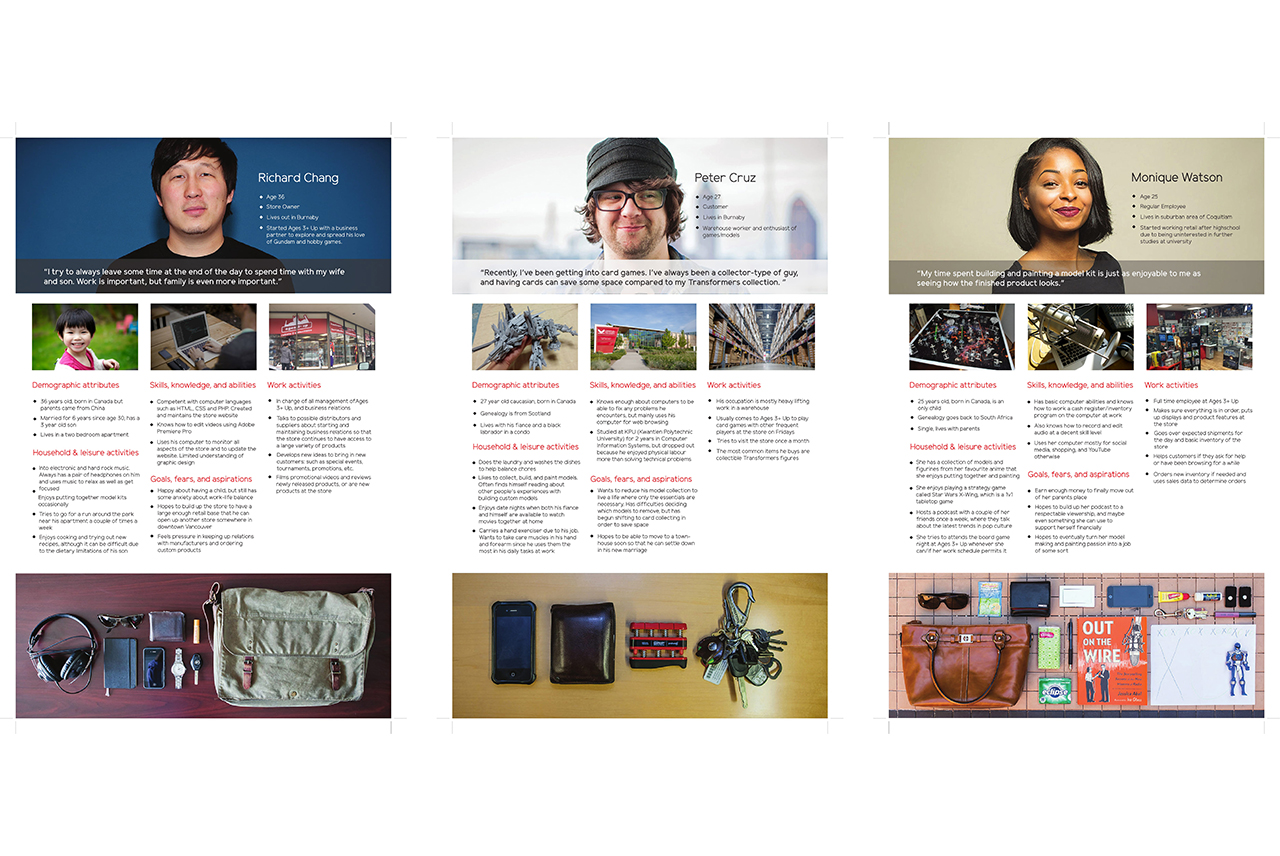
This is quite a unique project since our group was able to work along the side of a hobby store. To start off, since our team doesn't really know what Age 3+ Up need, our team put our focus interviewing the hobby store and we were able to receive permission to stay there for the entire day just to understand how the store works and their customer relationship. After close inspection, our team came out with 3 different ideas which all benefits the company, my main focus was on an application which accompany with the special tournament nights that Age 3+ Up hosts on a weekly basis.
Our group was tasked to first create three different sketch designs for our individual ideas. This would include the features of the idea and the journey framework. After reviewing our interview with the company, I wanted to create an application that both serves as a communication platform and also rewards the user for attending the tournament.
Our group was tasked to first create three different sketch designs for our individual ideas. This would include the features of the idea and the journey framework. After reviewing our interview with the company, I wanted to create an application that both serves as a communication platform and also rewards the user for attending the tournament.

In order to do so, I designed a platform where the company is allowed to announce their tournament; on the other hand, the participant would be able to reserve their seating and also gain points for both attending and winning the tournament. These points would be then used to trade in for goods within the store.
We presented our ideas and my idea was chosen as the best one for our team to pursue. Here's where I met my biggest challenge for this project. Our team's leader had a different design idea when it comes to the application. After understanding where he was coming from and also since he was much closer to the company than I did, I decided to put down my pride and focus on helping to make his design as perfect as possible. I created multiple illustrations for the application which focused on perfecting the existing features and remove some unnecessary ones (such as communication).
We presented our ideas and my idea was chosen as the best one for our team to pursue. Here's where I met my biggest challenge for this project. Our team's leader had a different design idea when it comes to the application. After understanding where he was coming from and also since he was much closer to the company than I did, I decided to put down my pride and focus on helping to make his design as perfect as possible. I created multiple illustrations for the application which focused on perfecting the existing features and remove some unnecessary ones (such as communication).

Overall, this project was an interesting experience for me since it is my first time experiencing such a difference in design within the team. I learned that in order to successfully push the team forward, all designer eventually needs to come to an agreement.