ANDREA TON
ANDREA
ICONS
Within the course of Graphic Design, I had to individually create an icon in gray scale for an application that would allow you to see into the past. The goal was to make it visually clear of its function and to retain its clarity when scaling.
1
2
3
4
ITERATION PROCESS
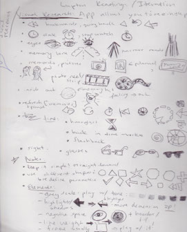
1. Firstly, I conducted visual research so it could help me analyze various content and produce a lot of ideas. As a result of these observations, I began to build my visual vocabulary. Thus, I constructed a list of ideas, objects, and icons that that are normally associated with my app (Figure 1A).
Figure 1A ,My visual vocabulary key.
SKETCHING
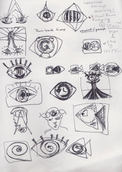
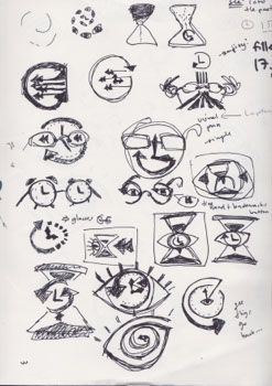
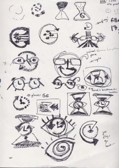
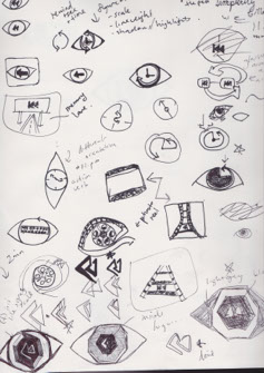
Figure 2A, Progress Time limits of sketches from left to right averages under 15 minutes per page.
2. Subsequently, I had challenges generating a lot of ideas and connecting the visuals I researched to create something original. To solve this, I applied the ideation method Visual Brain dumping. I set myself time limits for filling up a page with sketches (Figure 2A).
VECTORIZING
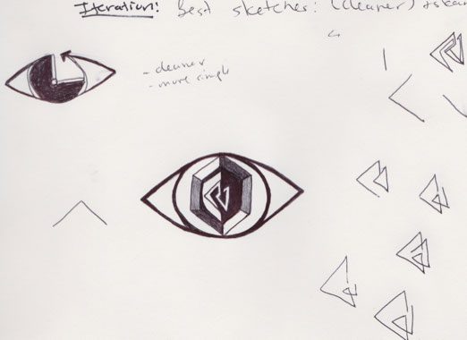
Figure 3A, Scanned sketch for post-production in Adobe Illustrator.
3. After sketching, I realized that majority of my sketches were quite complex and detailed and this would affect the clarity when scaling the icon down. Since shape is one of the first elements people establish an icon with, I played with different forms and scanned my final sketch to be vectorized in Adobe illustrator.
FINAL EVALUATION
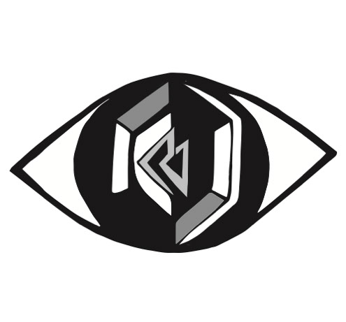
Figure 4A, The final vector image of an app that would allow you to look back into the past.
4. I applied all of the procedures of Design Thinking and it helped me successfully visually communicate my app and its functionality (Figure 4A). Through this project, it allowed me to practice graphic design processes and principals in a creative and technical way. In the future, I would try exploring with Adobe Illustrator more create colored element within an icon rather than just strictly gray scale.