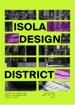
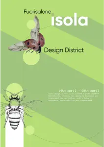
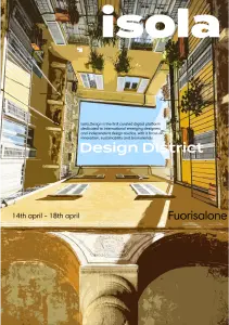
UX Interaction Case Study

Project Insights

  • Collaborative case study to design a microsite promoting local tourism for art exhibition attendees
  • Curated design assets for team brainstorming, guiding the project's strategic direction.
  • Designed and prototyped a Figma map feature highlighting routes to exhibitions and local points of interest.

Project overview

In this collaborative case study, I was tasked with designing the design elements. The chosen client was Fuorisalone Design Festival and the target was to create a microsite to promote local tourism while exploring the art exhibitions in Isola Design District. In the two months duration, I created the design elements and incorporated them in a Figma Prototype.

Poster Design

I had to create a poster for the festival to promote it while choosing elements that could be translated onto the microsite. I used bright vibrant yellow with a picture of a tram in different blocks. The viewer pieces together the background picture to make the poster engaging and used highlights of purple to bring asymmetry to the poster.

Final poster iteration for showcasing Isola Design Festival

Design Process

I started by selecting pictures that resonate ‘ISOLA DESIGN DISTRICT’ and ‘ART IN ISOLA’, and found well-paired fonts.

I sorted design principles and elements from famous artists to use in our trial posters as inpiration. Design inpirations were chosen to match the fun and vibrant style of art.

With the moodboard ready I started poster design keeping in mind translation of fluent translation of static design to interactive dynamic design.

Challenges

  • It was hard to choose a picture that resonates with Isola and Milan. I had to browse through pictures of Milan to find the right picture matching the landscape view of the microsite and portrait view of the poster. I settled for a picture from the street view to show the raw features of the area
  • Choosing a color pallete to make the poster and microsite vibrant and fun was challenging as I wanted the text to have contrast againg the color.

Learning Outcomes

  • Learning UX/UI interaction for a targeted audience while working in a collaborative environment with different opinions
  • Designing a working prototyping of a microsite on Figma while creating transitions on After Effects
  • Understand importance of text imagery and white space for poster design

Poster Iterations

To develop the posters, I created multiple quick iterations by referencing various designers as precedents. I incorporated elements from their work into my designs, which helped clarify the vision for the final product.

Poster pne shocasing a Ballet dancer to represnt one of the exhibition taking place in the festival about glass

Overlapping Imagery + Blown out text

Poster two ustilises designer Bruno Munari's design of overlapping similar images and creating a multi layer posters with heirarchy

Bruno Munari Common Semantics + Hierarchy

Poster three showcasing a whale as the primary focus to bring in viewwers attention while placing images on a grid

Use of grids + Misalignment of elements

Poster four utilizinf similar images represnting flying to shocase the heights reached by the festival

Bruno Munari Common Semantics + Hierarchy

Poster fives uses a buidling patio to frame in on text with bolded title

Massimo Vignelli Bold Text + Dan Friedman Misalignment

Poster six shocases a hand presnting a flower to an arcade machine to symbolise the present meeting the past

Use of grids + Misalignment of elements