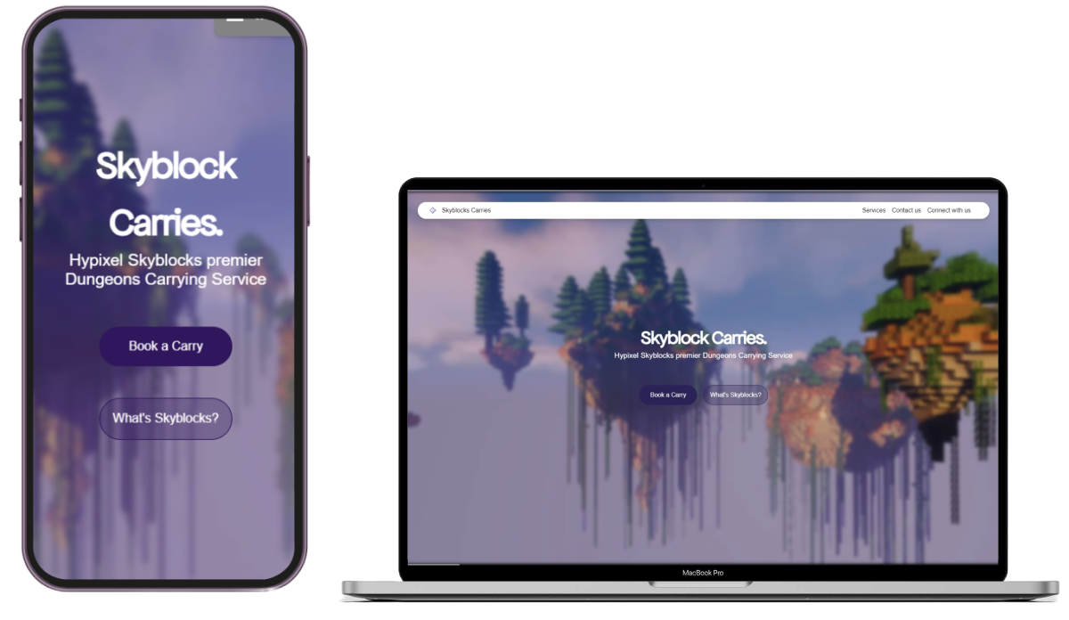
Skyblock Carries
Role: UI developer, Front end programmer
Duration: 1 Month
Teammate: Caleb Wu
Tools: HTML / CSS / Js / Figma

Role: UI developer, Front end programmer
Duration: 1 Month
Teammate: Caleb Wu
Tools: HTML / CSS / Js / Figma


Hypixel Skyblock is a multiplayer role-playing game on Hypixel, a multiplayer Minecraft server. Hypixel Skyblock features the gamemode Dungeons, a 4-player gamemode where players work together to find and defeat bosses. As Dungeons is one of the most difficult gamemodes on Hypixel Skyblock, the service Skyblock Carries aims to help struggling players by connecting them with experienced players to overcome challenges set by the game.
My role in my team was to redesign the website layouts to better inform users about their purchases and to simplify product descriptions. During prototyping, our team realized we hadn’t considered a navigation flow to purchase items. Also, we didn't consider new users and their unfamiliarity with in-game terms, such as having the product's description as the boss' in-game name. These issues disrupted the user's experience on the website and caused confusion during the purchasing process.
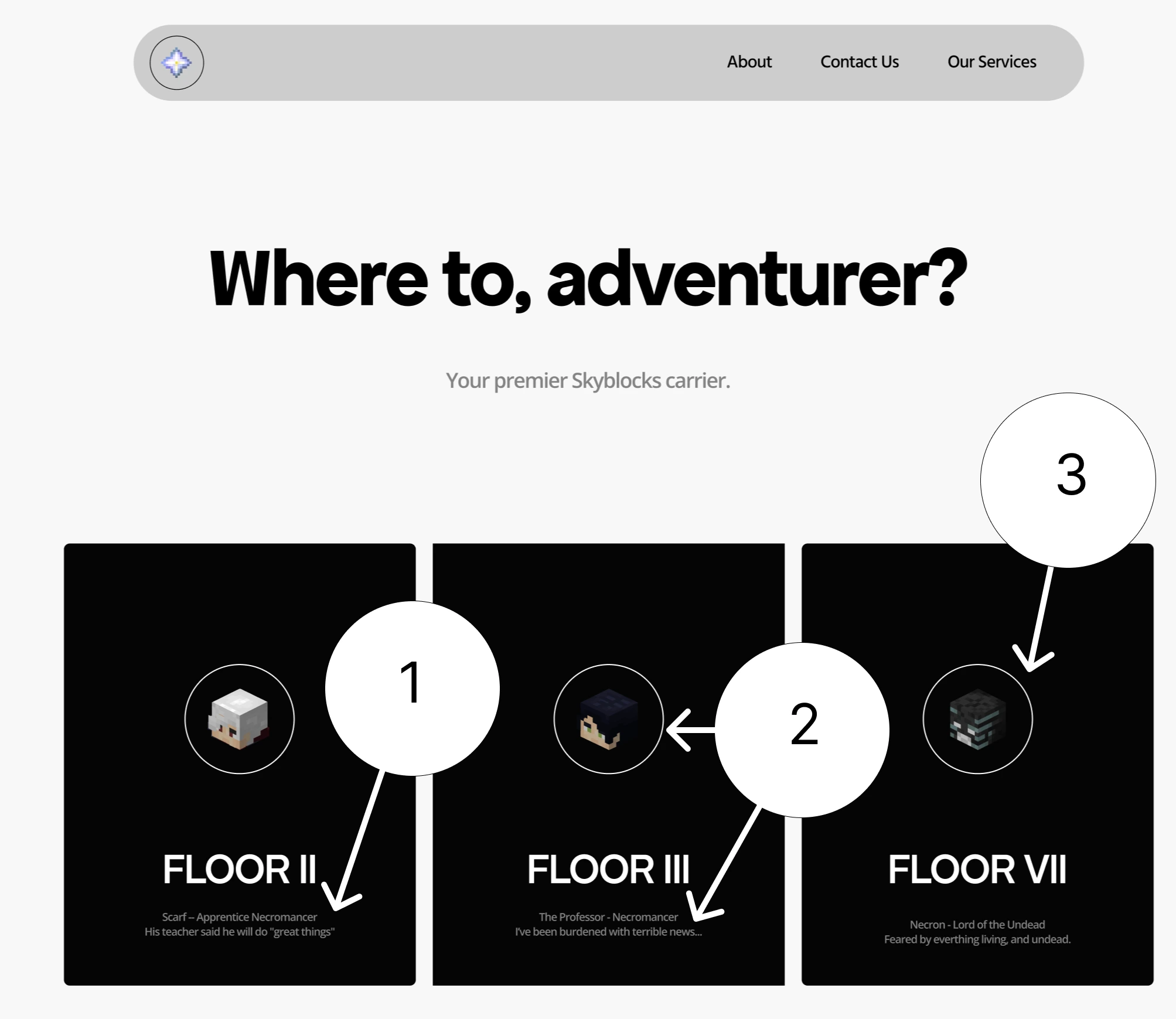
The title is unrelated to what the page is about, confusing users about their current location while purchasing a product.
Not enough information is given about the products (Eg. Price) and what the product looks like (Eg. What does the small head mean?)
The character head does a poor job with helping users identify what the product is, and should be replaced to give more context.
I focused on improving the user flow by simplifying website elements and terms, along with modifying or adding features to make the user experience straightforward and concise for all users.
To solve the website being unfamiliar to users, I evaluated the user flow from a new user's perspective and identified weaknesses, which were the unclear product descriptions and poor representation of the carriers page. From this, I was able to prototype and recommend redesigns to my team that prioritized user experiences that concisely informed users about products.
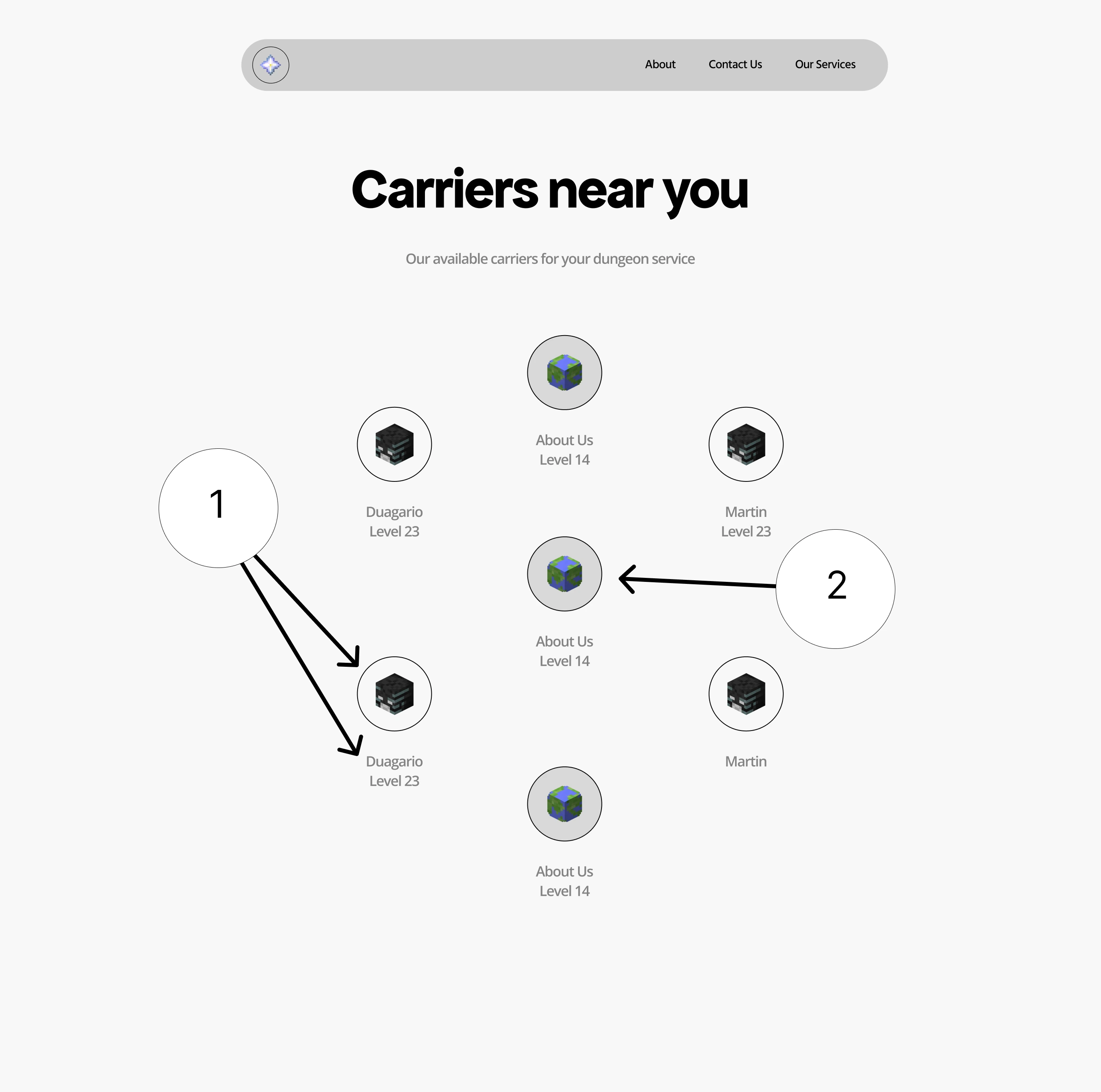
Symbols and captions are unclear to users, espesially new ones
Unclear about what is interactable on the page, such as the small buttons.
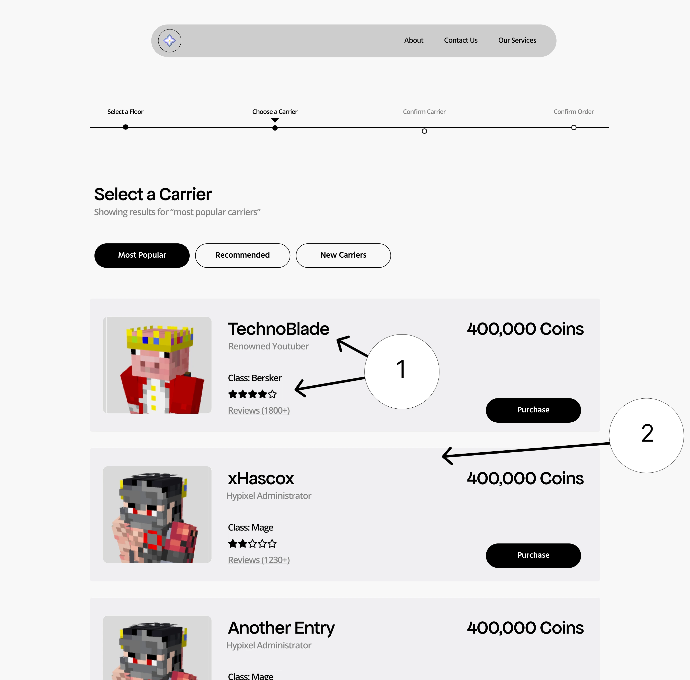
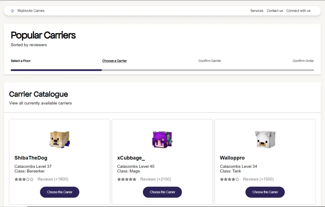
Products focus on being more descriptive and concise.
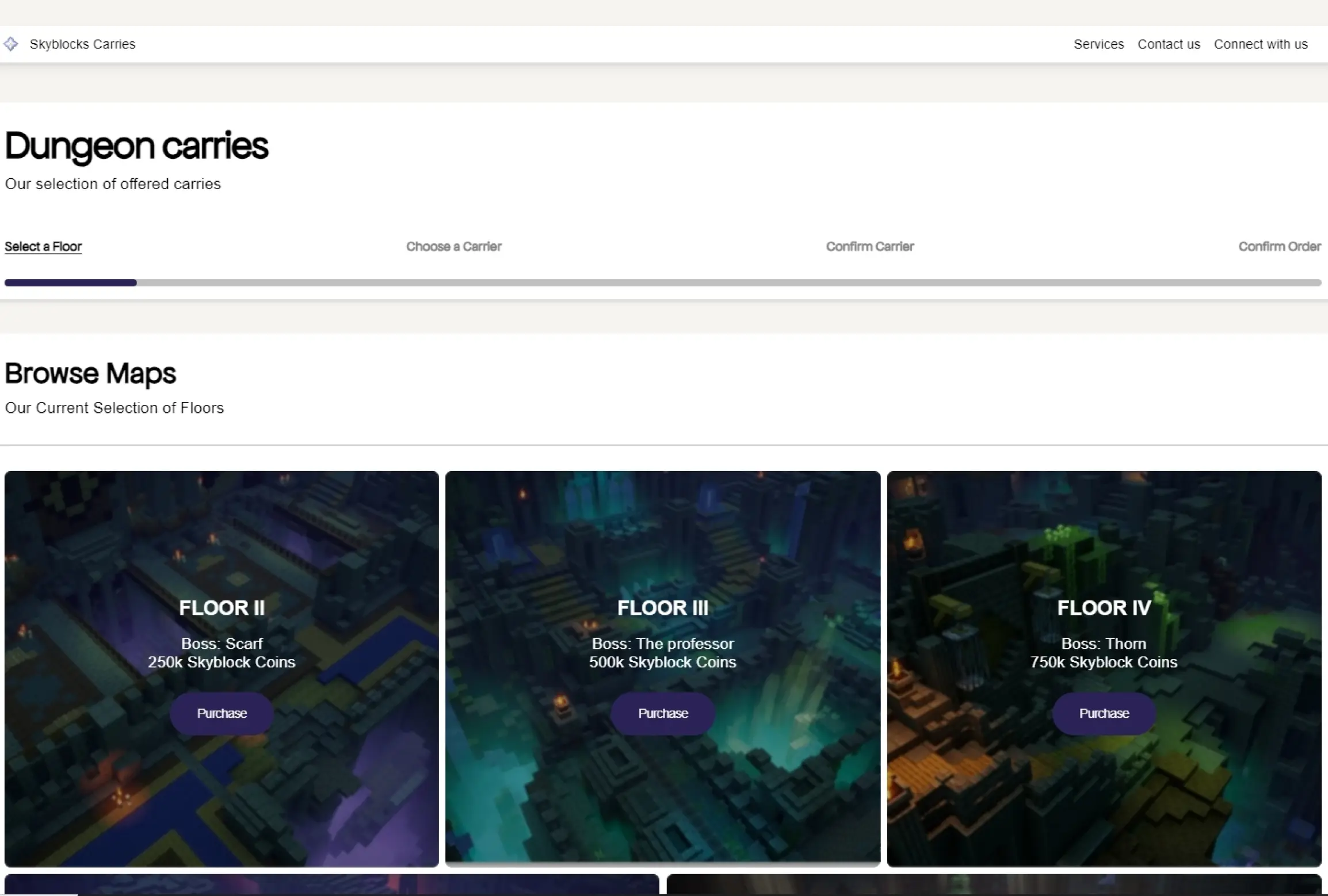
Product containers holds all the content together and makes it clear and recognizable when picking out a product.
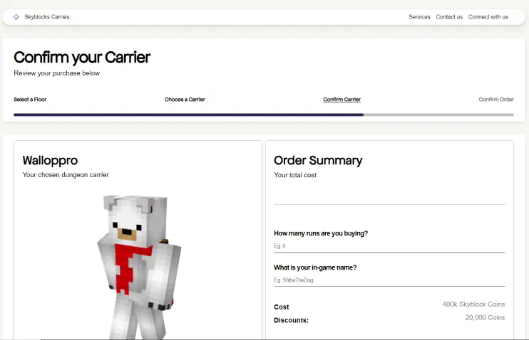
To help solve the issues with the user flow, I designed a user timeline to guide and inform users through the product selection process, providing options to backtrack if needed. Page layouts were adjusted to ensure content flowed smoothly, using containers with adequate spacing to enhance clarity. This process took multiple iterations to land on a user timeline that fits with the style guide while being recognizable as interactable.
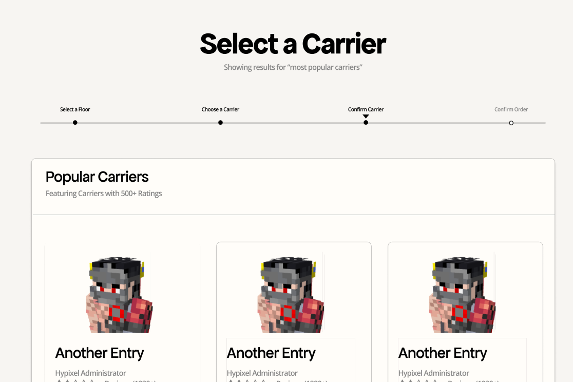
1st iteration: A simple line below the title to help guide users, but would they know its interactable?
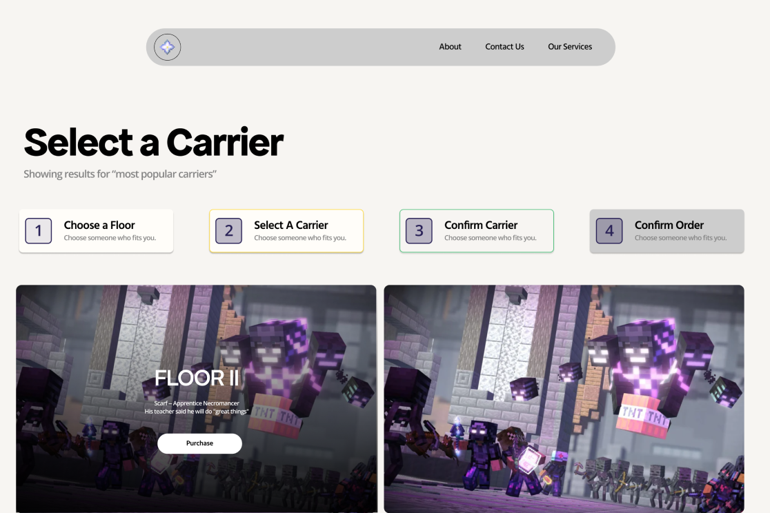
2nd iteration: Boxes that look more like buttons, but would it fit in with the style of the current webite?
Through multiple iterations (with examples above) on the user timeline and gathering feedback from potential users, I designed a user journey with aesthetics, readability, and minimalism in mind.
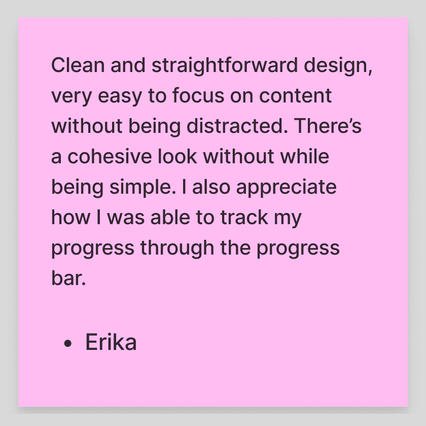
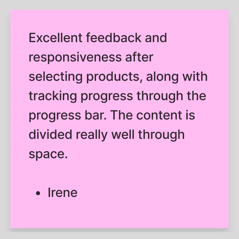
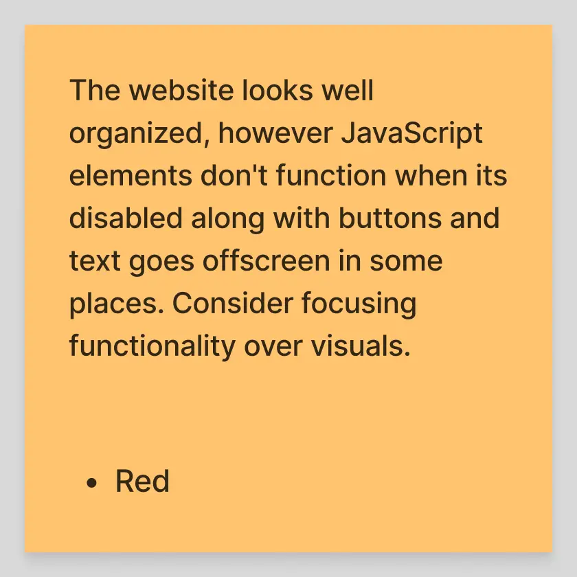
Feedback from new users highlighted the clear product information, intuitive navigation via the user timeline and a consistent style guide that simplified navigation.
Reflecting upon my work, this project taught me the value of viewing group work from a new user's perspective. Users appreciated the simplicity of navigating through the website over aesthetics and despite the design being simple, it was well-received. However, our group overlooked functionality issues such as the text going offscreen and backend code errors with Javascript.