

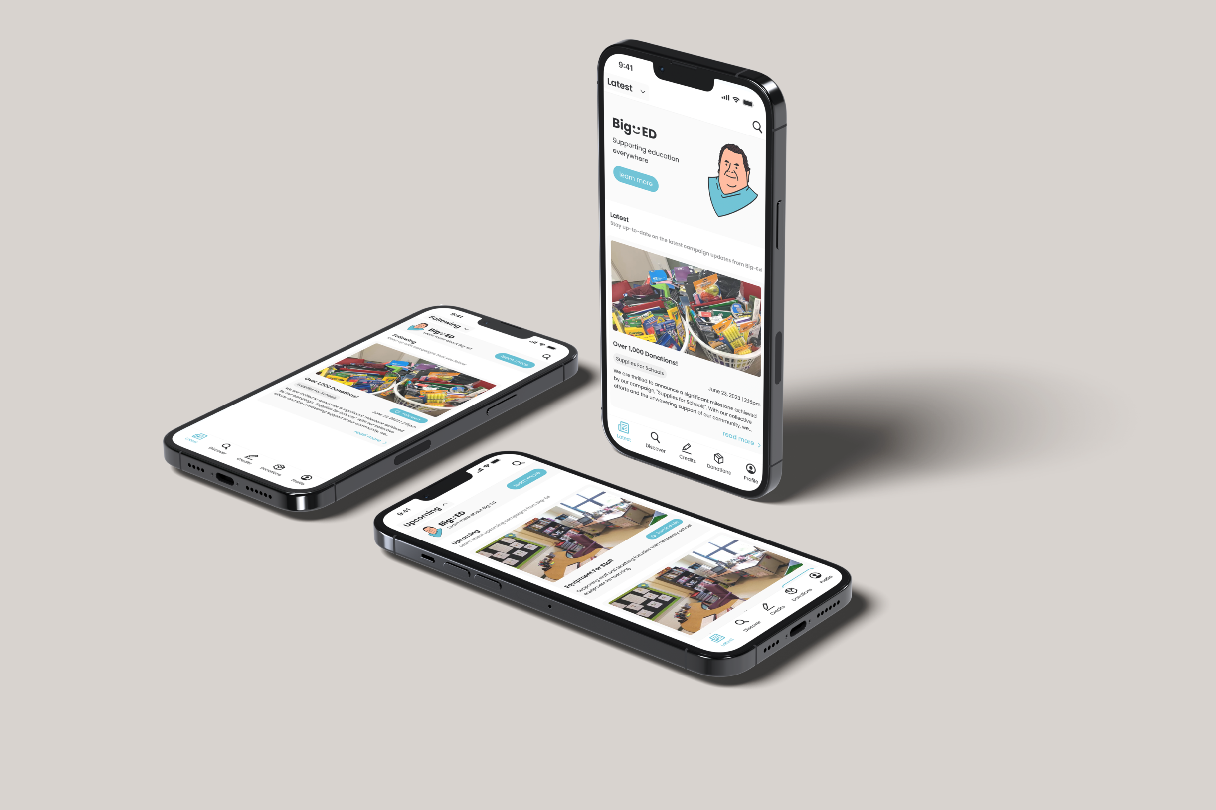
BigED is a charitable organization dedicated to advancing global education I was created in an interface design course with my partners. Our platform is designed to empower passionate donors by showcasing various campaigns supporting different facets of education,including school supplies, equipment, meals, and girls' education. We facilitate seamless interactions,allowing donors to effortlessly schedule pick-ups and drop-offs for physical donations. For added convenience, we offer diverse options for one-time or subscription-based contributions.

What sets BigED apart is our commitment to transparency. We provide detailed insights into campaigns,featuring information about organizers, timelines, and goal progress. What's more, BigED centralizes the monitoring of physical donations, allowing users to track their progress and locations. Our platform also maintains a donation history, streamlining the review process for users and facilitating tax-related purposes.
From the initial ideation, research, wireframing, to creating mock-ups, we conducted user testing and underwent a redesign phase. I was actively involved in the entire project. During the prototype phase, I was assigned the task of designing the user profile and credit system interface for the app.
During the brainstorming phase, I primarily approached the task from the perspective of customers. My aim was to demonstrate love through charity while also enabling individuals to make positive contributions to society. The resulting features serve as the main navigation buttons.
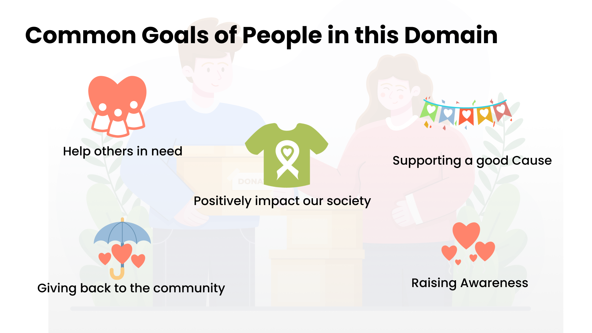
Within this context, I envision incorporating a pencil as a symbolic element to represent our point system, particularly because our app focuses primarily on educational campaigns. The pencil serves as a metaphor for educational tools. Users can earn pencils by donating money or items, which can then be used as a discount for their next contribution. In the profile section, there is a dedicated page explaining the Pencil Point System, its functionalities, and how to use it.
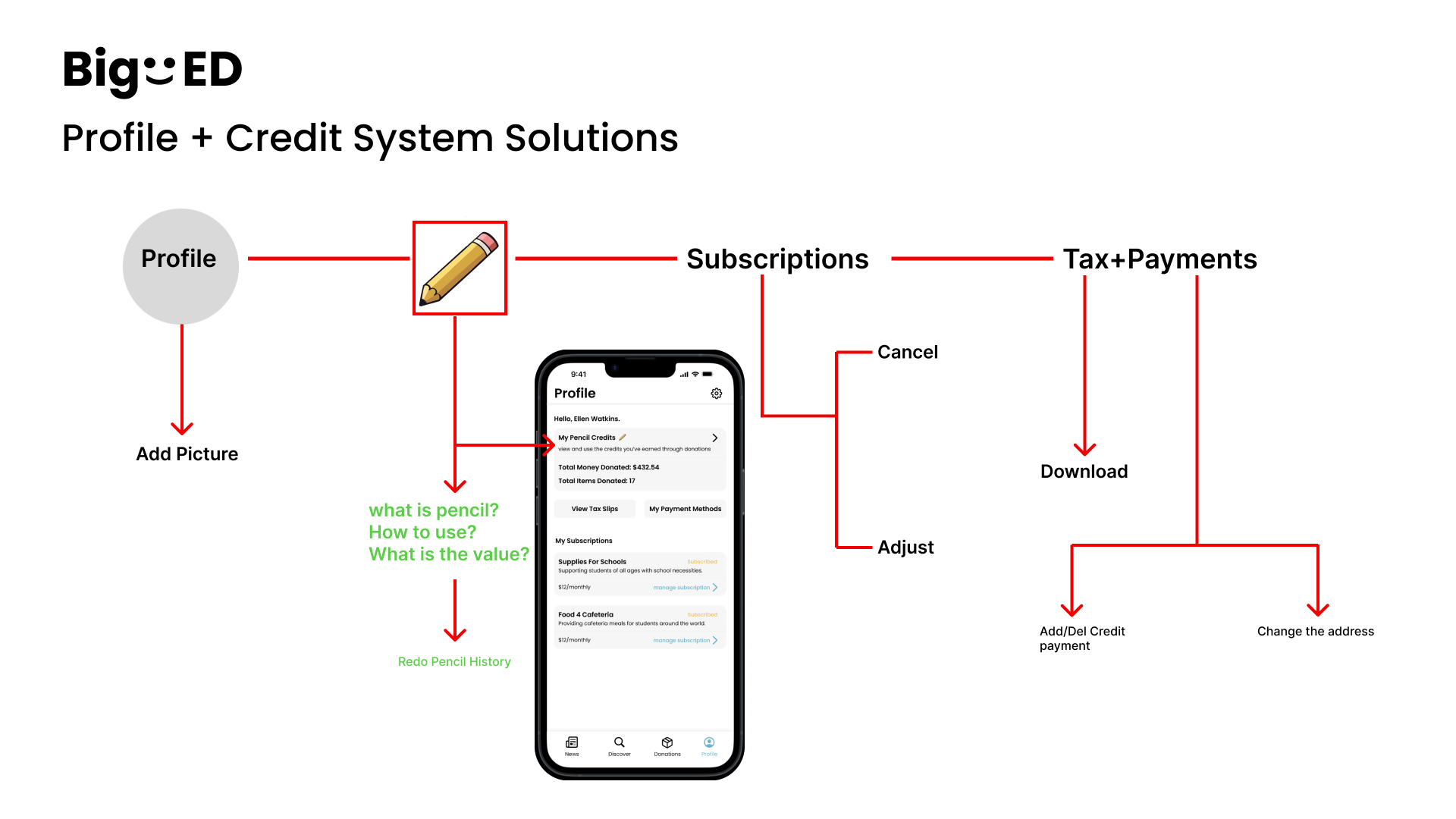
As the system was developed, adjustments were made based on customer testing and interviewee feedback. Although many users grasp the concept of Pencil System Points, some are still confused about how to use them. In an ongoing iteration process, we decided to create a dedicated button in the Pencil System’s navigation menu. This allows users to directly access and learn more about the Pencil System with just one click. Additionally, I kept the Pencil System accessible to users from the profile section.
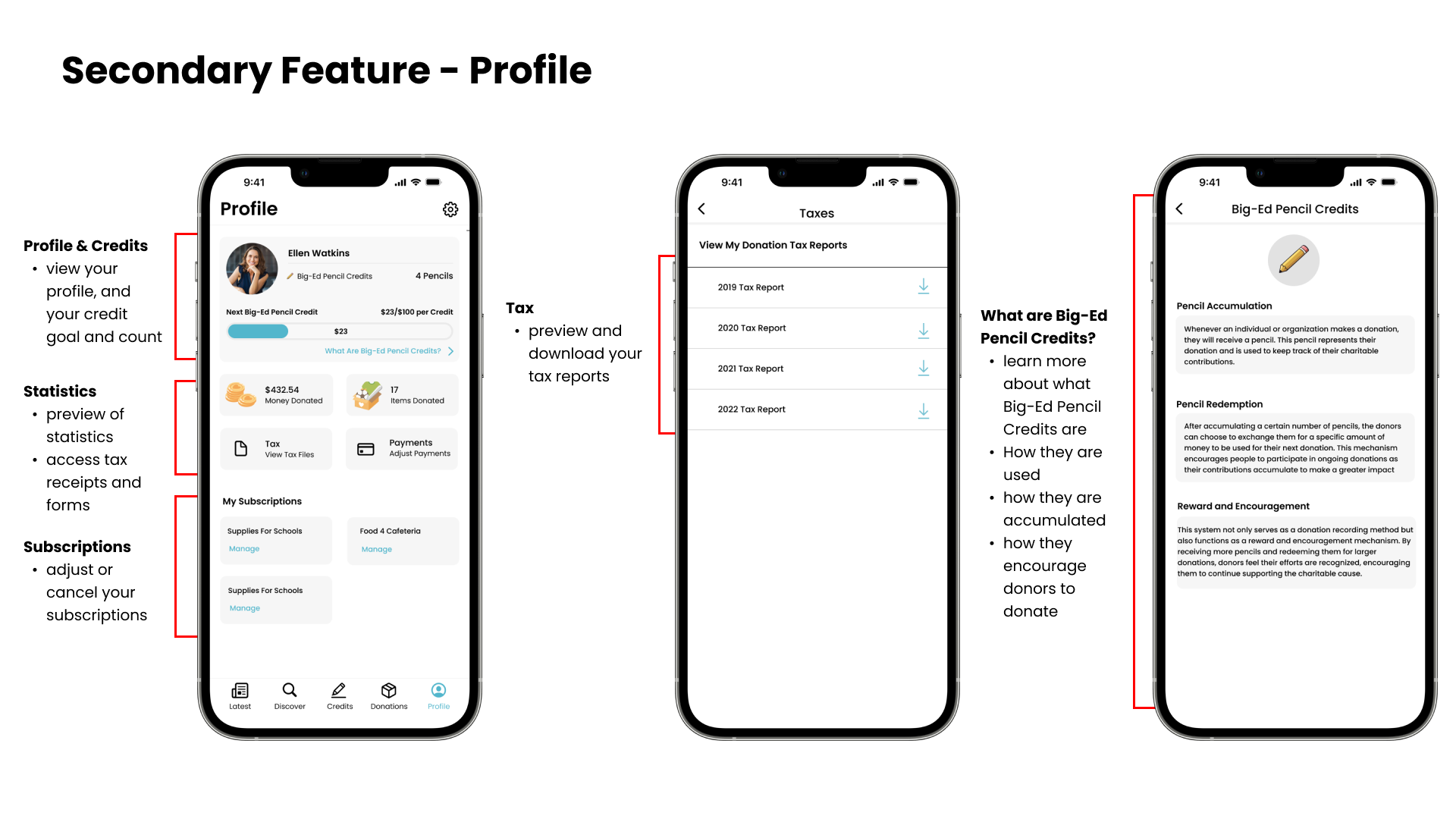
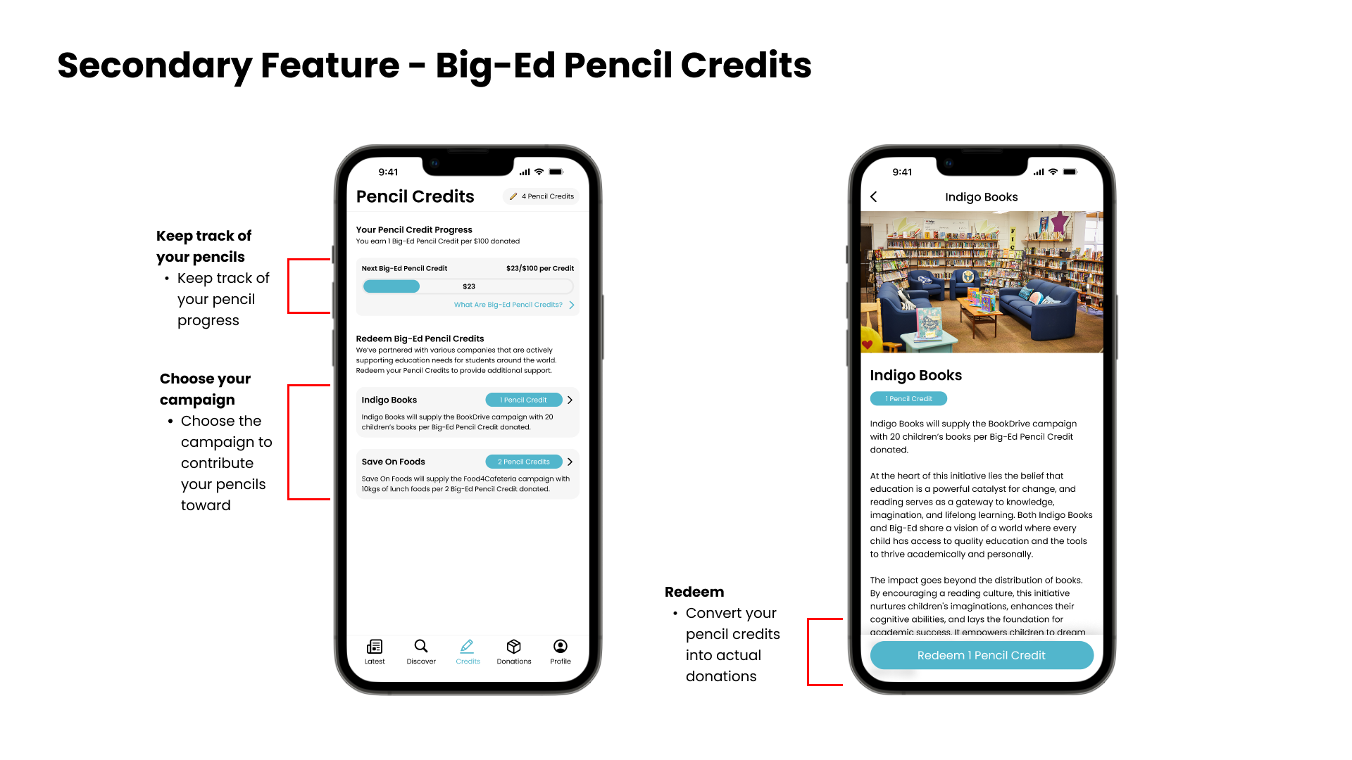


In the process of designing the profile and credit system, which constituted my primary responsibilities, I undertook multiple iterations. Following user testing and the collection of visitor feedback, I pinpointed several logical gaps in my designs. The root cause was identified as a failure to fully embrace the customer's perspective and a lack of clarity in explaining the intricacies of the credit system.To enhance comprehension of the credit system, I updated a specific explaination of the pencil and how to use these pencils for next donations. This adjustment aimed to provide a more visual and lucid explanation, addressing the previously identified issues.