Tea fest Express
Tea Fest Express is an imaginary week-long community festival with special daily events and workshops planned for each day of the week. My team was assigned to design and code the visual identity of their website.
Feel free to visit the Tea Fest Express website .
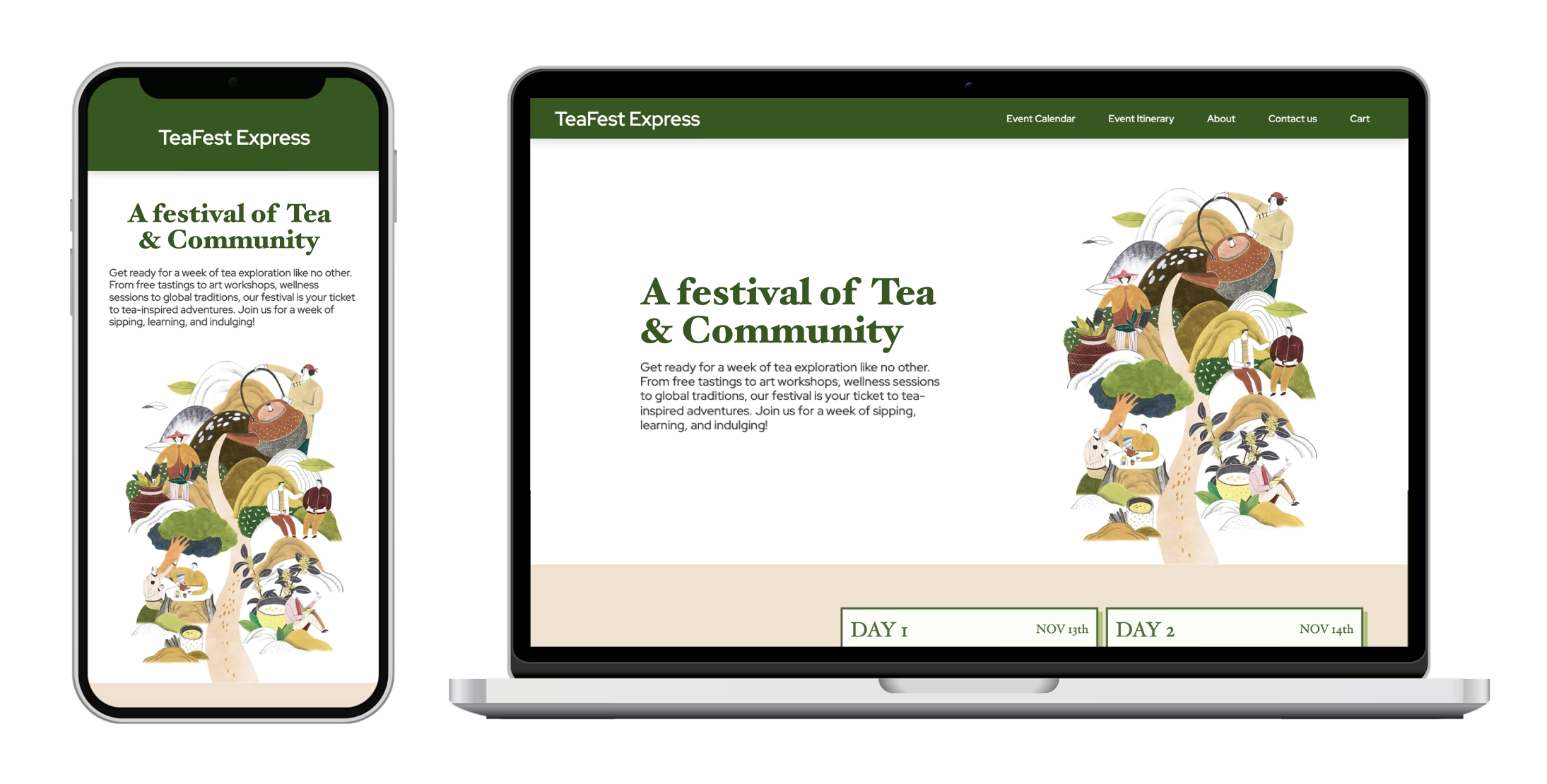
(a) project Overview
Project Goal:
To design and develop a static e-commerce website experience for an imaginary Tea Festival event (without utilizing frameworks)
Context:
5 week long academic project
Team:
Sahar Babaei / Kaia Crozier
Tools used:
Figma / Visual Studio Code / Browser dev tools / HTML5 / CSS
My contribution:
Concept ideation / Wireframes / Responsive Design / Usability and Accessibility considerations / Coding the Design / Progressive Enhancement
(b) design Thinking
Please note: Due to the project's extensive scope and the diverse variety of my contributions, this project analysis will solely focus on the usability considerations during the design and development process of the website.
Usability and functionality considerations are essential when designing and developing a website for an organization that wants to use their website as a medium to reach more customers. Moreover, a pleasant and inclusive online experience for customers can reflect positively on the organization's overall ethos.
Following is a breakdown of some key design decisions to ensure the website is responsive, functional, accessible and easy to navigate.
01 - Communicating through Visual Cues
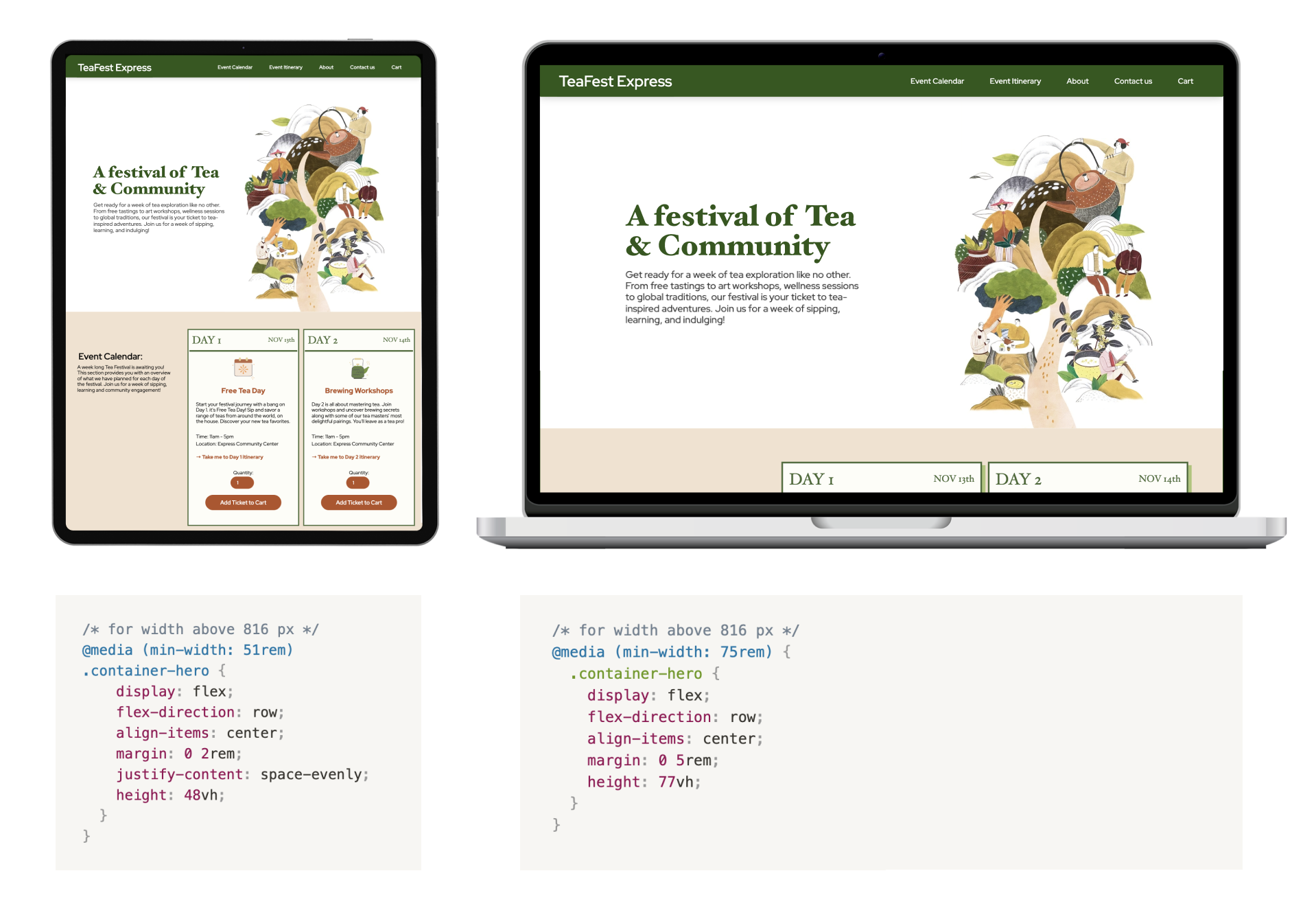
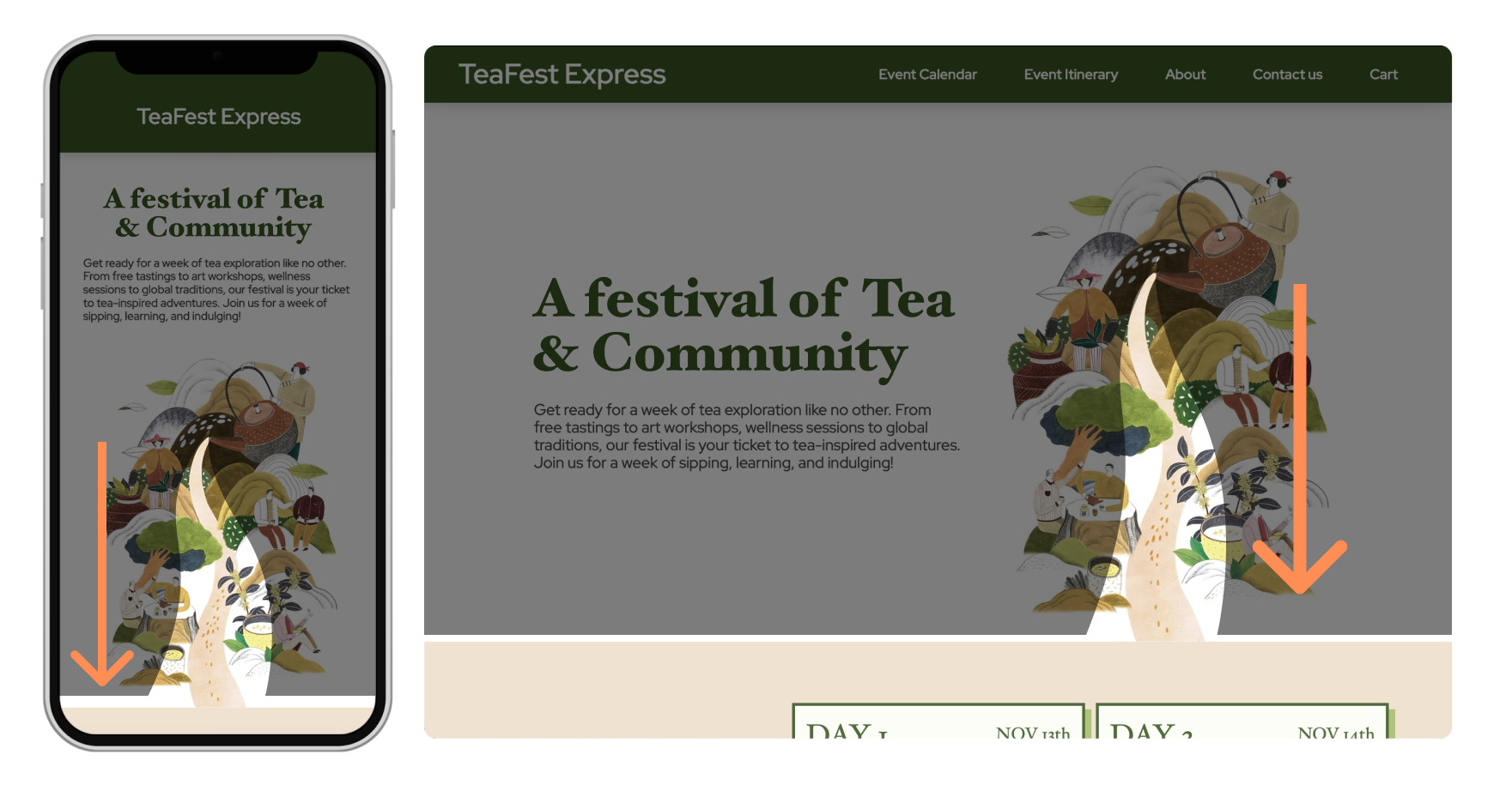
The hero section of the website landing page introduces the festival to viewers. To encourage users to scroll, the hero section is designed to only take up a portion of the screen, allowing a glimpse of the event calendar section. This is done by setting the section's height using vh (viewport height) for different screen sizes. Additionally, the linear flow of tea in the image used for the hero section guides the viewer's eyes downward, motivating them to scroll.
Hero section's height is adjusted depending on the screen size of the device used.
Visual flow of the hero image guiding the gaze downward
02 - Consistency of Components
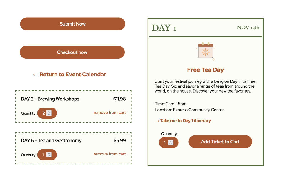
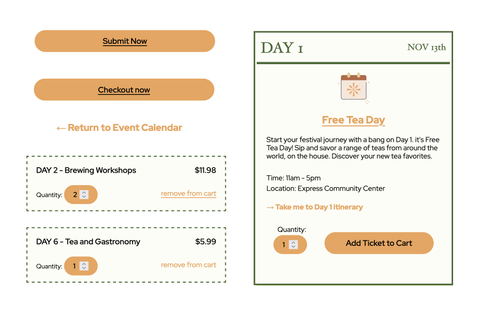
The UI elements are designed based on their function. Elements with similar functions are styled similarly to help create a consistence visual language across the website and also help users easily recognize the function of elements by the way they're styled.
Visual design of interactable elements
Visual design of interactable elements in hover and focus state
03 - Limit Distractions
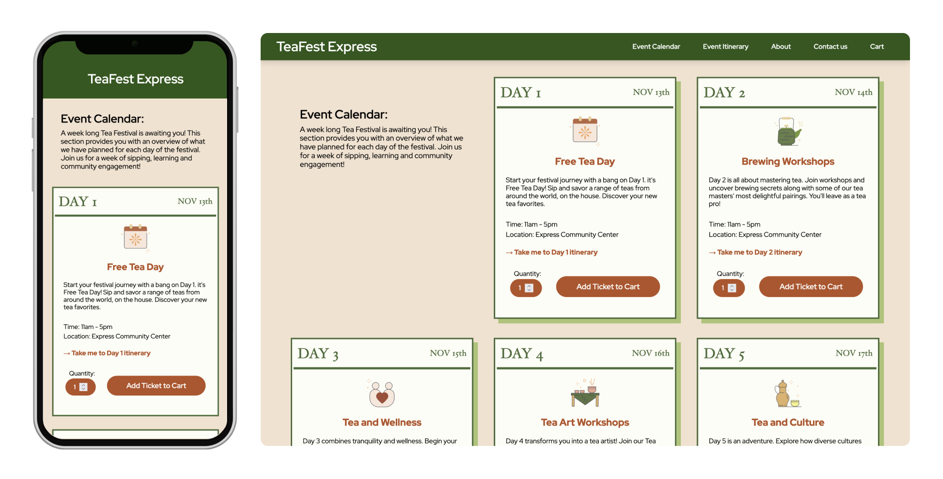
Having too many visual elements would clutter up the screen. This would lead to users getting distracted from their main task goal when navigating the website. This is a bigger problem for smaller screen sizes since their space is a lot more limited. For this reason, decorative elements like card shadows are removed for the design of smaller screens. Additionally, the layout structure of elements is re-arranged to accomodate the limited spacing of smaller screens while maintaining full functionality, accessibility, readability and hierarchy.
Calendar section layout difference between smaller and bigger screens
(c) challenges
01 - Prioritizing Usability
Due to my initial unfamiliarity with web accessibility and inclusivity considerations, the process of implementing progressive enhancement, which aims to guarantee full accessibility and usability of the website at its most basic level, felt challenging to me. This was my first time developing a web design project through coding, and I learned that I needed to shift my mindset to prioritize usability and functionality before focusing on decorative elements and interactions.
02 - Balance between Design and Code
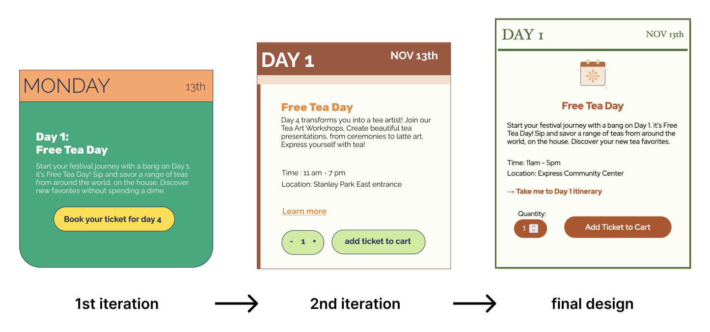
Focusing heavily on utilizing best modern coding practices for the development process led me to initially neglect the visual design of the website. This called for re-iterating the design and re-coding a huge part of the website styling and structure.
Improvements include added illustrations, a harmonious color palette and descriptive labels for interactive elements.
(d) final reflection
By designing and developing this website, I had the opportunity to apply the design principles and guidelines I learned throughout my academic studies. This project taught me the importance of creating inclusive and functional designs.I realized the significance of implementing progressive enhancement, which ensures that the website is accessible and usable by everyone, regardless of their abilities, internet speed, or device power. Additionally, I learned that intentional and cohesive visual design of elements assists in effectively communicating their purpose and function, thus enhancing the overall user experience.
