1 / 5
2 / 5
3 / 5

4 / 5
5 / 5
1 / 5
2 / 5
3 / 5
4 / 5
5 / 5
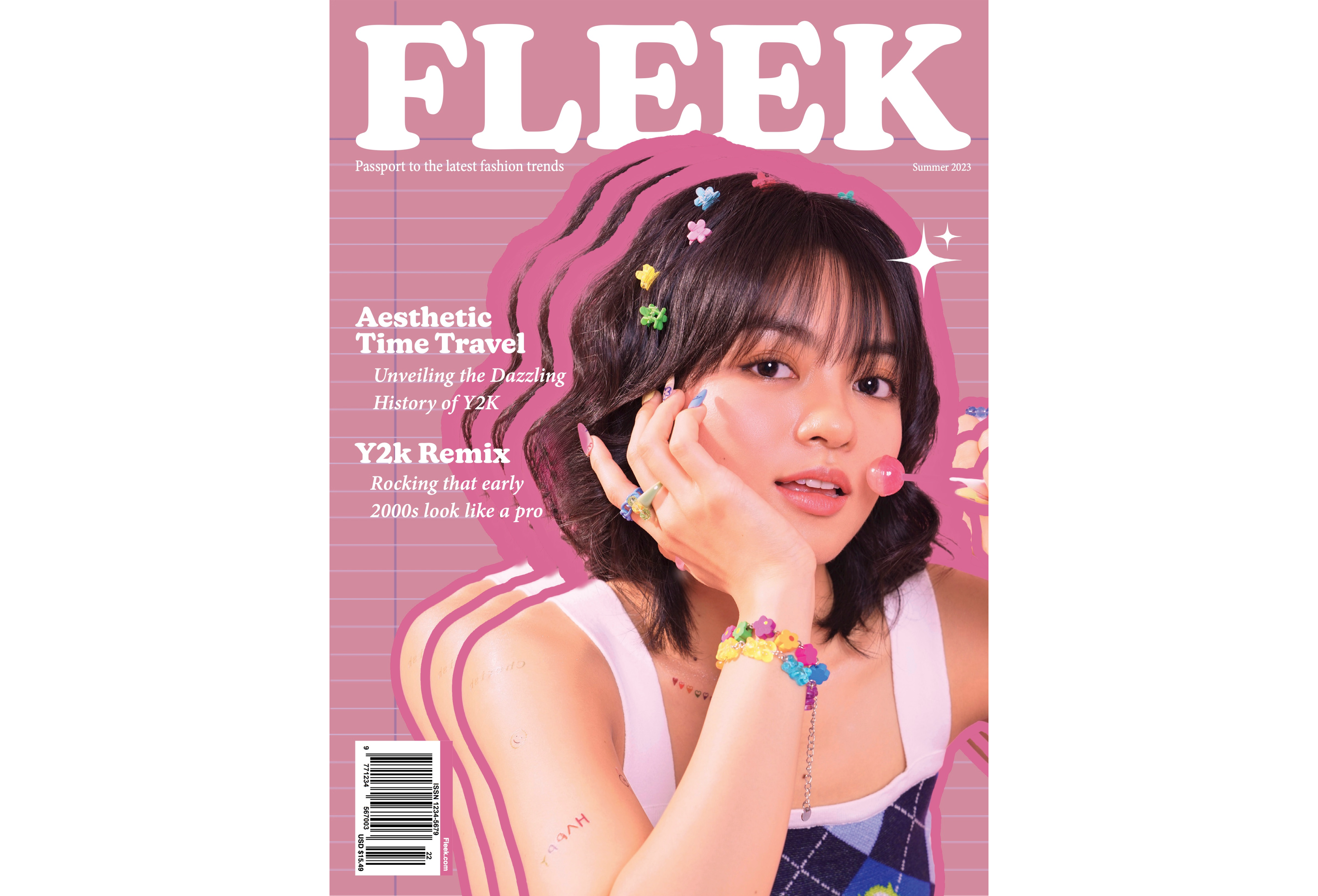
fleek magazine is designed for teenagers and young adults that are interested in the latest fashion trends and would want inspirations of styles on the specific trend. the term Fleek was chosen for the magazine name because it was a popular slang in the 2010’s. the term is defined as attractive and perfectly stylish which shapes the theme of fashion and trends in the magazine.
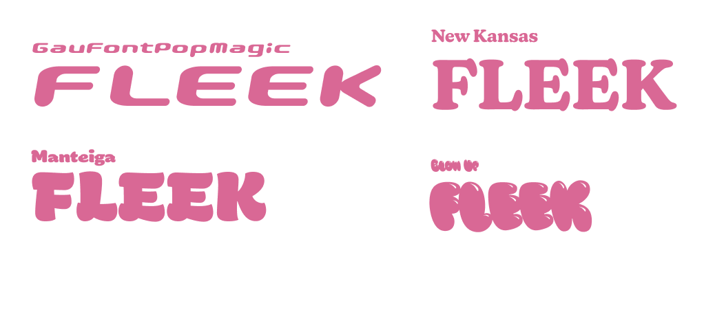
the magazine name uses a sans-serif font that contains a bold and bubbly feeling to deliver the fun and artistic vibe and incorporate the branding. i had tried out different bubble text before landing on with new kansas font. however, the font gaufontpopmagic contains a sharp technology and futurism vibe that didn't align with the theme i pursue. also, manteiga and blow up fonts were too bubbly and exaggerated. in which i had finalize with the new kansas font for the headings and logos and minion pro for the body copy.
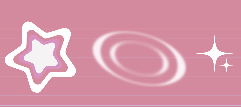
icons such as stars and whirlpools were added to emphasize the y2k theme. the background of the image uses a notebook page with candy-bright style colors to further highlight the theme.
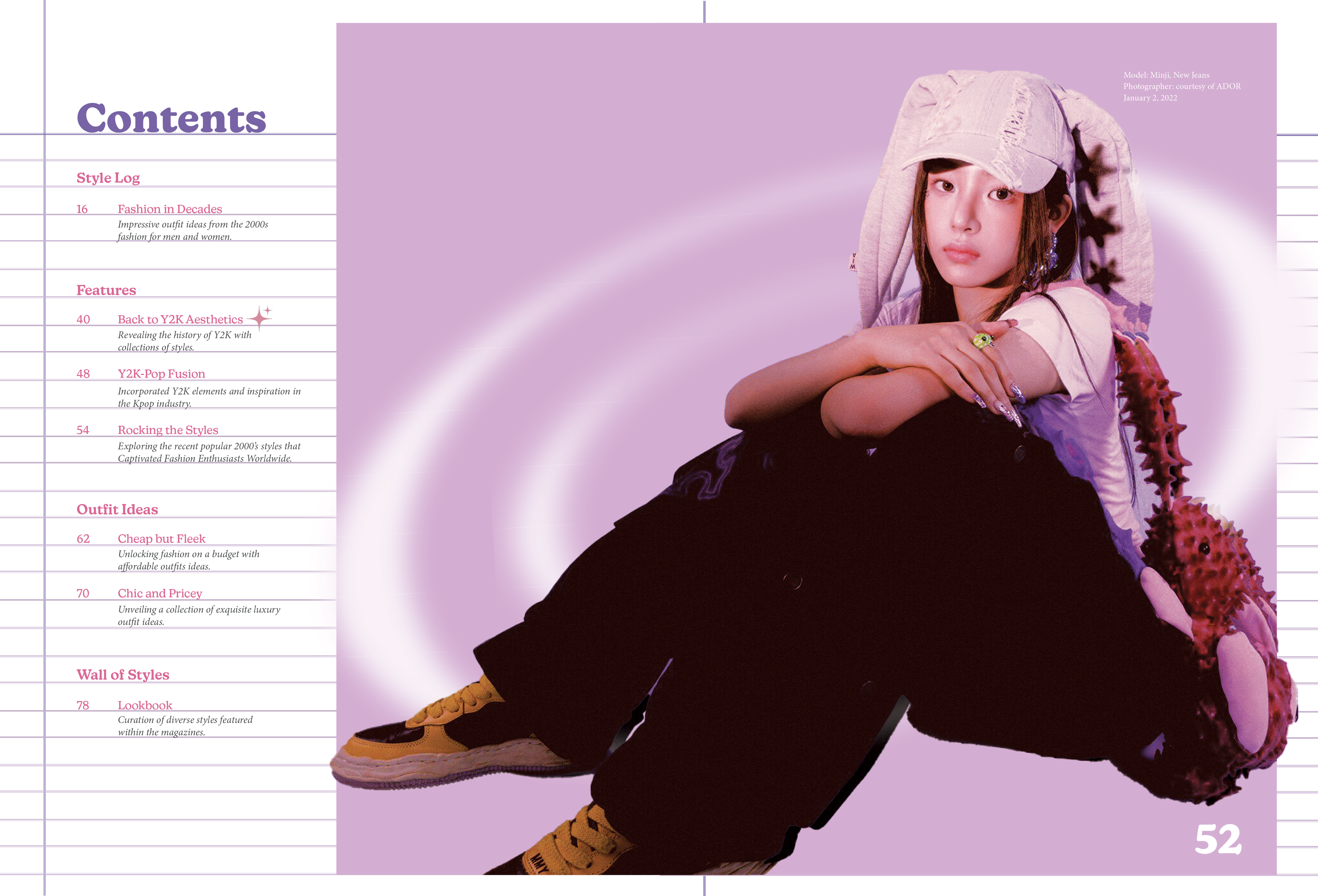
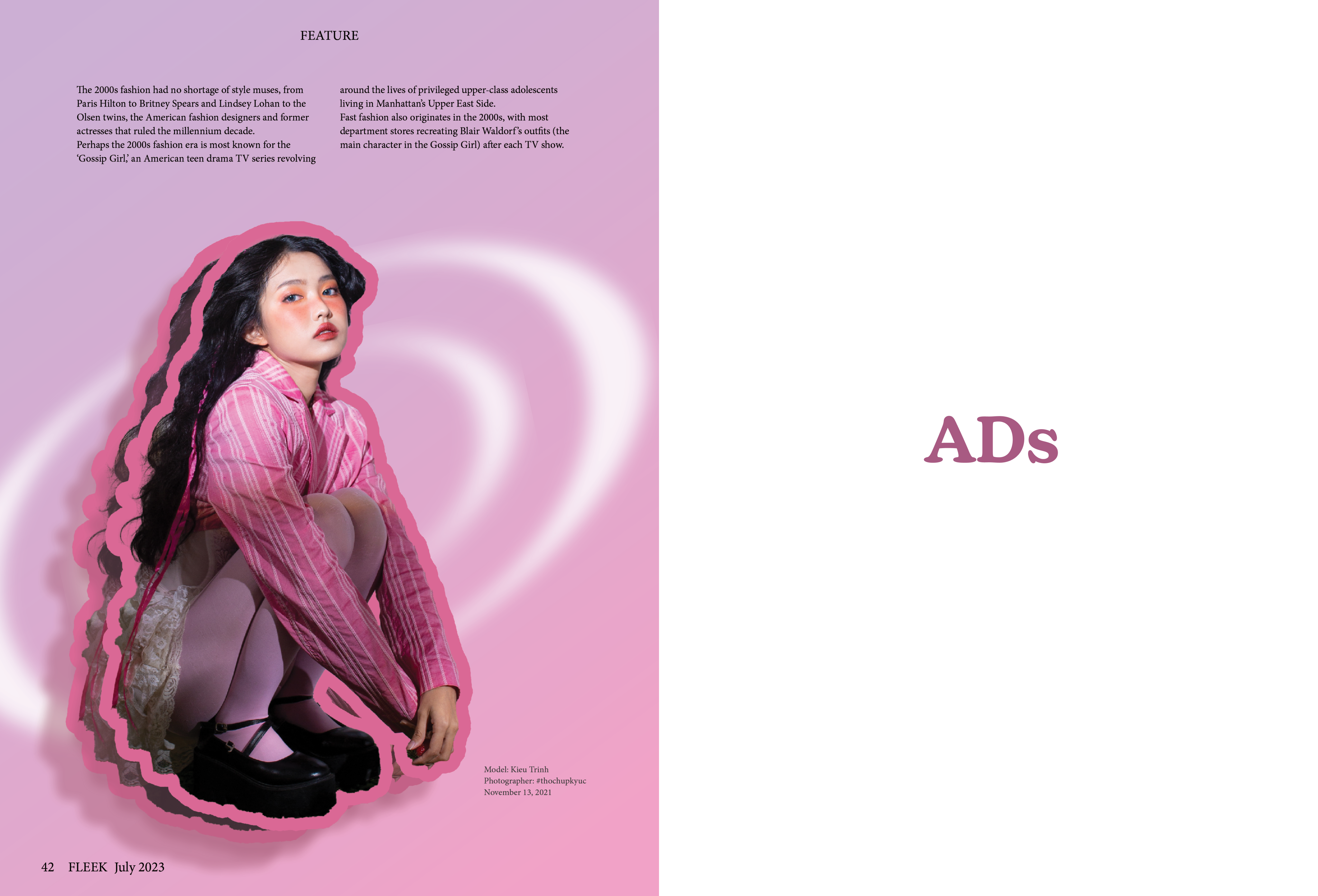
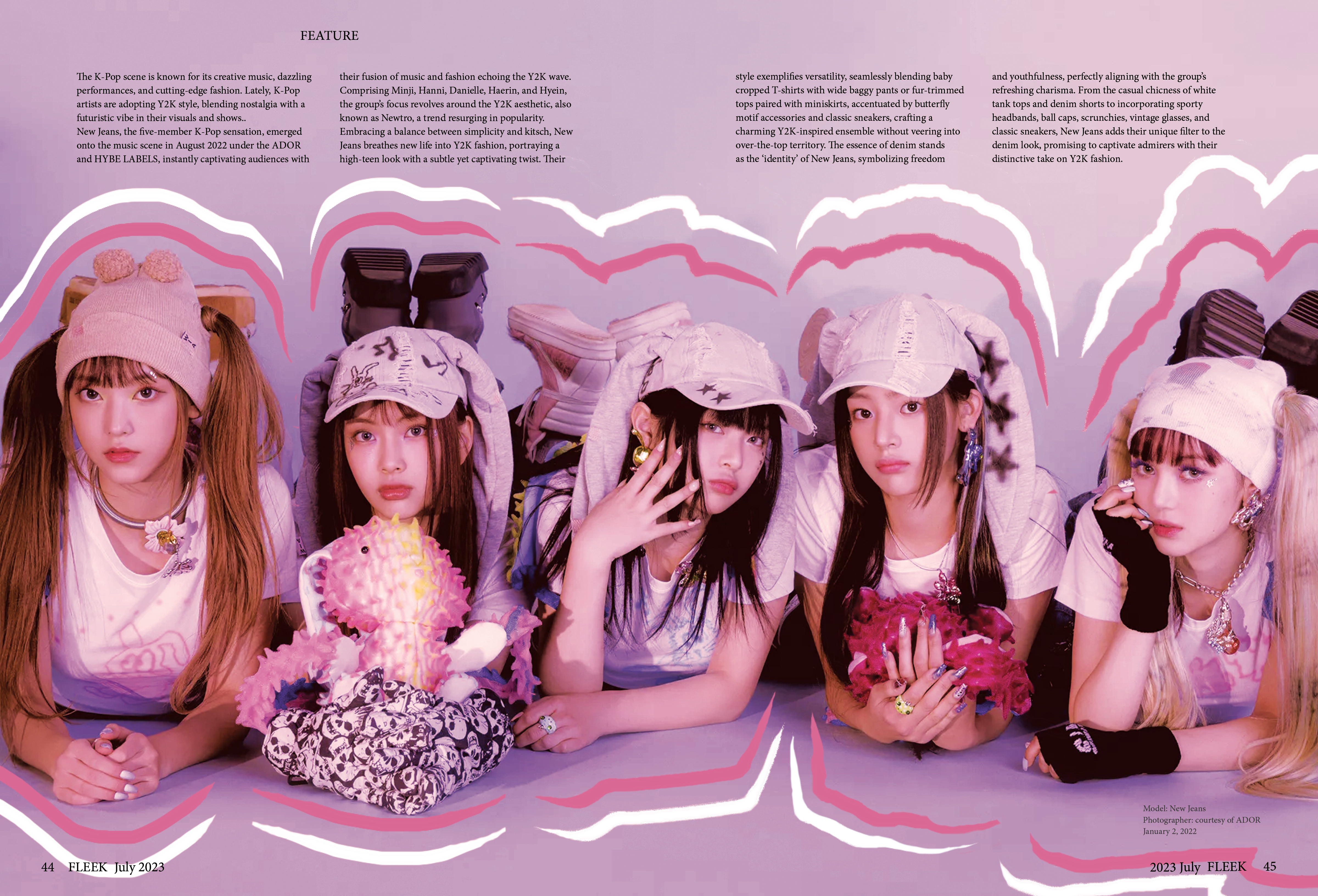
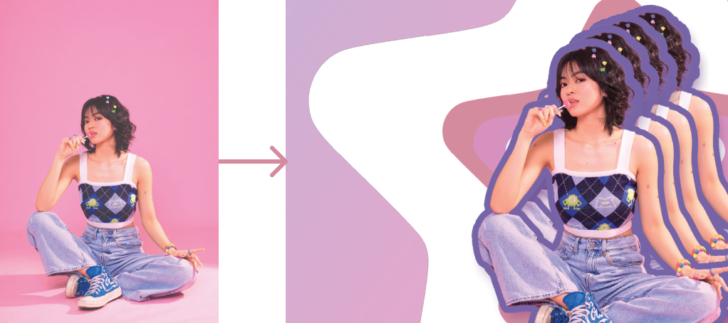
for the cover image, i chose to use a repetition of a person to highlight the y2k theme and assist in attracting readers to the magazine. the person was photoshopped with strokes to give a glitch and candy-bright style. for the feature section, images were photoshopped to maintain consistency, with a similar color scheme and strokes around elements.
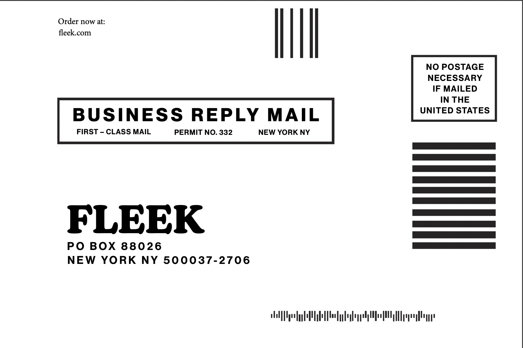
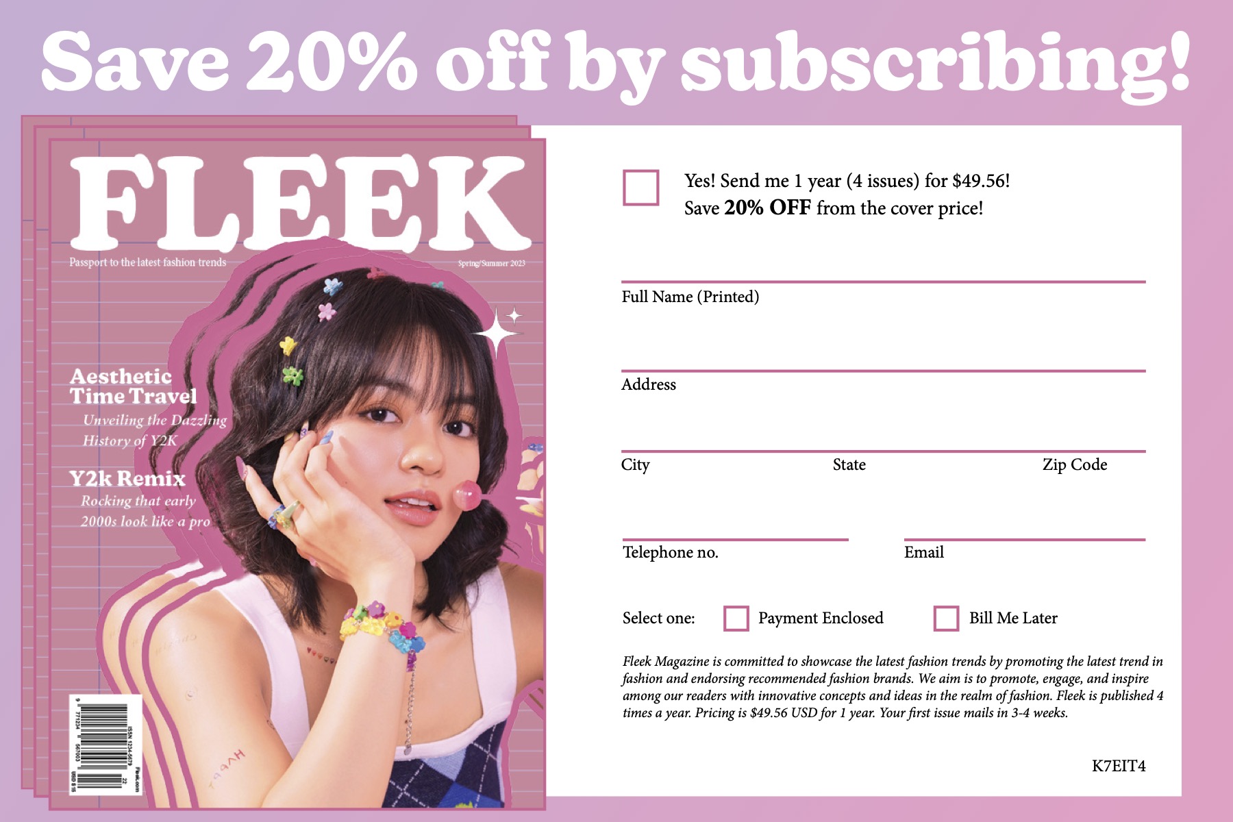
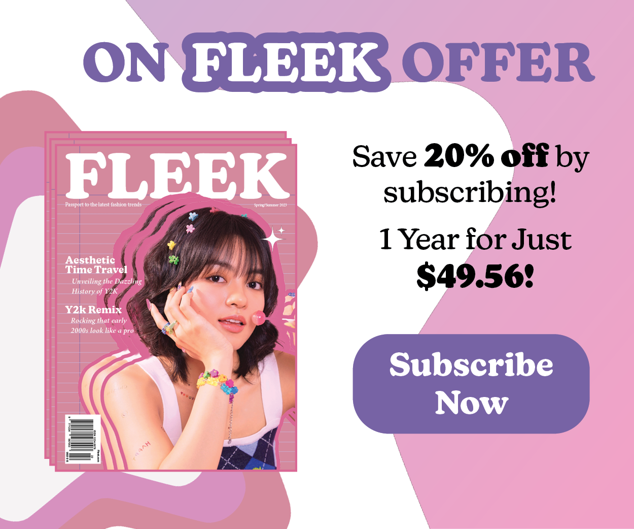
subscription cards and web advertisements were designed to create a multiplatform and cohesive magazine subscription campaign.
assembling a y2k-style magazine was an immensely rewarding journey as i encountered challenges that ultimately enhanced my design skills. designing a y2k style magazine was a hard approach at the first place as it was hard to find images that could be laid out on multiple pages consistently as the style contains a bold and sharp approach and every image contains slightly different vibes which i had to spend lots and lots of time to photoshop to keep the theme consistent. however, while photoshopping, i learned more about adobe photoshop and illustrator to do color treatments and add strokes to images.