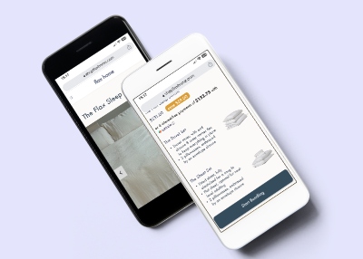
flax home is a female-founded company based in Vancouver that offers lenin products such as beddings and various home goods. through our initial discussions with the company, it was found that the website was optimized for desktop and 50% of the users view the website on mobile. through this project, our group goal is to evaluate the original design and provide design recommendations to optimize the mobile shopping experience.
the research and user testing conducted by the group revealed a usability issue on the bundle selection page for mobile users. the bundle selection page offers two different selections for the user; however, the second selection is below the screen fold and can go unnoticed. based on this issue, i have come up with two bundle page designs.
my first idea involves displaying product photos alongside color selections. this approach aims to offer a clear representation of the products while minimizing errors. it requires users to proceed through each step, ensuring a comprehensive selection process.
to visualize the color combination of the products effectively by reducing the need to scroll back and forth to view the product's colors.
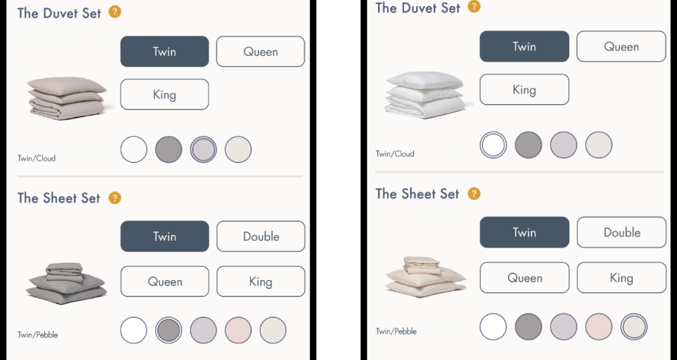
the 'add-to-cart' button is partially hidden until both product selections are completed to prevent errors in adding the default size and color to the cart.
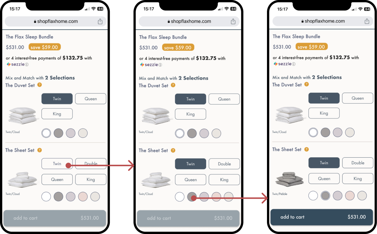
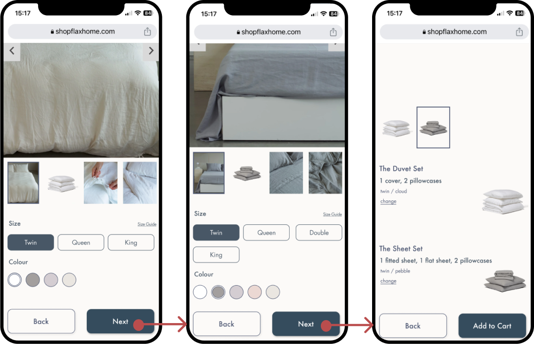
my second idea was to break the bundle color selection into smaller steps to ensure that the user made their selection for both the duvet set and the sheet set.
images and options could be displayed on one page to reduce the repetitive behaviour of scrolling back and forth to see the changes after each selection.
bundle selections are broken down to smaller steps and users are required to select each options on different screens and confirm the items before adding it to cart.
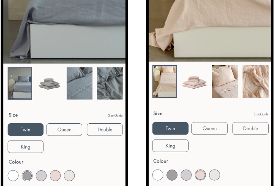
after designing and setting up prototypes for the two ideas, i facilitated two a/b tests and took notes for three. during the a/b testing, it was found that the majority of participants preferred idea 2 because it provided detailed information about the included items, aiding participants' understanding of the bundle. it also offered a better visual representation through photos. however, the a/b testing also revealed navigation flow issues in idea 2. participants noted that they had to go back through step 2 when they wanted to change the item from step one. consequently, i reduced unnecessary screens and animations that had caused confusion.
from the two designs, i moved on and finalized idea 2 since it provides a better visual representation and it is more engaging as the photos in the gallery dynamically changes colors according to the users selections. the change item option was also implemented and users could easily go back and change their choices of duvet set or sheet set.
check out the final prototype in figma here!with the given time we had, i can only propose the two designs above with only button interactions that are functional and have no responsiveness when interacting with images. which i would like to explore more and also examine the prototypes with more user testing to get a better idea of whether the design solutions were effective in improving the mobile shopping experience. however, despite the challenges, i gained valuable experience in working with e-commerce websites.