The Mountain Town of Kalmont
This project is a website created for a fictional mountain rescue team. The purpose of this project was to inform potential users about the organization and mountain safety tips.
Team members: Lisa Pan, Charles Yang, Sylvia Shen
Tools used: Figma, Sublime Text, Cyberduck
Skills: Graphic design, HTML, CSS
Overview
This team project, which was done for my information design course, consisted of each member creating sketches, mockups, and coding the website from scratch using HTML and CSS. I took this course right as I started my second year, and this project required the use of various different skills over its course. However, because I took this course right after finishing my graphic design course, I felt confident in designing the potential website layouts, by applying design principles I learned from graphic design to this project. At that point, I was still developing my own style, so I would go online to look for inspiration.

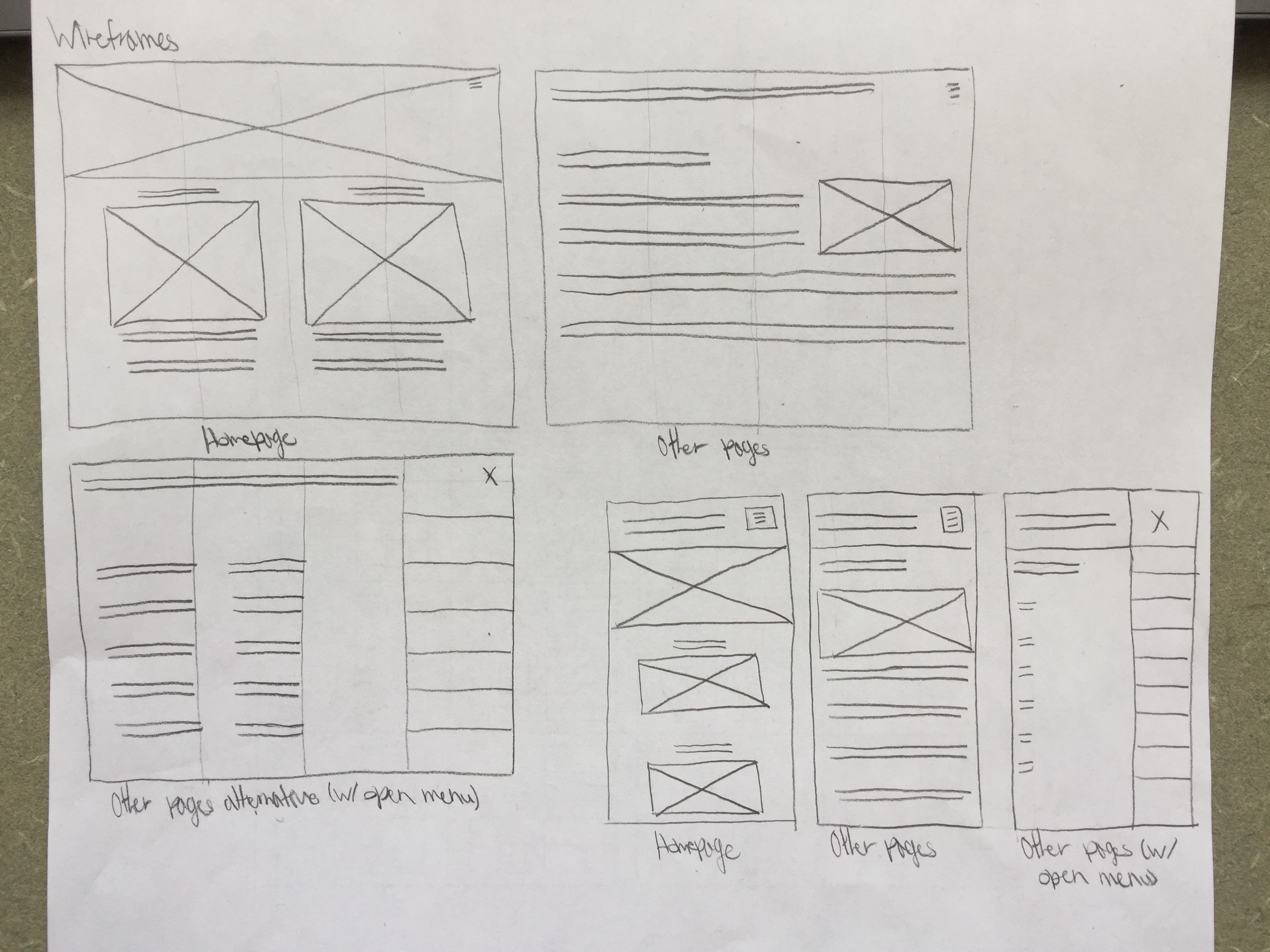
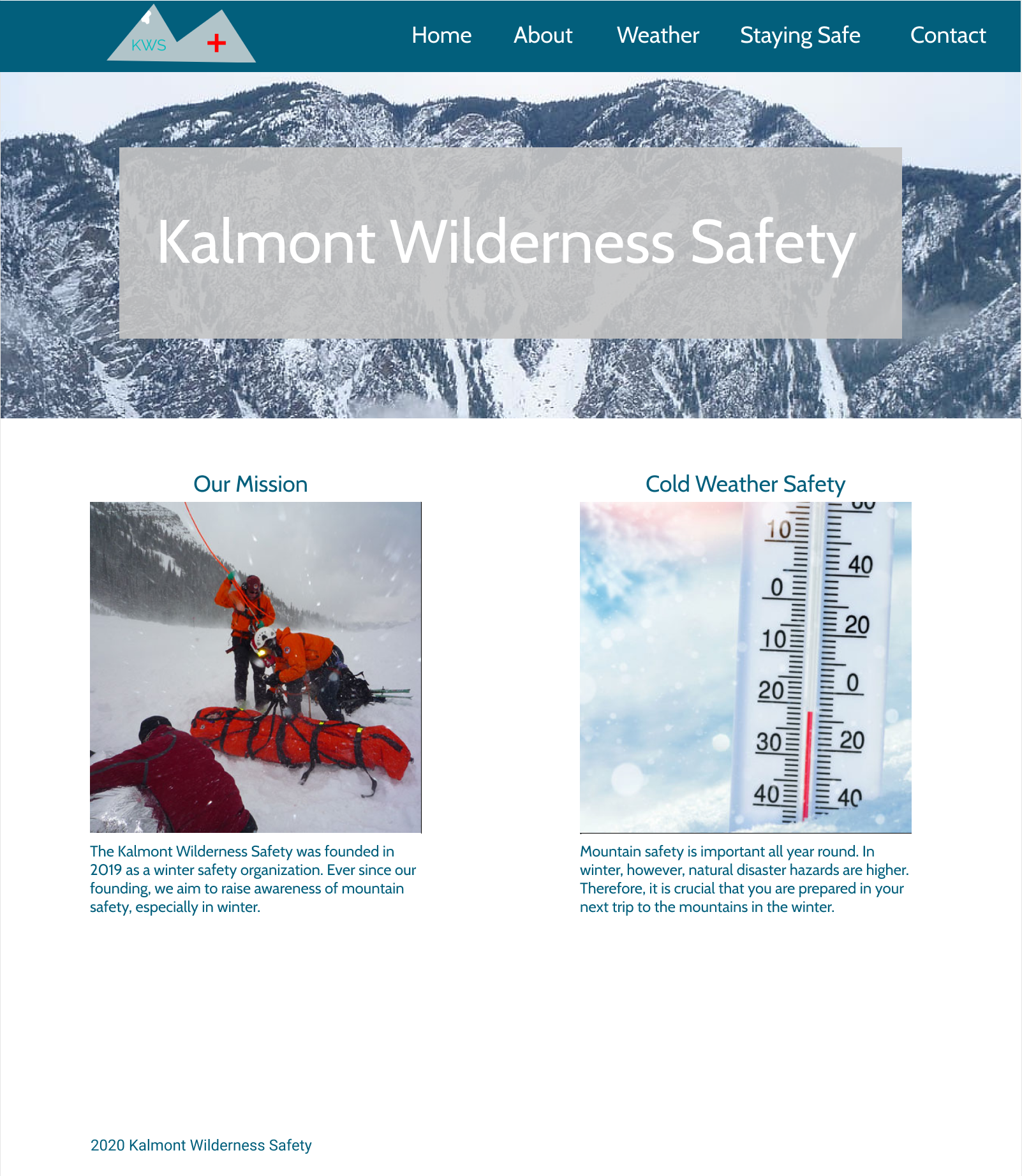
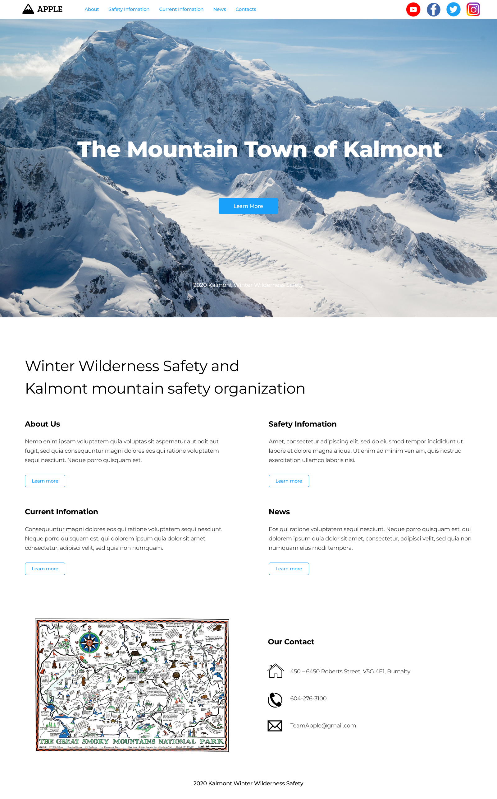
Since I was already working with second- and third-year students, I realized from looking at their work that I still had a lot to learn about design and that I should not rely on online inspirations. Through comments by the TA and looking at my teammates’ work, I learned how to design websites with better aesthetics; although there were not necessarily any problems with my wireframe sketches, my high-fidelity mockup (Figure 2) was not quite it. As compared to one of my teammate's designs (Figure 3), my mockups were not aesthetically pleasing for a modern mountain rescue team and safety website. Part of my initial mockups were based on an assignment I did for my graphic design course (Figure 4). In the beginning of this project, I heavily focused on the grid layout principles I learned in my graphic design course instead of ideas such as color contrast and accessibility.


This project consisted of applying various design skills, including graphic design, UX/UI design, and web design. Throughout the project, I was able to strengthen my graphic design skills, and at the same time, I was able to start getting comfortable with learning new software; furthermore, this project allowed me to explore my interests, especially when starting on the coding portion of the website; because of the various skills needed to complete this project, I was able to determine what my strong areas and weak areas were. This project also helped me strengthen my existing layout design and color skills. At the same time, it tested my ability to adapt to new environments using new skills.