Microsite Project


Triennale Milano museum is one of the most important cultural institutions at an international level. It hosts design, architecture, and the visual, scenic and performing arts. The mission of Triennale Milano is to expand and innovate individual ways of thinking and to bring experiences of different cultures and languages in one place.
To help Triennale Milano museum to engage with larger audiences, my team launched a microsite (an extension of an existing organization or company website) to advertise the exhibitions, artists, and performances for Triennale Milano museum. For duration of this project, I collaborated with the other two teammates Kaiden Zhu and Mikhail, built a microsite by performing a task analysis, creating a wireflow and prototyping the product. Following the design constrain, we focused on design for desktop experience only.
The challenge of this project is to identify an appropriate scope to design an intervention that helps users perceive the value of their experience in Triennale Milano museum. I was challenged to build a visual representation of how users will move through the microsite.
I chose workflow because it combines the benefits of wireframes and flow diagrams. Describing user's needs allow me to understand users' motivations. Consider all the ways that users may potentially navigate through the microsite helps me to define and connect the key screens.
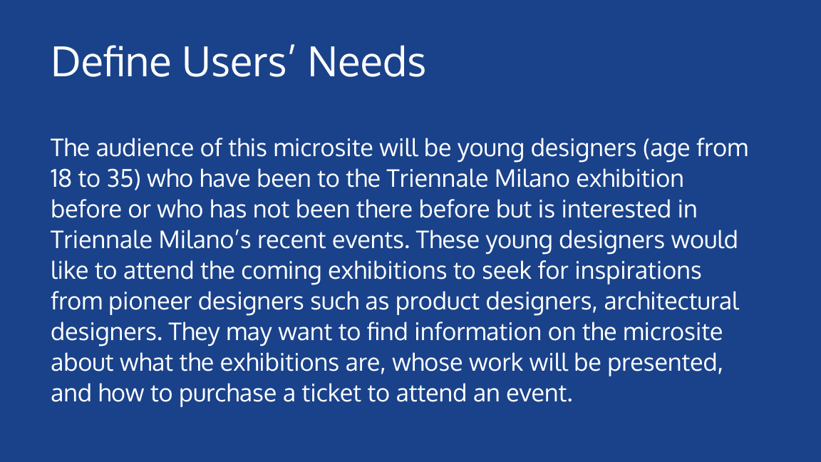
Defining users’ needs helps to me to understand the user’s goal for example, what are users trying to accomplish on this microsite.
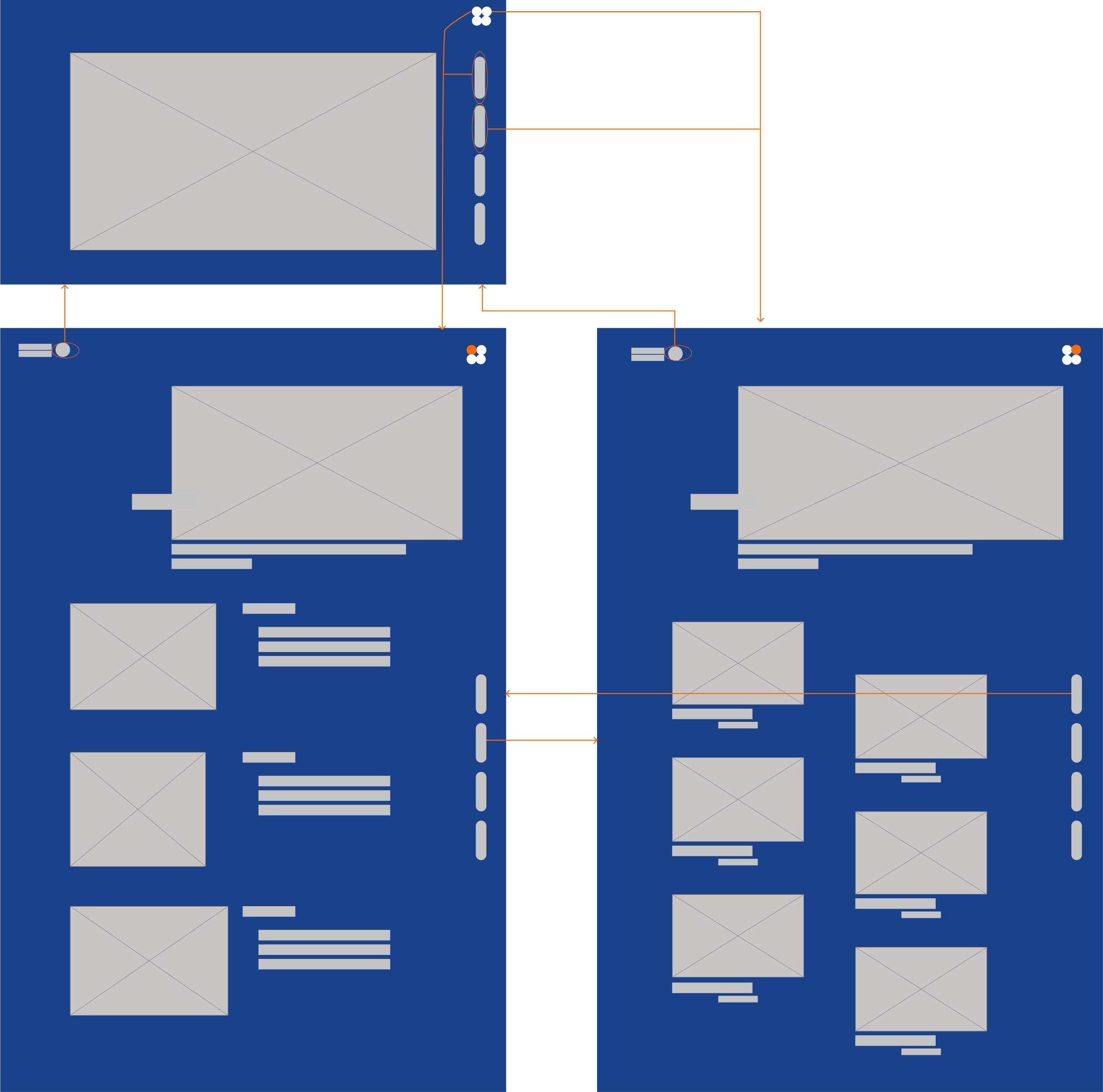
An arrow in the right side wireflow indicates path that users may take while using this microsite. The wireframe images represent the static interface of homepage, highlight and designer pages respectively. The small changes of the wireframes for highlight and designers' page indicates the state changes and sequences in the user interaction.
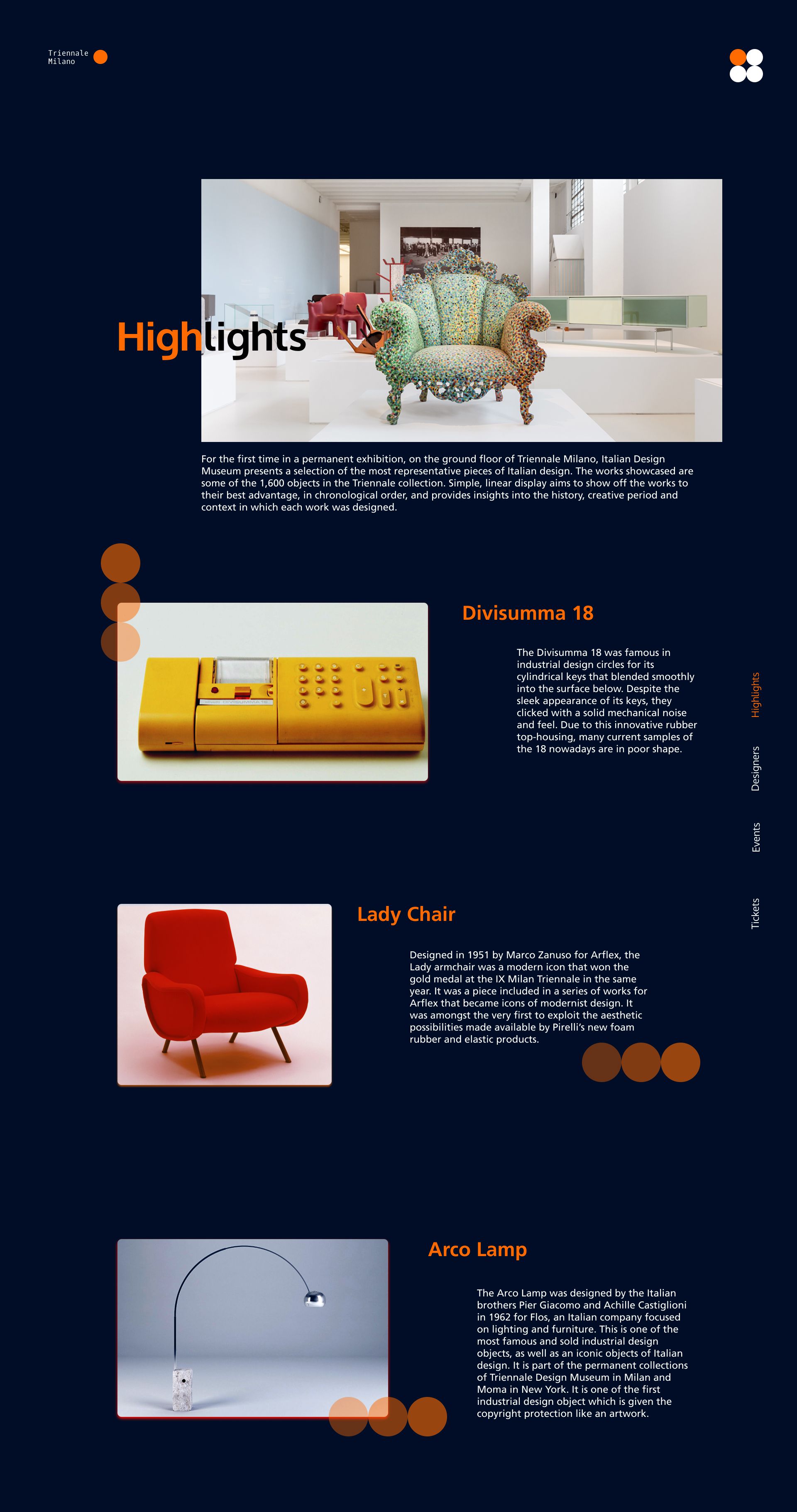
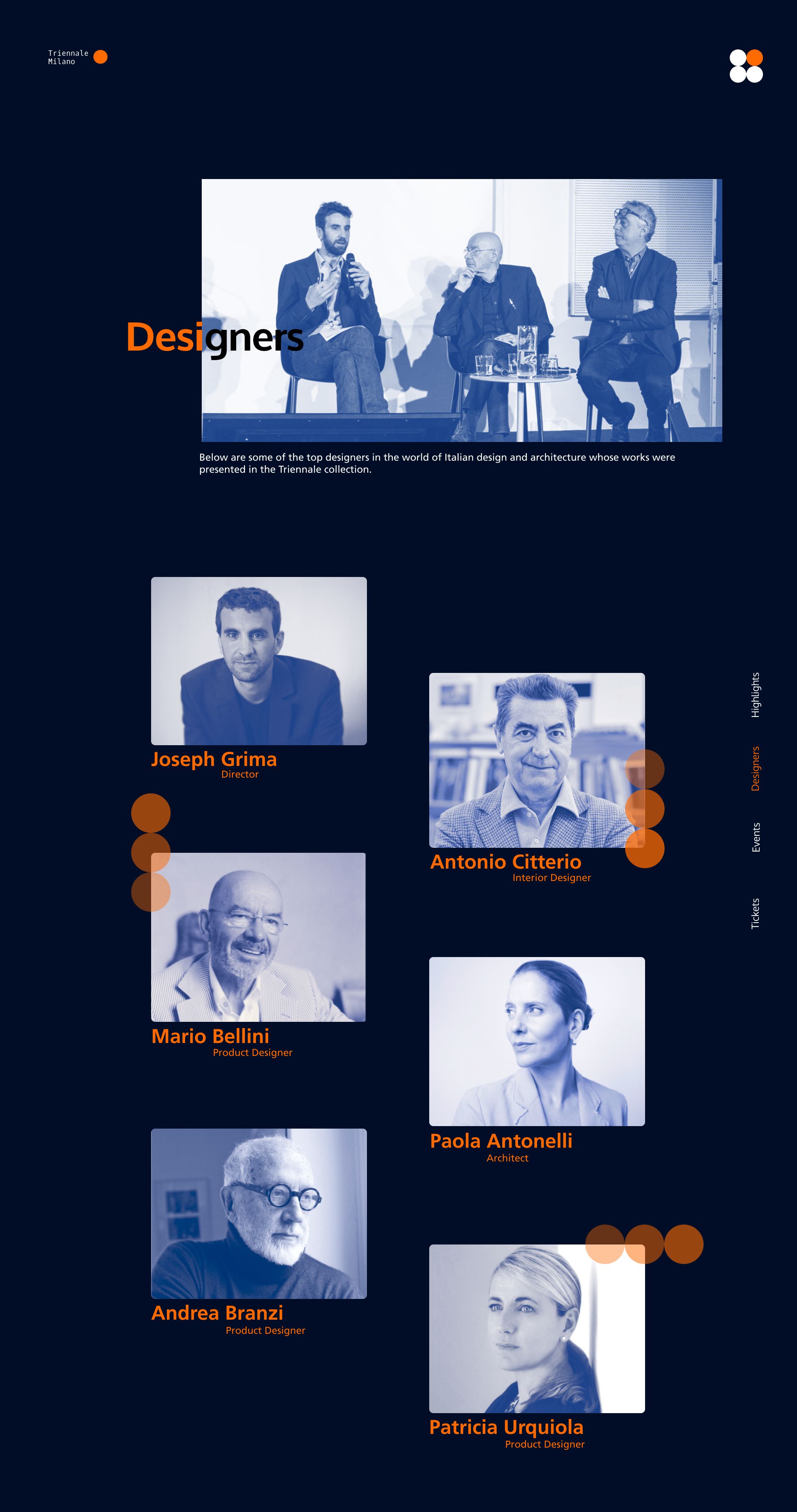
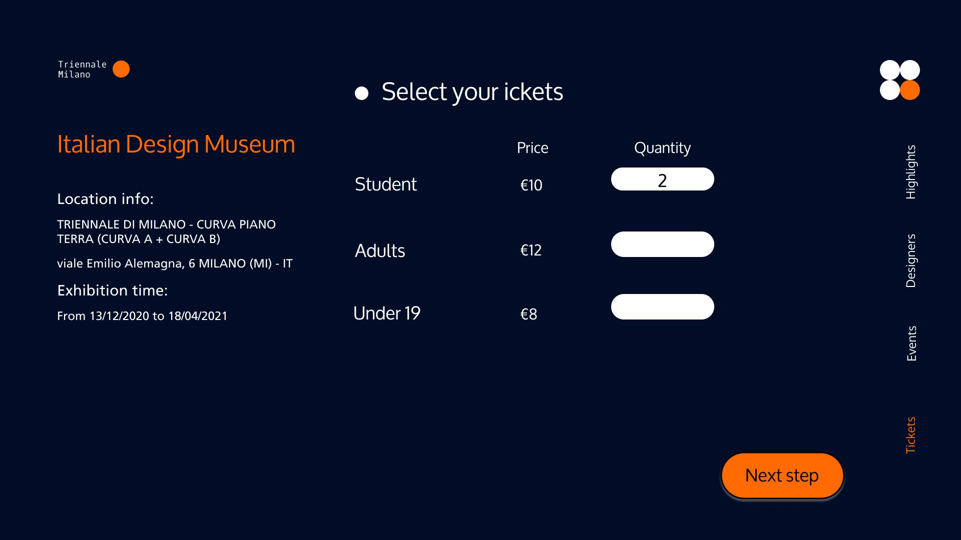
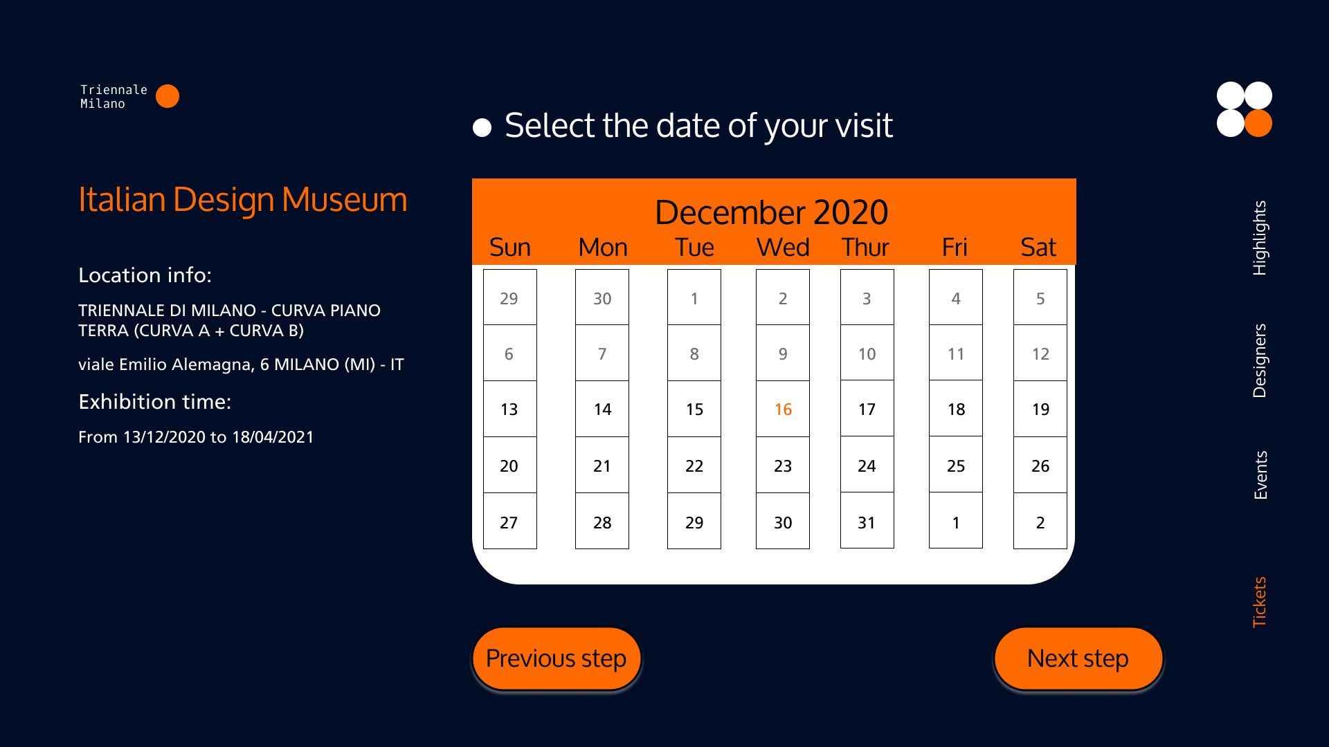
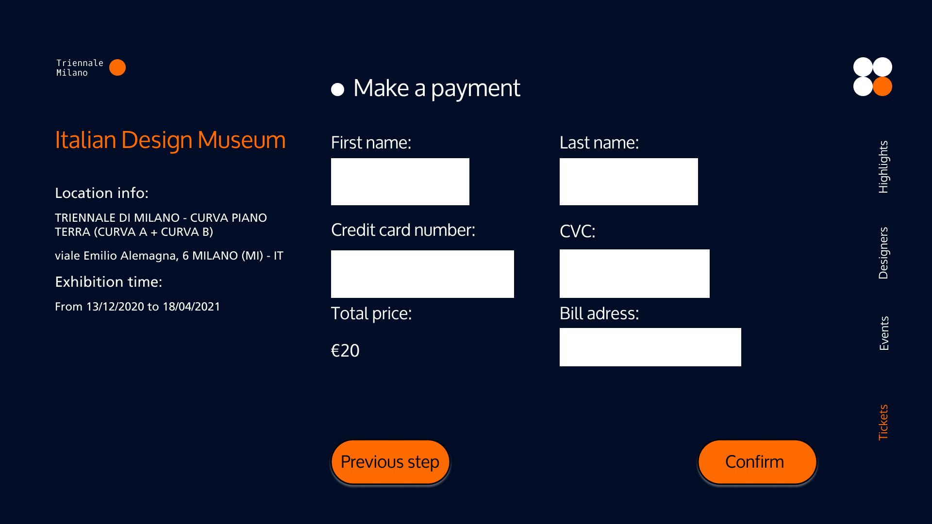
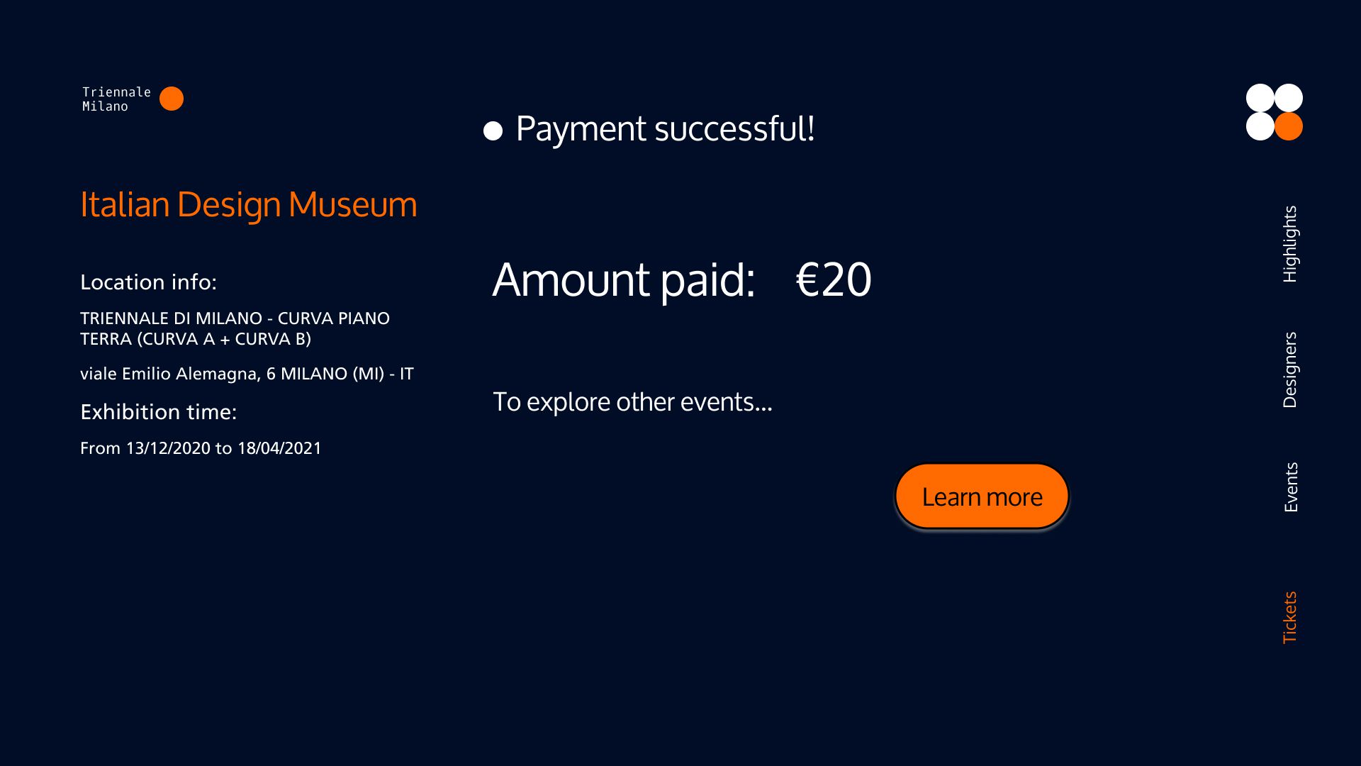
Due to the time and space constrain (during COVID lockdown), we have not tested the microsite with users. I realized that the wireflow may not align with user’s requirement because it was bult based on a series of assumptions. Without user testing, I would not know the areas of improvement for the user flow.