Poster
Design
Plagiarism Campaign
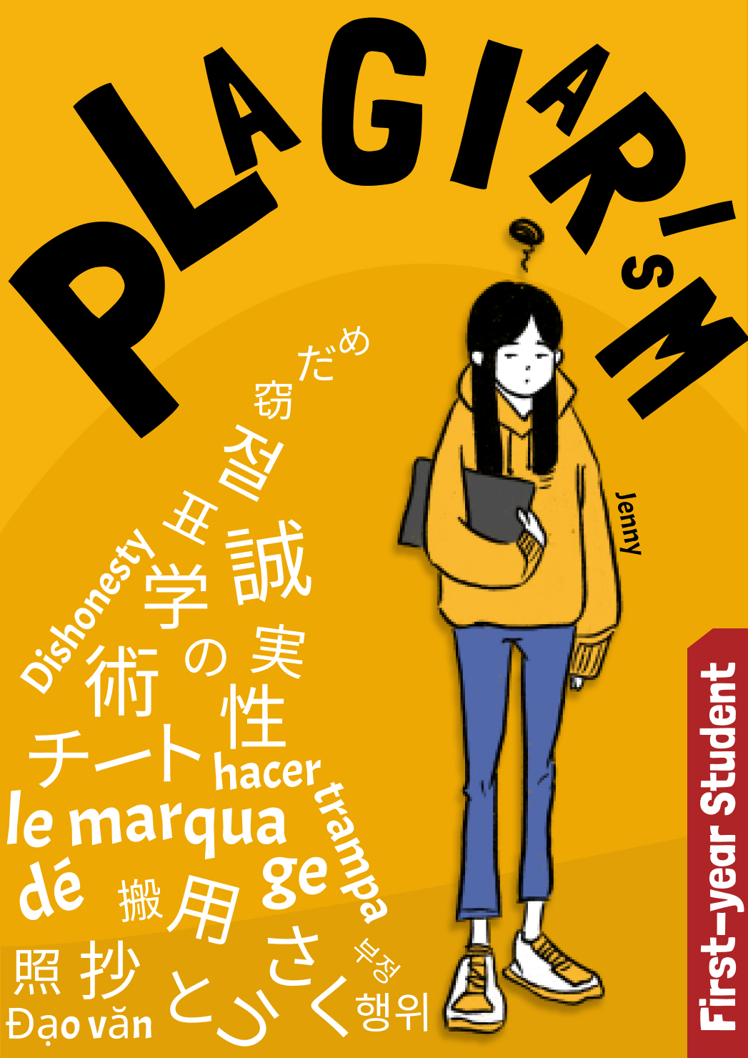
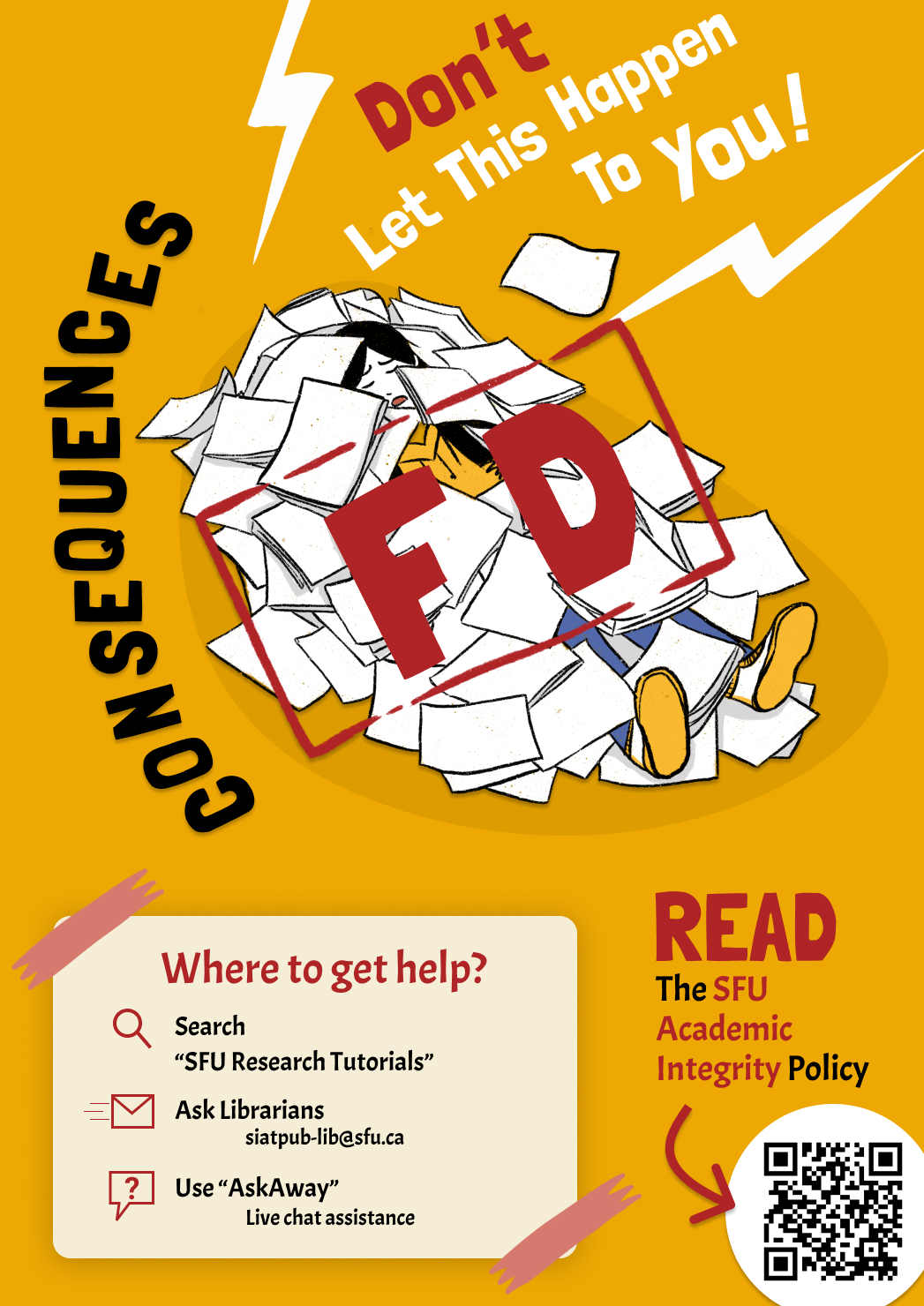
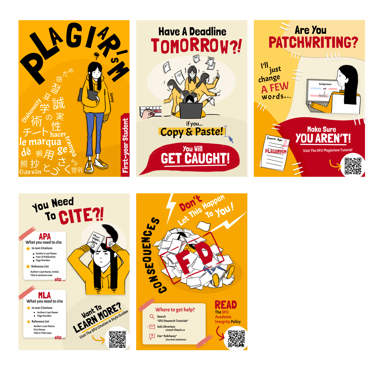
In a design communication and collaboration writing courses, working in a group of 5 with teammates Jashan Thind, Xing Chen Cao, Peiwen He, and Jiayu Shen, we created a series of 5 posters aim towards first year students regarding the importance of academic dishonesty and plagiarism. For this project, I contributed mainly to the art direction and poster design, specifically the design composition and color palette. My intent was to design a collection of posters that had a narrative and purpose in order to convey a stronger message. The protagonist in our posters was an illustration we created named Jenny, a relatable first-year student who struggles with the complexities of writing papers at a post-secondary level.

Inspiration
Before ideating the general design of our series of posters, we explored different poster styles for inspiration. I focused primarily on the art styles of minimalism, maximalism, collage, and juxtaposition. Among them, collage and juxtaposition particularly stood out for me. Collage allows me to effectively present an ample amount of visual information and juxtaposition offers a strong impression to the audience. Considering the balance between the amount of information required on the posters and our target audience, I ultimately chose collage and juxtaposition to be our primary art styles as I thought they were the most appropriate for our informative graphics.
However after discussion with teammates, we came to the realization that the collage style will simply overwhelm the audience with information leaving us with just juxtaposition. We then took inspiration from suprematism and constructivism as shown in the figure. Gaining an appreciation for the simplicity, vivid color palette, and the use of geometries, we concluded that we wanted our posters to be colorful and have a clear visual hierarchy to draw the audience's attention and have an impact.
Process 1
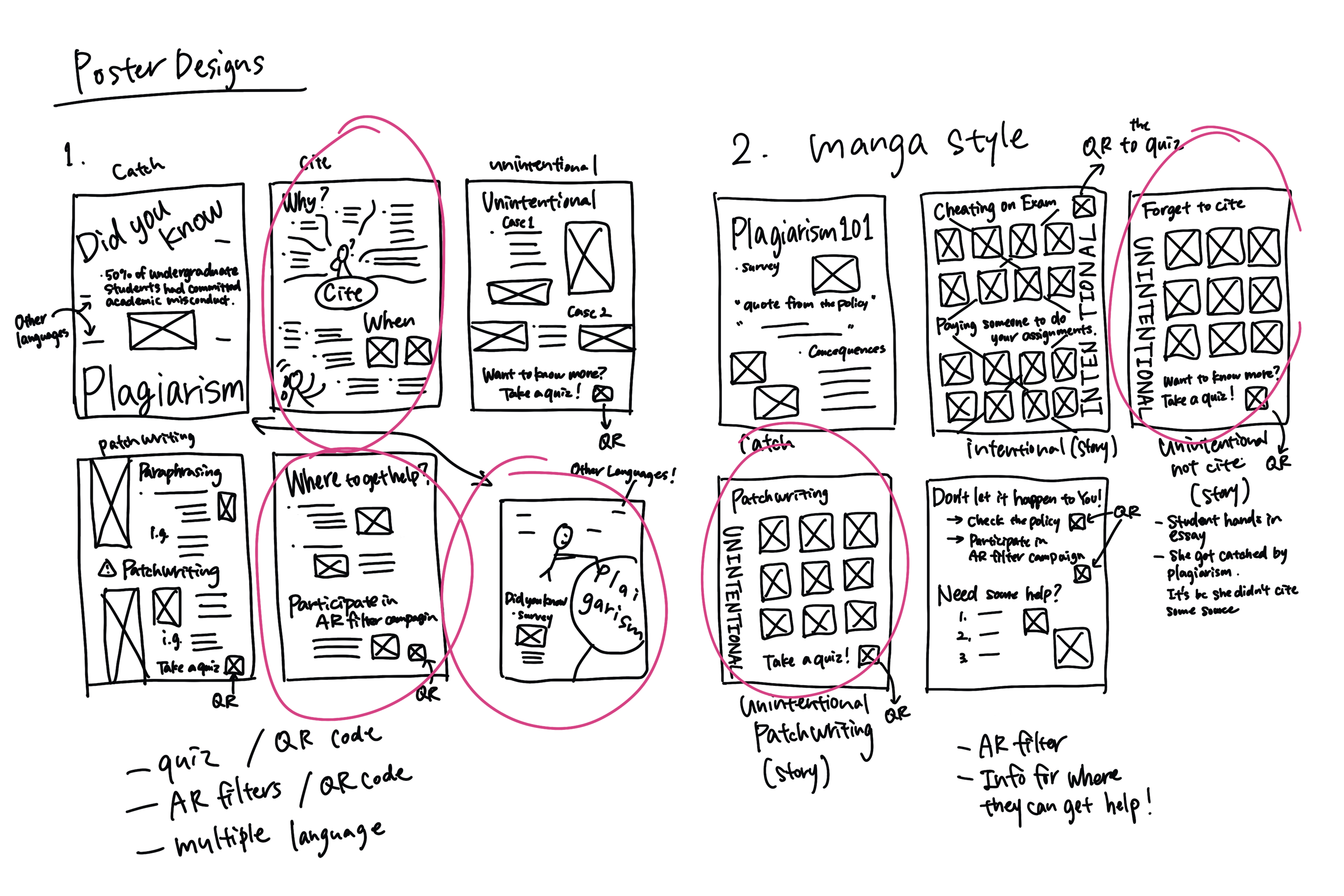
During our initial ideation phase for our poster designs, we came up with the idea of a group of posters that created an engaging narrative. Putting that into consideration, I drew two barebone wireframes as shown. The first idea was what information we believed would be important to our audience and how we should structure our posters. The second idea took inspiration from the styles of a comic/manga. However, again after a team discussion, we felt that the second idea posters would become too convoluted and draw attention away from our message.
Process 2
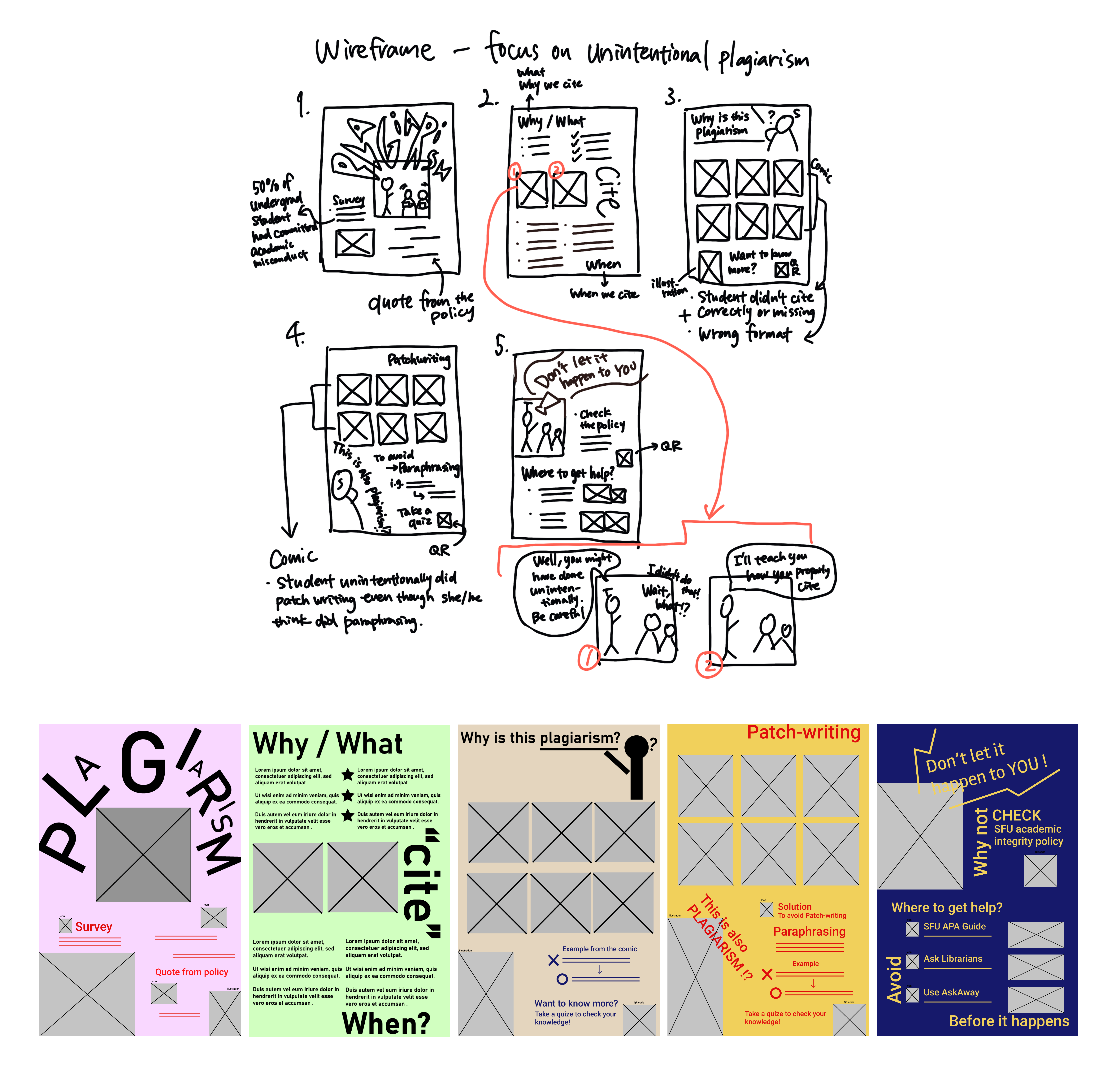
After sketching, we decided to combine the two designs I sketched above. As the second idea was too overwhelming, we still kept the comic style but simply reduced the amount of comic book-elements. Combining that with the informative nature of our first design, we were able to create a poster that attracted the audience's attention while simultaneously keeping our message the focus. As I moved onto the digital wireframe, I had to start exploring color palettes. I first settled on different bright colors for our series of posters in order to keep in theme with suprematism and constructivism however after viewing our posters in series, it simply didn't look unified and lacked cohesion.
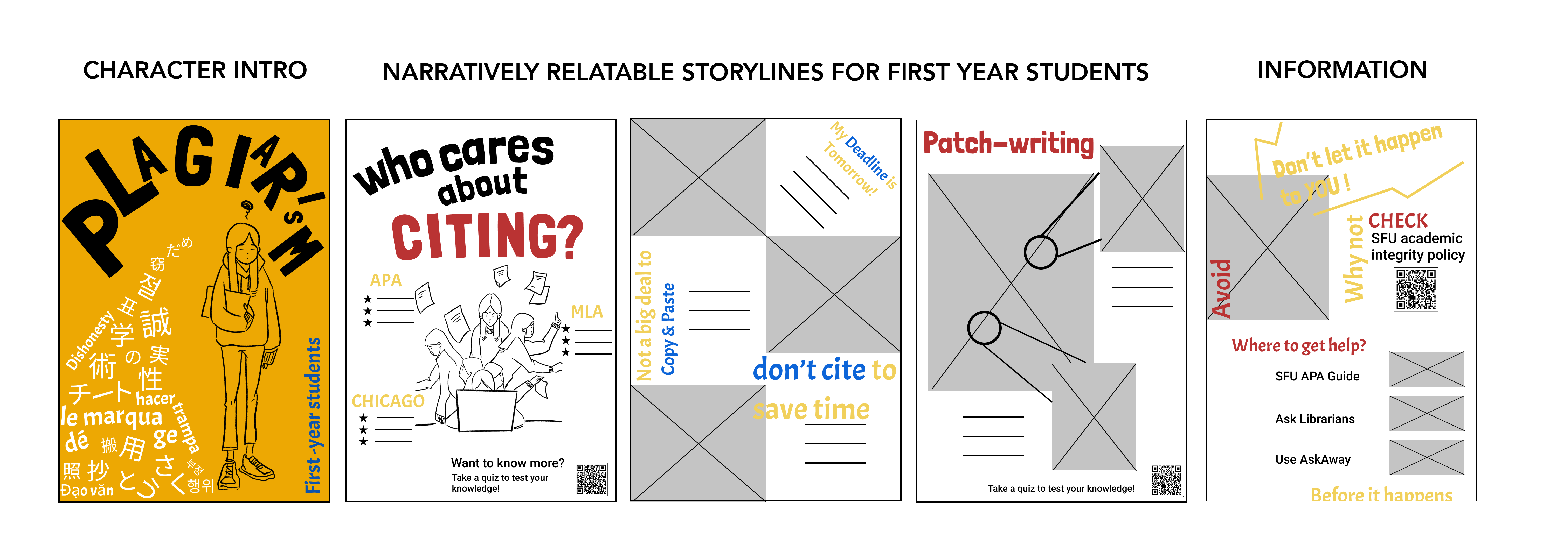
Process 3
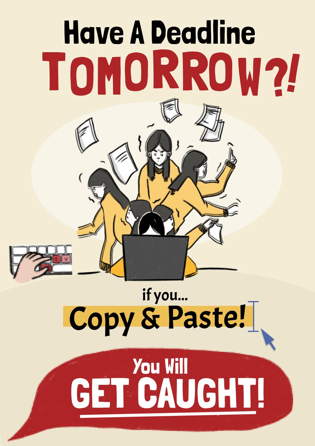
In our next design stage, we reduced a lot of text and removed all the comic elements because we agreed that we should utilize all 5 pages of our poster series and thus could concise the story into one for each poster and connect the stories across the posters. Using our illustrated character, a first-year student who struggles writing papers at a post-secondary level, we tried to make our character as relatable as possible to first year university students. Instead of having comics on the poster, I suggested having fairly large illustrations of our character for each poster in order to portray a story. Then, I created the story flow from the character introduction, a story of how our character decided to commit plagiarism and thus dealing with its consequences over 5 posters. So we narrowed our ideas and removed excessive and unnecessary content to achieve simplicity and visual hierarchy. For the color palette, I picked based on the primary colors since the SFU school color is red and we wanted our posters to be bright and with impact.
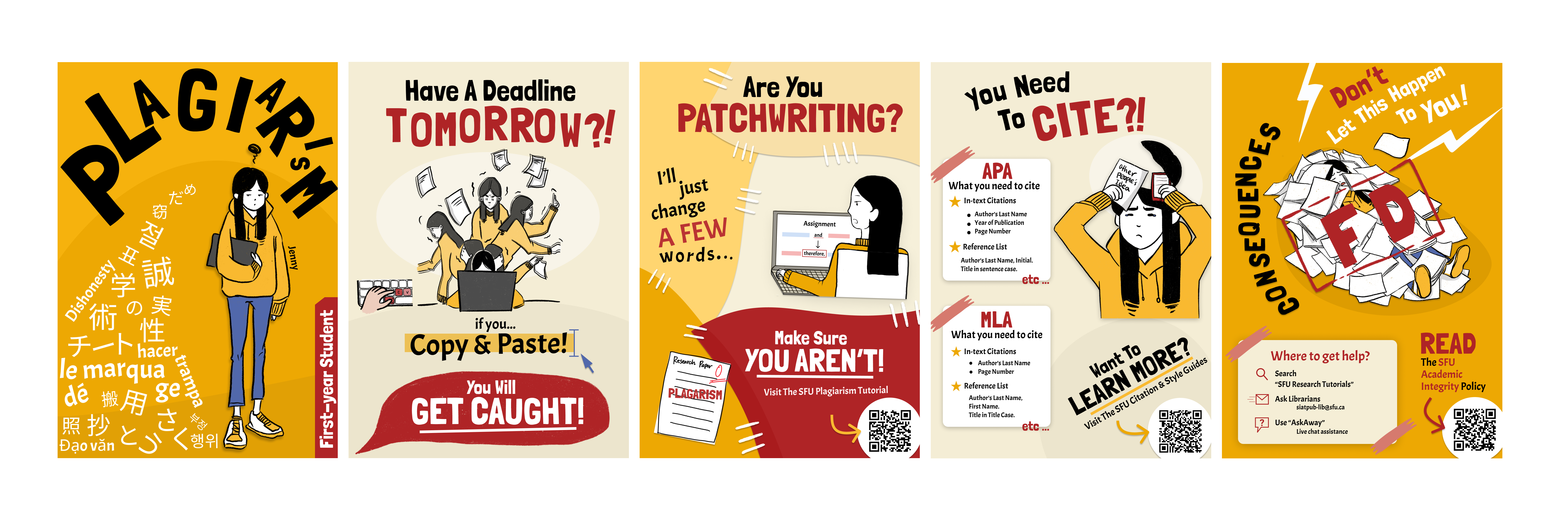
Final Process
In the final process, we kept the concept from the last process and I further refined and polished up our design. I reduced the unnecessary texts to make it possible to visualize information as much as possible while providing relevant information. I also paid close attention to the contrast in scale for texts and illustrations to emphasize the contents. Me and my teammates had some difficulty ideating the overall form of our posters since we wanted our posters to be cohesive in terms of narrative and visual relationships with the other posters; yet independent enough to stand alone and still be engaging while providing a clear message. As designed, I changed the color theme to red and yellow in order to contrast the SFU colors and we were left with a poster campaign that we were all proud of.
Reflection
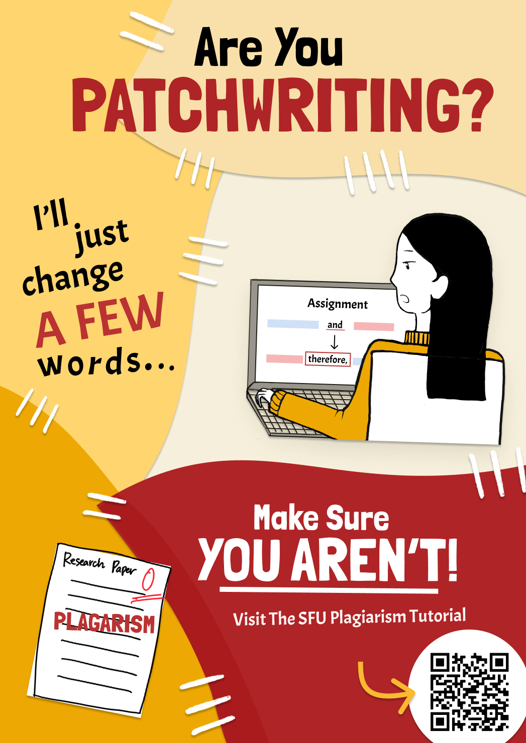
Throughout this project, I mainly worked on the ideating design, layout, and color palette. By iterating the design process, I was able to come up with a better color palette in terms of adequacy, energy, and cohesiveness while referring to the color use of suprematism and constructivism. It was an iterative process and I was able to analyze them with my teammates to make critical decisions in order to improve them. Particularly in the design iteration from the third to the final one, making the cohesive and unified design as a whole was the most challenging for me. For the third poster about patchwriting, I've tried a lot of different possible designs such as placing patching marks around Jenny or designing Jenny's shadow to be attacking her in order to indicate her fear of plagiarism and visually imply patchwriting, but none of them felt right to me. However through communication and collaboration, we were able to agree on visually representing patchwriting through the use of overlaying cloth and connecting each of them with patches. From this project, I learned the importance of visually expressing the content in order to attract the attention of the audience.
As a team, we developed clear communication platforms, meeting times, and work environments using Discord, Figma, and Google Drive/Docs which helped us to stay on track. Overall, we are happy with our posters, but I believe if we had more time and iterations, we would be able to produce a more cohesive storyline between our series of posters as I am not completely satisfied with how our posters look when presented individually.