Regalo Bakery

About the project

Where there's a whisk,
there's a way.

A passionate young baker from Delta, B.C., my sister Camille passionately wanted to share her love for baking to the community. According to her, the best part of baking is the ability to think of new ideas, and sharing those ideas in edible packages of joy! Naturally, she wanted her brand to be both youthful and familiar to reflect her passion in creating delectable goods. Each mouthwatering creations are made with the top-shelf ingredients and are lovingly handcrafted from imagination and tradition.

Role

Visual Design

Branding

Illustration

Business & Marketing

Client

Regalo Bakery

Date

January 2020

Insights & Problems

Out with the old... in with the new!

Regalo Bakery is a rebranding project of Busy Bee Bakery. After a few years of farmers market, online orders and consultations with myself, the owner thought that "Busy Bee" moniker was not quite a unique enough name that meant something to her customers.

Regalo Logo Breakdown - Crown Part

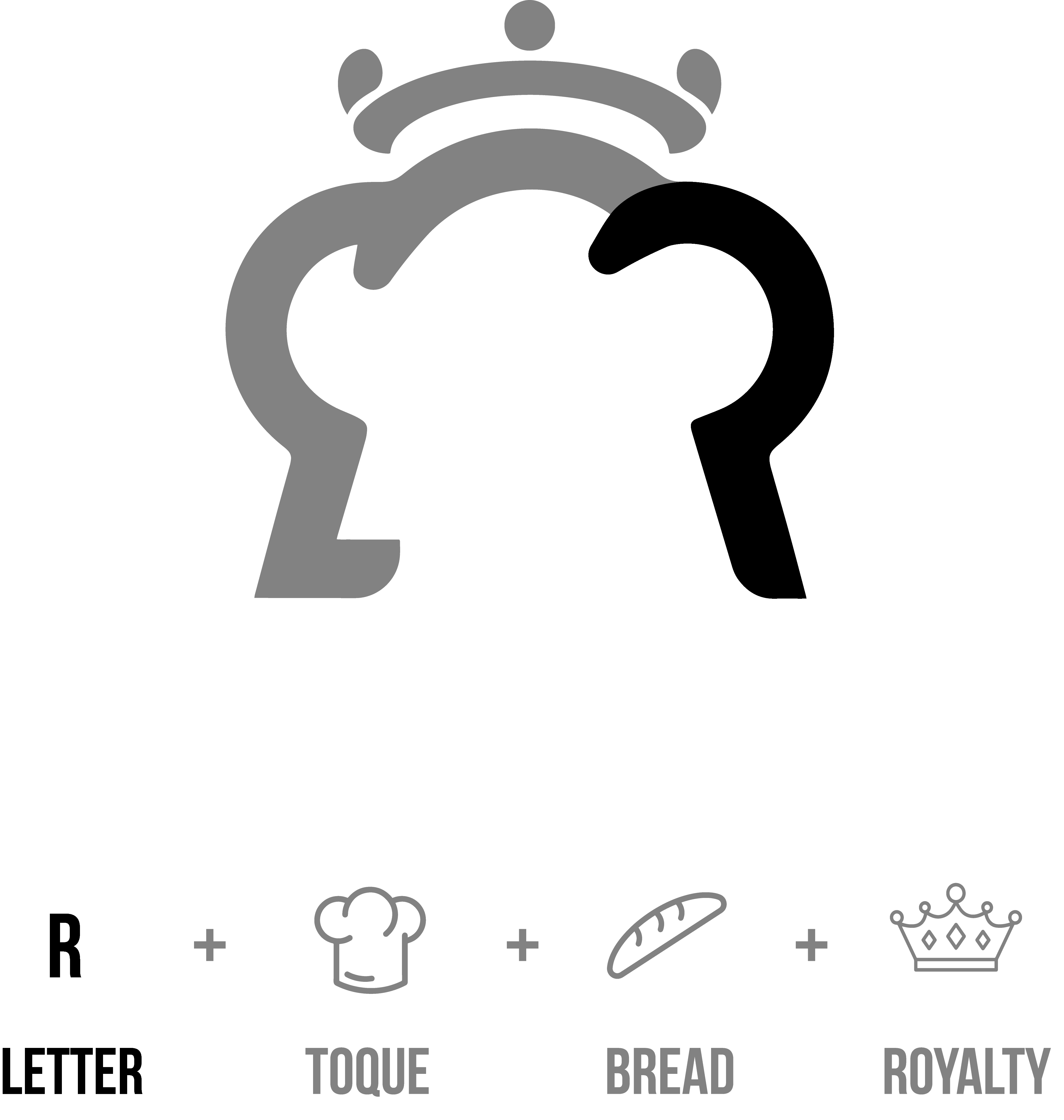
While her baking has always produced the same high-quality products that garnered her loyal customers, she thought that she did not have a lasting first-impression under the "Busy Bee" name. Settling on the word "Regalo", which means "gift" in her native language, Tagalog, we went on further to define four things that she wanted to communicate in a simple and legible monogram.

Animation by Natalie Booth

Visual Identity

The familiarity of modernism
with energy from the 70s.

I chose to modify the Bebas Neue for its geometric appearance with modern proportions to complement the wide variety of products that Regalo Bakery offers. A retro palette was used to suggest a feeling of youthful yet familiar energy to its customers. I learned very early on that bakers are very tradition-oriented craftspeople. The time and commitment needed to master even the simplest recipes are all but part of the process of being a successful baker.

TYPOGRAPHY

Visual Identity - Modified Bebas Nueue Typography

COLORS

#4681A6
#F2A20C
#F2E0BD
#D9411E
#F2887E

What I learned

Working with my sister

I thought it would be way easier to convince my sister about what I thought made more sense, but apparently not! In the best way possible, she pushed me to create a better design, finally reaching one that she and I was both happy with.

Monograms... kilograms

Monograms are simple icons that rely on it's shape to convey meaning. To come up with a clever monogram that incorporates many meanings transformed the logo and brand into a more dynamic and memorable design.

Throwback colors

I very much enjoyed working with colours I had very few opportunities to have worked with. The dynamism that the 70s color palette brings about a sense of warmth and familiarity that my sister and I both believe to suggest about the brand's selection of items and honor in baking tradition.