Grammar Design Magazine

Photo of The Twist by Benjamin Ward (2019)

About the project

Thinking big
from Mr.BIG

Being that we could choose whatever we wanted our magazine to be, I looked to one of my inspirations for designs. World-renowned Architect Bjarke Ingels of the Bjarke Ingels Group (a.k.a BIG). I've always had a keen interest in magazine layout and learned very early on that it is a whole different beast when it comes to jampacking information into a static medium. With this being said, I took inspirations from the whimsical architecture of Mr.Ingels and I realized that static things can be very dynamic in their own ways.

Role

Visual Design

Branding

Illustration

Client

School Project

Date

January 2021

Insights & Problems

A versatile and smart layout for design connaisseurs.

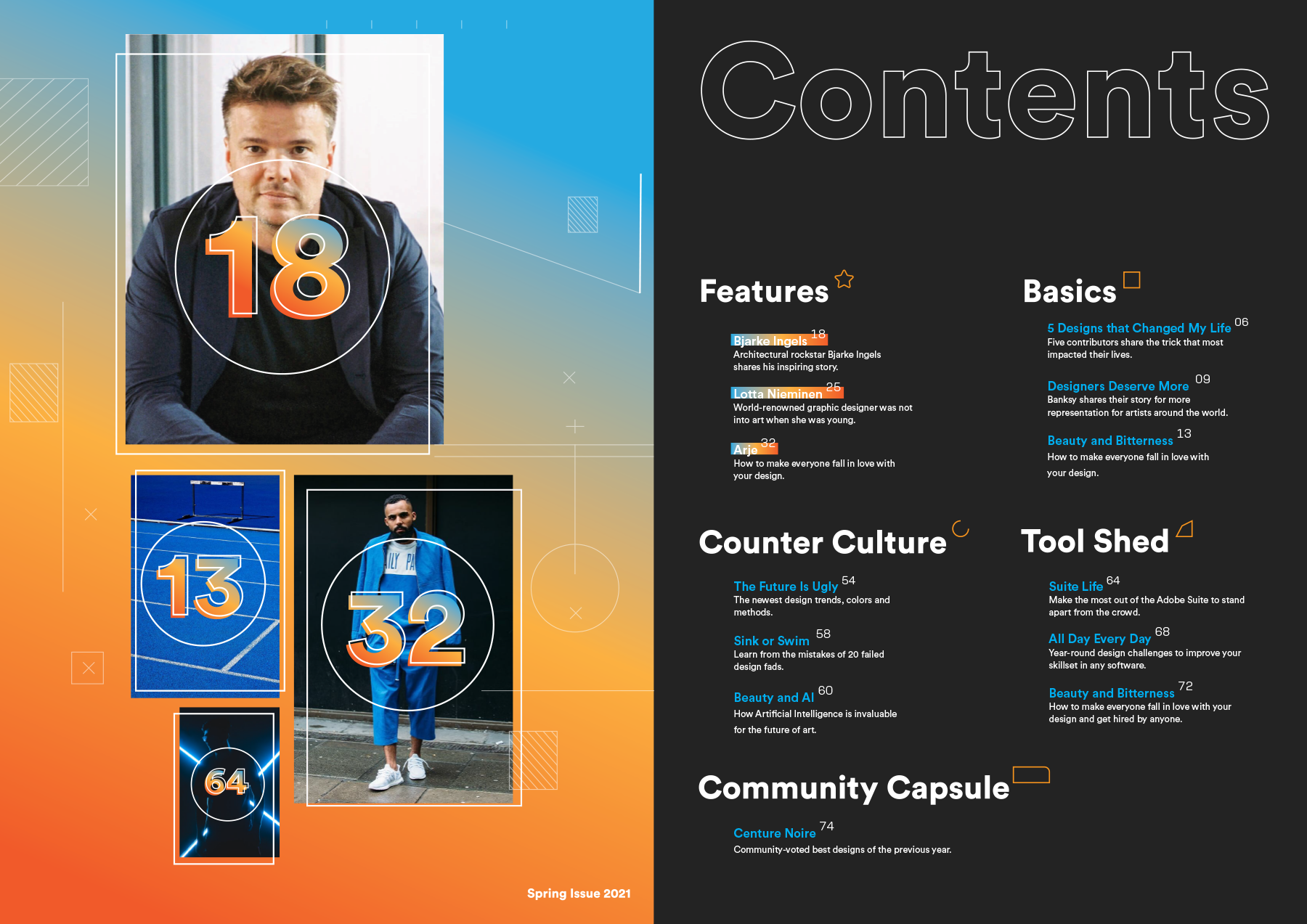
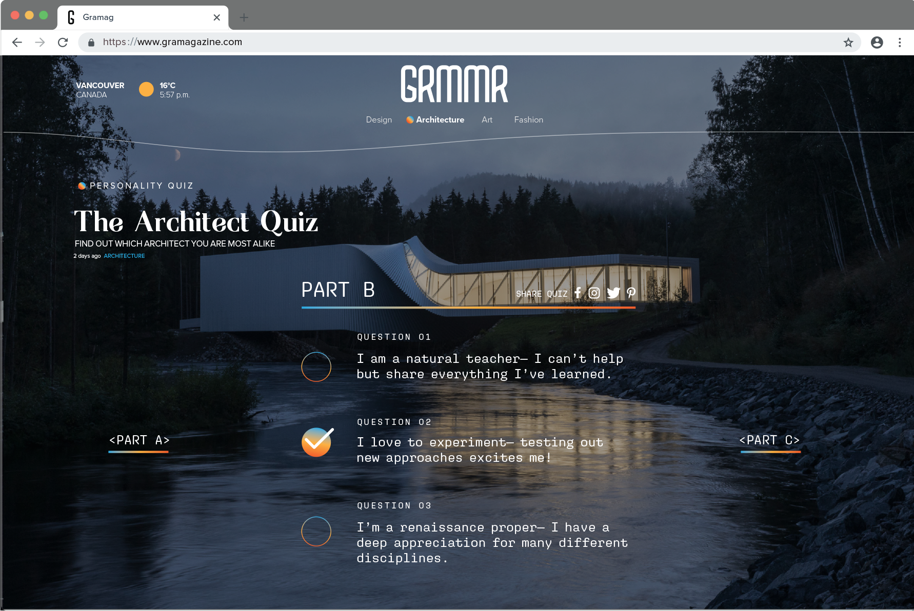
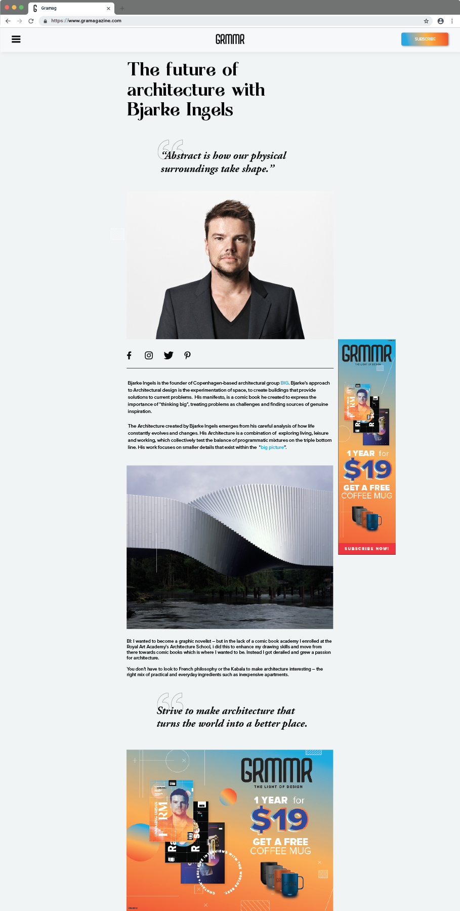
GRMMR Magazine is a design and architecture magazine for the aspiring creative as well as the industry professional. It features a section for community-curated designs and stories of established professionals looking to share some wisdom to the community.

Regalo Logo Breakdown - Crown Part

Catering to both aspiring amateurs and professionals, I wanted to incorporate small but precise details that resemble things that are precisely cut by machines. These will form the foundation of details that will populate my design.

Photo of Bjarke Ingels by Anton Corbijn (2017)

Visual Identity

Smart and posh stories for the
modern technophile.

I chose three typefaces to help me achieve a contemporary look for my magazine. I chose Agne as the header typefaces because I believe it gave it a sense of exclusivity and prestige given the craftsmanship that is apparent in the curvature of the letters. Circular Medium and Aglet was used for paragraphs and smaller detail elements respectively as to maintain the idea of precise and calculated thinking of my design language of my magazine.

TYPOGRAPHY

Regalo Logo Breakdown - Crown Part

COLORS

#4681A6
#fbb042
#f15c2b
#CECDCC
#000000

SAMPLE TEXT

STREAMS

Cras vitae purus posuere, ornare mi id, fermentum enim. Sed erat justo, porta ut nisl dictum, faucibus lobortis turpis. Nullam lobortis hendrerit consectetur. Nullam in lorem placerat, semper odio et, iaculis odio. Cras sit amet pharetra purus, nec lacinia mi. Quisque velit orci, interdum non ultrices eu, rutrum ac quam.

STREAMS 2.4

LOGO & BRAND

MAGAZINE COVERS

Starting from the left was the very first draft of some kind of magazine cover that I wanted to explore my initial ideas with. We can already start to see the form of the intricate lines and gradient circles taking shape in the background. Based on feedback, I evolved it further into having real faces, to represent the potential content that would be in my magazine. Draft #2 played on this idea of a Japanese-themed featured content. With this I was more convinced that I liked the underlying details of my brand design. The final design encorporated all the previous details, including real pages, a catchy and intriguing headline, and paged content that one would actually see inside the magazine.

Grammar Magazine Cover Version 1 Draft #1 Exploration of Magazine Cover
Grammar Magazine Cover Version 2 Draft #2 Exploration of Magazine Cover
Grammar Magazine Cover Version 3 
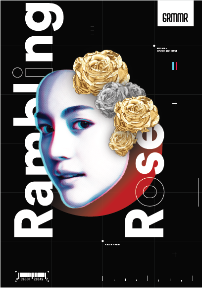
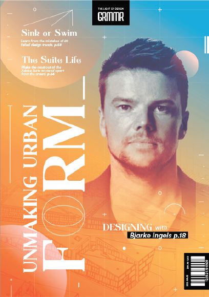
Final Magazine Cover

CONTENTS PAGE

Continuing on to the contents page, we see the final version of the contents page which extends the orange-to-blue color gradients and intricate design line elements. Since Architect Bjarke Ingels is the featured content of this magazine issue, his picture is enlarged and his page section is also highlighted.

Grammar Magazine Cover Version 1

MAGAZINE CONTENTS

The magazine content spanned just under ten pages. I tried to minimize the body text because I wanted readers to be able to admire the design of the renowned architect through photos.

Grammar Magazine Cover Version 1
Grammar Magazine Cover Version 2
Grammar Magazine Cover Version 3

MOCK WEBSITE

On top of the magazine, I was asked to extend the brand onto a digital media which would be in this case, a website. It provided a solid foundation given that it is somewhat the same horizontal format of a magazine, with supercharged interactivity! I took this interactivity element into consideration and created mockups of what GRMMR magazine would have inside its website. More articles, and even a quiz section!

Grammar Magazine Cover Version 1
Grammar Magazine Cover Version 2
Grammar Magazine Cover Version 3

What I learned

Listening closely

When I was not designing, I had spent most of my time consulting with my client, the professor. My mission was to create a magazine that was beyond traditional tabloids. I wanted a design that can be treated almost like a poster, one that can be cutup and framed by the magazine's readers.

Details show intention

I particularly enjoyed spending a lot of time in the details of the magazine. I realized that the consideration for the smallest things really do add up and this was apparent when I also had to design the mockup website.

Be confident in trying new things

I was initially daunted by my own ability to execute something I had never done before. Despite the magazine medium being very new to me, I was encouraged to improve and explore ideas that made sense. Little by little the picture of the magazine became more and more clear in my head and I was able to put together a cohesive magazine brand.