Team Members
Carissa Shum
Derek Liu
Chamira Perera
Jeremy Yan
My Role
UX/UI designer | Illustrator | Researcher | Interactive Prototype Maker
Goal
The overall goal of the interactive career and course planner is to address many of the HCI issues with the current course and career planning methods offered by SFU. With this tool, users should not have to handle cognitive and memory overload for information retrieval and the rate at which they find information about a course or career should be relatively faster compared to the current method of finding course information.
Statement of User Problems
By speaking to upper-year SIAT students and conducting a short research survey, we discovered that:
1. Students are not always aware of what career paths they want to pursue because they are not familiar with the available options, or they have not taken a course that interests them yet.
2. Those who have an idea of a prospective career path have difficulty figuring out which courses are the most relevant and which ones can provide them with applicable portfolio projects.
3. Most students search up course information before making a decision regarding which classes to take. However, the university information sites lack clarity in the provided course descriptions, forcing students to consult with external information sources to feel more confident about their selection.
Design Process
As we were developing the career and course planner, we recognized that using colour comes with perceptual limitations. It may be difficult for colour blind students, or those that have a harder time seeing contrast, to utilize the system if it relied so heavily on colour distinction. This is why we tried not to attach too much informational weight onto the colours, and instead, use them to categorize information.
Since one of our motivating goals was to centralize data to make gathering information more efficient, we were concerned that this could lead to cognitive overload and a cluttered user interface. To ensure that there was not a cognitive overload, we decided to only display the most relevant course information, which consists of the course number and title, credits, brief description, prerequisites, and related careers.
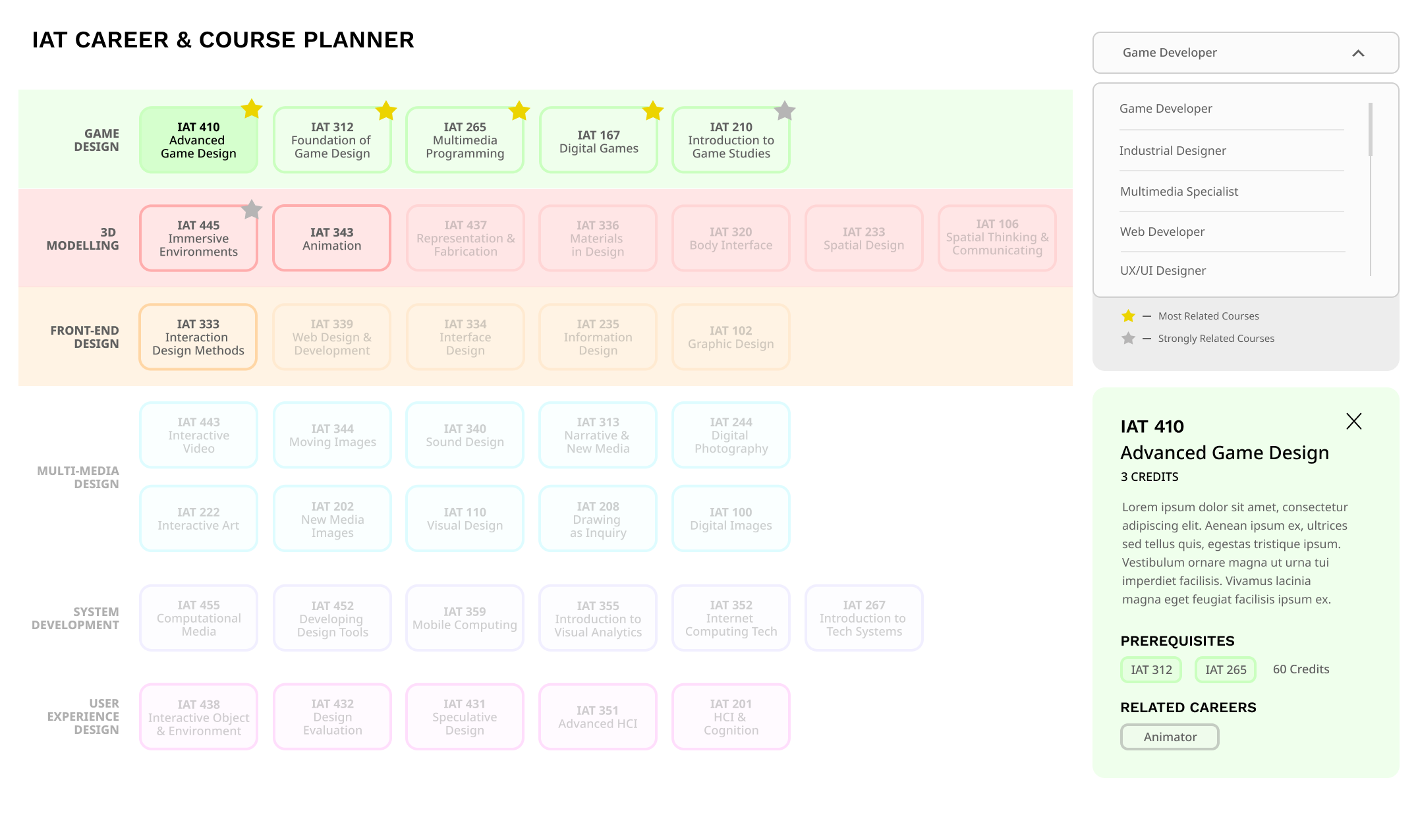
In relation to the concern of a cluttered user interface, we took inspiration from data visualization principles. Specifically, Shneiderman’s mantra, discussed in IAT 355, outlines how an overview should be shown first, zoom and filter, then display details-on-demand. We put this into practice by first displaying all the available courses in an overview to allow students to get the bigger picture and the overall context.
Finally, the concept of details-on-demand is used as course information is hidden in the overview phase. When the student selects a course node, that is when its corresponding information is shown in the sidebar. This helps to reduce the cluttering of the interface and also lessens the cognitive overload as they would not be presented with this information until they are in search of it.
Final Design
The system is a web-based career and course planner that would allow students to interact with different features of the interface to get information about the program’s courses and highlight which ones would be the most relevant to the careers related to their degree. IAT students are able to select a prospective career and view the related courses rated by relevance to the chosen field. It essentially centralizes the list of IAT courses, course information and prerequisites, and possible career paths into one tool.