 LACIE NGUYEN
Urbanee
Front-End Development / Responsive Website / School Project
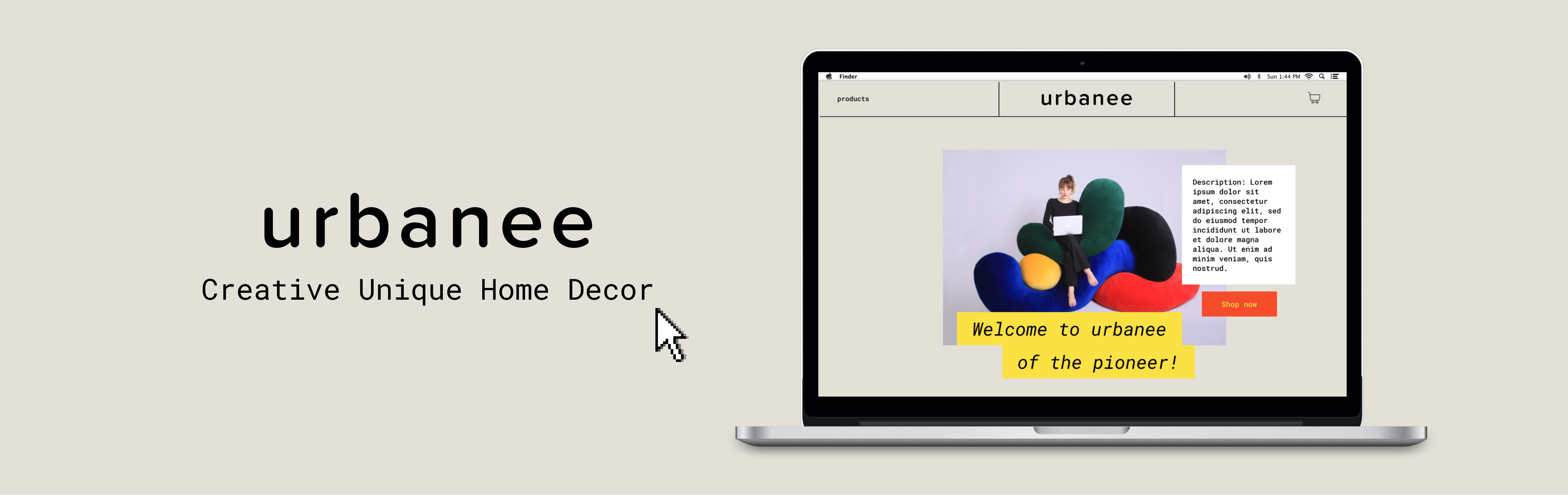
A conceptual store that sells creative and unique home decorations. Urbanee is a place that will inspire you to tap into your creativity and help you to bring good vibes home.
×

My Role
- Web Designer
- Front-End Developer
Team
- Nhi Nguyen
Duration
- 4 weeks - Spring 2022

Project Overview
This project was a part of an upper-division web design and development course that focused on front-end development. We mainly worked with HTML, CSS but also had a little touch on JavaScript. The most significant goal of this project was designing and building a responsive and functional website.
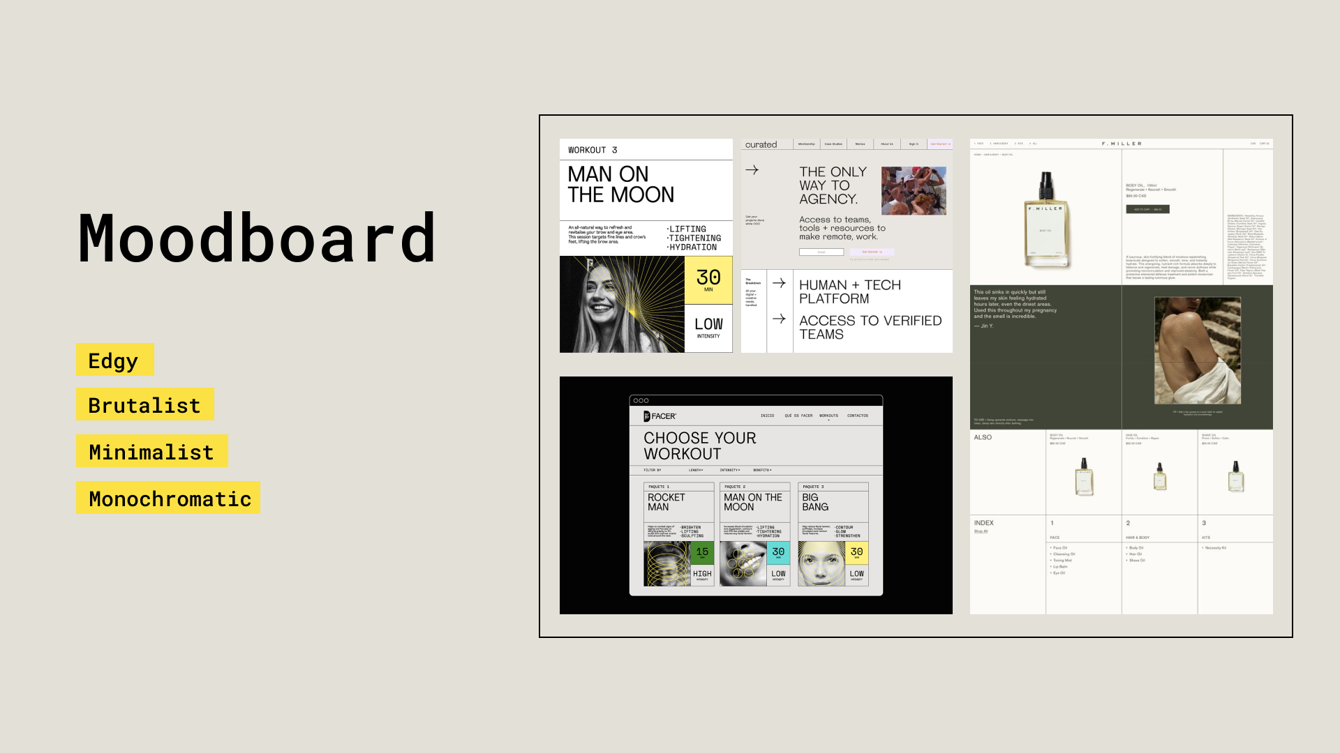
A Brutalist and Minimalist Website
Aiming for a minimalist design that can emphasize the products and interactive elements, we decided to apply brutalism because of its rawness and monochromatic colour. Our website kept a simple and straightforward process that users could easily discover and buy their favourite pieces.
Design Concept
TYPEFACE
Roboto Mono was chosen as the primary brand typeface for Urbanee due to its elegant san-serif infused with a quirky style, this typeface face brings a stylish feeling.

LOGO AND COLOUR PALETTE
Urbanee's colour palette borrows the earthy tone for our background colour and highlights the elements with hints of vivid and saturated hues.

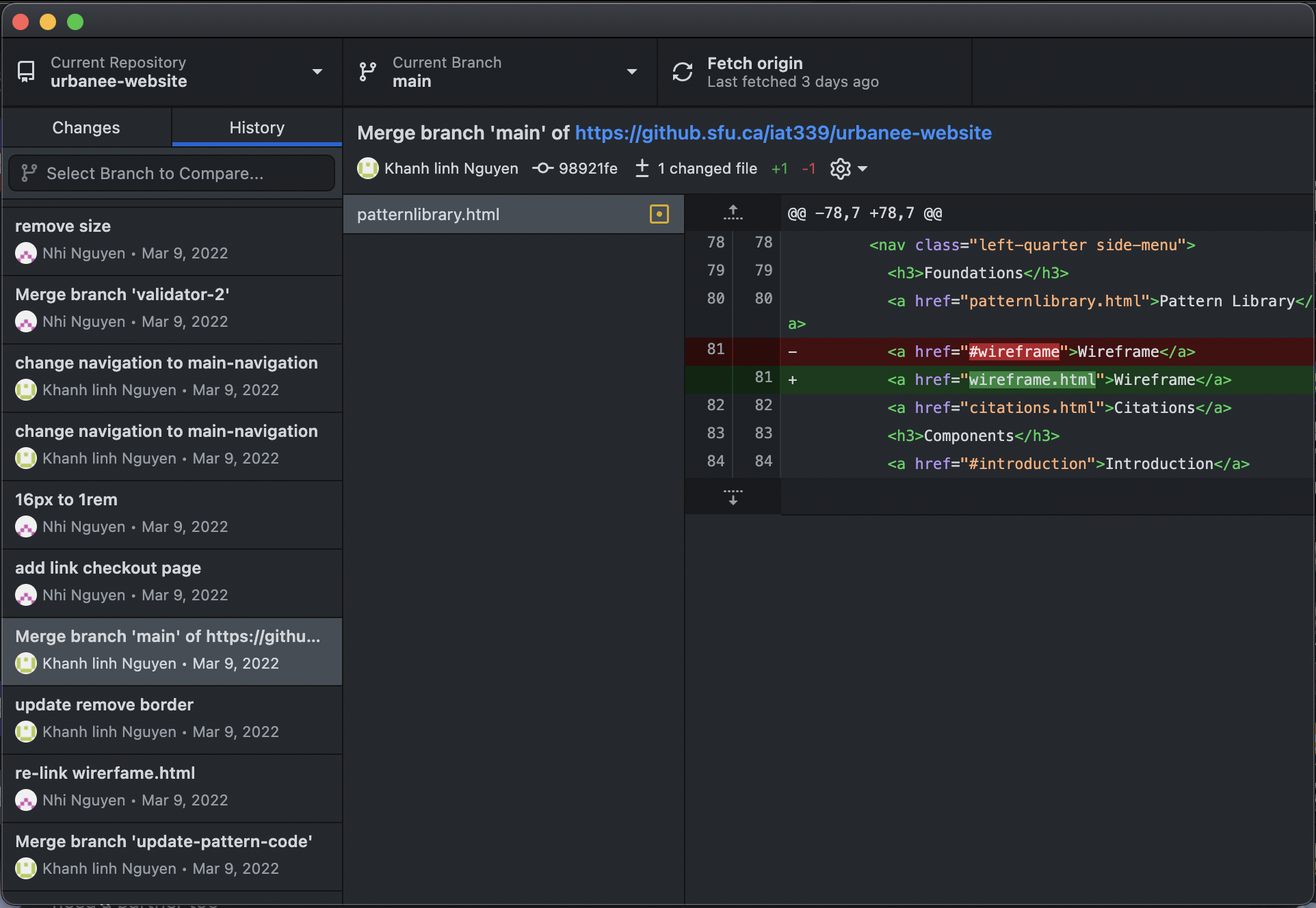
GitHub is Our Friend!
Because this was a group project, we needed a place that let us host and update every change that the members made on the code. GitHub not only allowed us to share our code but also helped us keep track of our change history. I had a practice of keeping my design files in different versions so I always created a new branch whenever I made any change and merged it to the main branch to avoid messing up the main code.
Hover and Focus States
Our interactive elements signify a mouse hover by changing the mouse cursor to a larger one. Additionally, we give clear feedback for both hover and focus states by changing the state of elements. The call-to-action button and secondary button will change their background colours. The input forms will have different border colours depending on they are hovered or focused. Our products on the product page change to different images to signify hover and focus states.

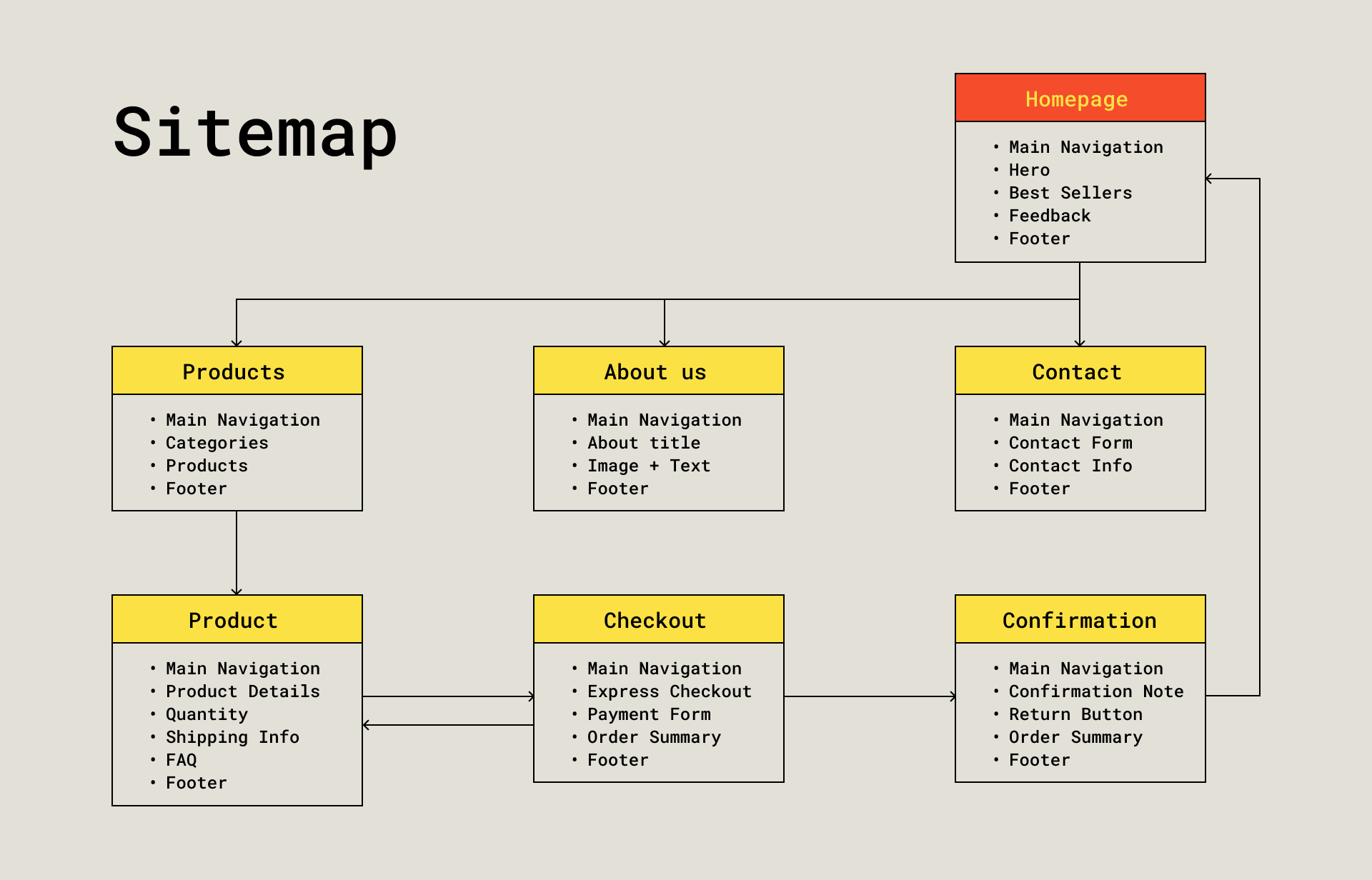
A Design for All Devices
We noticed the importance of a responsive website that users can use on any device or browser. To achieve that, the majority of our content used grid and flexbox. Together with media queries, grid and flexbox allow us to easily break the content into smaller columns or rows based on the size of the users' screen or viewport.

Reflection
Because of the limited time and resources, we cannot fully create a functional front-end website. To make it fully functional, we need to learn more about JavaScript, Ajax or Bootstrap. However, as a person who knew nothing about front-end development, this is a valuable project for me. Through this project, I know how to code and style a whole website based on HTML, CSS and a little JS.