Duolingo
Feature enhancement: addition of Radio feature to Duolingo
Overview
📅
Date
Fall 2020
🏫
Client
Simon Fraser University
📍
Location
Vancouver, BC
🙍🏼♂️
Team
Individual
Objective
The objective of this project is to add a new feature to an existing application while respecting the app's existing design language. I chose to enhance the language-instruction app, Duolingo. I started discovery by exploring Duolingo's purpose, differentiating factors, key features, interface design patterns and target audience. Next, I brainstormed feature enhancement concepts, and finally selected the new feature.
Deliverables
- Comps
- Interactive Prototype
- Presentation
Background
Duolingo is a popular, free application which enables anyone to learn a new language with ease. By using interactive prompts, peer-sharing, gamification, and self-paced learning, it breaks the norm of other language-learning methods. Those features help to facilitate learning, and to encourage people to keep learning.
Approach
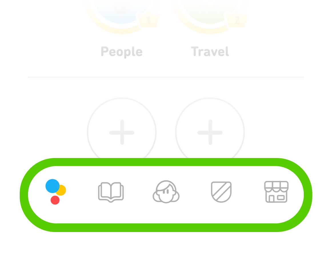
Duolingo users access primary functions of the application from the bottom navigation bar. From accessing lessons, profile and the shop, the lower-nav indicates which part of the app they're in and enables them to quickly jump between features.
If a new, major, distinct feature were to be added, incorporating it into the existing navigation bar would likely be the best way.

Brainstorming
After researching background information on the application, I envisioned ways Duolingo's feature-set could be expanded, whilst remaining true to the product. The top three contenders were:
- Language Introduction
- Collaborative Learning
- Duolingo Radio
After careful consideration and input, I selected the Radio feature because:
- It expanded the cultural connections within Duolingo
- A Radio feature would provide another avenue for users to immerse themselves into the language. This supports Duolingo's recent efforts, when they introduced Stories and Podcasts.
- Music offers a psychologically positive and proven way to deepen users' understanding of language and culture.
- It fit the scope of the project
- A radio feature fits within the application and the parameters of the request, whilst the other ideas were either too insignificant (Language Introduction) or too sweeping (Collaborative Learning).
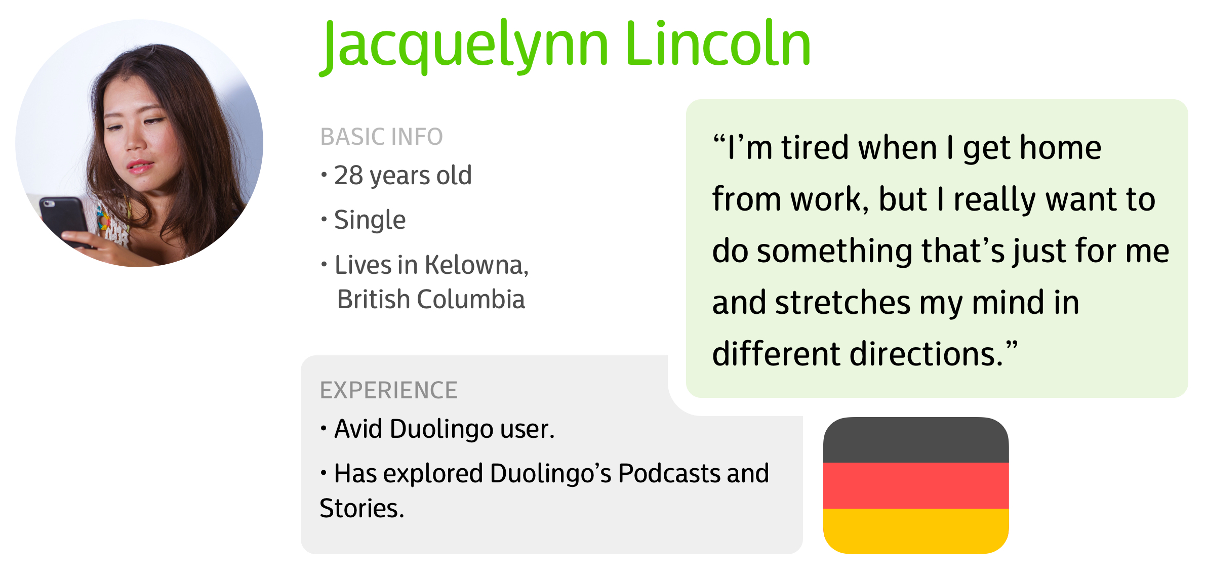
Persona
Although multiple personas are more typical, given the size of this feature, focusing on just one persona felt adequate.

The traits for Jacquelynn were compiled from a small user survey I conducted amongst my friends and family, who ranged between being proficient to not having used Duolingo before.
Prototype
Using Sketch, I created a prototype of the feature functionality. By linking pages together, the prototype demonstrates how users interact with the application and also enabled more effective usability testing.
Run prototype here- To run the prototype, click on the link above.
- Interact with the prototype by pressing on screen buttons, buttons available to press will be visually indicated on screen through a yellow highlight.
Presentation
The final presentation is available here.

