Problems
I
designed the Crater Lake project after my original project failed
miserably. For that, I wanted to analyze the spatial extent of
the damage
and 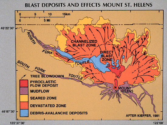 destruction
caused by Mt. St. Helens. Unfortunately, with the exception of
DEMs
(digital elevation models), no raw data was available. For
example,
coverages of damage caused by ash, pyroclastic flows, lahars, and
various other
volcanic events had already been made, and converted into convenient
JPG
form (like the picture on the right from Kieffer, 1981). While
the coverages looked wonderful, there were simply no
spatial
analyses for me to do, aside from interpreting the maps. Hence,
although
the project would have looked nice, my grade for the project likely
would not.
destruction
caused by Mt. St. Helens. Unfortunately, with the exception of
DEMs
(digital elevation models), no raw data was available. For
example,
coverages of damage caused by ash, pyroclastic flows, lahars, and
various other
volcanic events had already been made, and converted into convenient
JPG
form (like the picture on the right from Kieffer, 1981). While
the coverages looked wonderful, there were simply no
spatial
analyses for me to do, aside from interpreting the maps. Hence,
although
the project would have looked nice, my grade for the project likely
would not.
While
I was looking for Mt. St. Helens data, I stumbled upon a GIS data
clearinghouse
for national parks, monuments, and historical areas of the United
States.
This clearinghouse was run by the NPS (National Park Service).
The data
was fantastic; complete, concise, and accurate. It seemingly had
data from
every area in the states, except for Mt. St. Helens National
Monument. Naturally, this didn't sit too well with me, and I
began to
re-think my project. After taking a quick break to relieve any
residual
hostility (rollerblading break), I explored the NPS data a little
further.
I discovered data for several national parks that I could do a good
project
with. Not every park had the same data; Crater Lake was well
suited for a
tourism style analysis, while Zion National Park in Utah, for example,
had
coverages that would have made it well suited for an environmental
assessment. I explored other parks with other themes, and settled
on
Crater Lake. It was the right size, with the right amount of
data.
Doing a similar project on a much larger park such as Yellowstone or
the Grand
Canyon would have taken far too long.
While
Crater Lake data was plentiful, there were still some missing elements
that
would have greatly contributed to it. The most notable absence is
a raster
based topological map. Given the fact that the majority of the
hikes are
climbs, the slopes and elevations would have been greatly
beneficial. It
would have been great to use a topographic image as a base map for the
trails,
instead of a generic park boundary map. Then, the relatively flat
Pacific
Crest Scenic Trail would not appear to have the same (lack of)
elevation gain
that the Mt. Scott climb does. The USGS had some
fantastic raster data
including DEMs (digital elevation models), digital orthoquads, and the
topographic DRG that I desperately wanted. However, their format
was mrSID, and as such, unrecognizable to FME. Therefore, I could
not use this
data (or so I thought). Rob informed me that ArcToolbox could
convert
it. Unfortunately, red tape prevailed: the lab needs a license in
order
for ArcToolbox to convert anything over 50MB. The DRG was 100MB,
which
effectively wiped out that plan.
Another student doing an analysis of Crater Lake, Dylan, was working
with a
different DEM. I downloaded it, and briefly entertained the idea
of using that as a
basemap. I decided against it though, because its
vertical exaggeration was severely lacking. The DEM looked very
flat and
unconvincing. Besides, it was really the quantitative elevation
data I
wanted. With that, I decided to let the simple green background
stand.
Aside
from putting the trails onto a topographic map (which makes perfect
sense), I
would have liked to make some viewsheds, and compare them to actual
photos. For example, it would be interesting to see how IDRISI
represents
Crater Lake from the top of Mt Scott, compared to a real picture.
I'd need
a higher quality DEM for that though.
Geocommunity
has
raster graphics and digital orthophotos that would have potentially
been useful, but it was
only available for a price. I was not going to pay for something
that in
all likelihood, I would not have on time, nor really have any idea what
I was
buying. The USGS and NPS data, on the other hand, I could
preview in
JPG form before I downloaded it.
One of
the main problems, in my own personal opinion, was that this project
was
confined to IDRISI. This is a raster based program with extremely
poor
final output. I think the maps would have looked far superior in
ArcGIS,
which is vector based, just like all of my data. The cartographic
outputs
are much more aesthetically pleasing in ArcGIS, not to mention, easier
to work
with (ie, constructing a legend is seemingly infinitely more difficult
in IDRISI,
and its visual quality is not even comparable.) The digitized
point data
would have looked great in ArcGIS, because that software has built in
symbols for
boat launches and highway markers. Those, naturally, would look
far
better than circles and squares that do not really mean anything on
their
own. With appropriate symbols, one can simply look at the map and
say
"yup, here's a boat launch" as opposed to "what's this circle with
crosshairs in it supposed to represent? I gotta search the
legend.
Lame!"
A few gripes as I do my final upload to the web on Monday
afternoon, Nov. 24...
- When I try to access my
"crater_lake_history" page, I recieve the following error message: "You
don't have permission to access
/geog355fall03/rurner/Project/crater_lake_history.htm on this
server." It is the only file that happened with, so I have no
idea what the problem is. Hopefully it comes up on everyone
else's browsers okay. I'm sure it's fine, I just can't verify my
links on that one page. I had the same problem in lab 6, and Rob
told me it was not uncommon, but he was not sure how to fix it.
(Update - Nov. 26 - I fixed it, by simply changing the filename.
Why didn't I think of that before?! I still have no idea about
that error message though)
- The resolution on the screen in the lab is different
than my home resolution, so on this lab screen, the caption for one
photo got displaced. The optimum resolution is printed on the
index page though, so if that is followed, there should be no problem.
- There are a few quotes throughout this website.
At home, I did them in "Kaufmann" font, which is like written
scroll. Unfortunately, this did not translate to the lab's
computers, so the font looks the same as any other text in this
website. (Update - Nov. 26 - My computer still writes it just
fine on the web. I guess the lab computers just don't have the
font.)
- Waiting around for computers in the overflow lab =
&*%^!!!!!!!
Back
to the main page