4. Spatial
Analysis
The main analysis of my project was about the
distribution of 'Starbucks' in the various Census Tracts of Vancouver
related to different social factors.
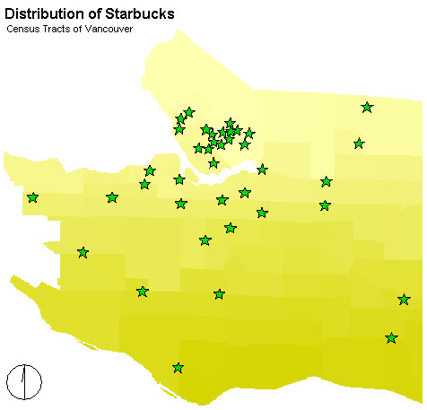 The basis map, as you can see on the right,
shows the 89 Census Tracts of Vancouver. Information about the latter
are given in the attribute table. Furthermore,
it shows the distribution of the 39 'Starbucks' in Vancouver.
In the north of Vancouver there is a grave agglomeration
of several 'Starbucks'. This overlaps with the area of Downtown Vancouver.
Most of the areas in the south offer no 'Starbucks'.
Which are the hidden factors that influence
the decision of locating a 'Starbucks'? Is the dominance of the
Service Sector as in Downtown the main determinant? Or are there other
influences, not visible at the first the moment? As mentioned before,
I chose eight factors to analyse the relation between them and the
distribution of 'Starbucks'. My final step was, working with the results,
determing the suitability of different regions of Vancouver for a
location of 'Starbucks'.
The basis map, as you can see on the right,
shows the 89 Census Tracts of Vancouver. Information about the latter
are given in the attribute table. Furthermore,
it shows the distribution of the 39 'Starbucks' in Vancouver.
In the north of Vancouver there is a grave agglomeration
of several 'Starbucks'. This overlaps with the area of Downtown Vancouver.
Most of the areas in the south offer no 'Starbucks'.
Which are the hidden factors that influence
the decision of locating a 'Starbucks'? Is the dominance of the
Service Sector as in Downtown the main determinant? Or are there other
influences, not visible at the first the moment? As mentioned before,
I chose eight factors to analyse the relation between them and the
distribution of 'Starbucks'. My final step was, working with the results,
determing the suitability of different regions of Vancouver for a
location of 'Starbucks'.
- Women/Men Ratio
- Population Density
- Main Groups of Age
- Proportion of Non-Canadians
- Main Groups of Persons per Household
- Rate of Unemployment
- Rate of Income
- Proportion of the Service Sector
At least I will present my final analysis.
1. The Distribution of 'Starbucks' related
to the Women/Men Ratio
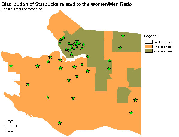 The map on the right visualizes what kind of gender
dominates in which parts of Vancouver.
The map on the right visualizes what kind of gender
dominates in which parts of Vancouver.
As you can see, in most Census Tracts the proportion of women
is dominating (colored in orange).
But more than half of the 'Starbucks', this means 23, are
in areas where there are more men than women.
Considerably is, moreover, that the areas
where the proportion of men is dominating are only one quarter of
the whole area approximately.
As a result it could be said that there is a grave
tendency locating 'Starbucks' in areas with a high proportion of
men.
But it is more probable that that this is only a coincidence.
That is why this factor plays only a less dominant role in the
final weighting.
2. The Distribution of 'Starbucks'
related to the Population Density
The map below shows the different proportions
of the Population Density in Vancouver related to the Census Tracts
of 1996.
The more darkly the blue, the more people
live in this region per squarekilometre. The main centre of high
Population Density is in the south of Downtown followed by a line
of high Population Density in the direction of south-east of Vancouver.
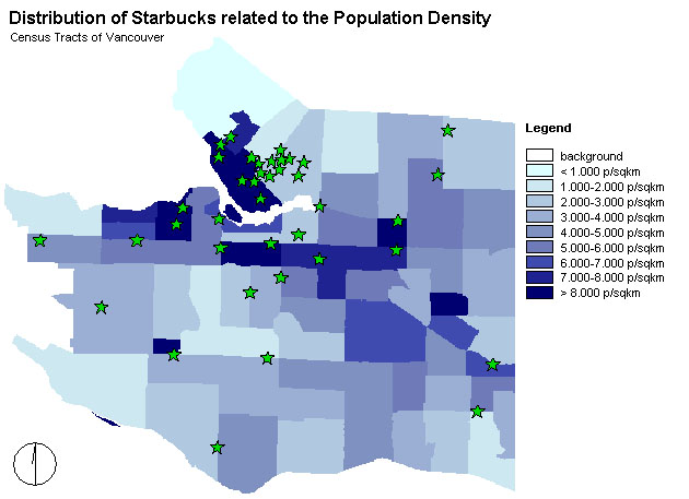
In detail, there are
Starbucks
|
p/sqkm
|
| 0 |
< 1.000
|
1
|
1.000-2.000 |
14
|
2.000-3.000
|
5
|
3.000-4.000
|
2
|
4.000-5.000
|
3
|
5.000-6.000
|
2
|
6.000-7.000
|
4
|
7.000-8.000
|
8
|
> 8.000
|
In a common sense it would be logical to say
that the higher the Population Density, the higher the numbers
of 'Starbucks', because a higher Population Density means a higher
probability of customer. Looking at the table shows that the numbers
of 'Starbucks' are rising with a higher Population Density. But the
peak is at a Population Density of 2.000-3.000 p/sqkm. The explanation
for this phenomenon is that in this area is Downtown. Many people are
there during the day, working or shopping, but actually they don't live
there. Calculating the Population Density during the day would mean an
extremely higher value for sure.
Finally, Population Density was an important
factor of the Multi-Criteria Evaluation. But because the Population
Density during the day is important to know, too,
the weighting was not as high as it maybe should have been.
3. The Dis
tribution of 'Starbucks' related to the Main Groups of Age
The map below shows the different Groups of
Age in Vancouver related to the Census Tracts of 1996.
The more darkly the blue, the higher the
Group of Age. The green colors mean that there are two peaks, or
two dominant Groups of Age in this tract.
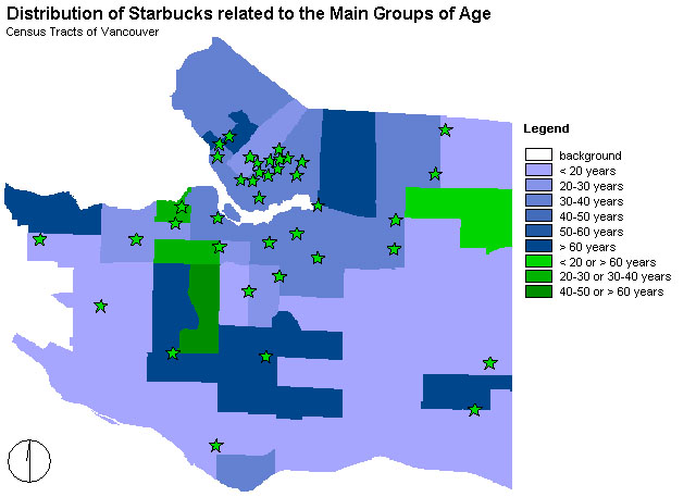
In detail, there are:
Starbucks
|
Main Group of Age in years
|
7
|
< 20
|
6
|
20-30
|
22
|
30-40
|
0
|
40-50
|
0
|
50-60
|
3
|
> 60
|
0
|
< 20 or > 60
|
2
|
20-30 or 30-40
|
0
|
40-50 or > 60
|
As you can see in the table, the peak of the
locations of 'Starbucks' is in areas, where the Main Group of Age
is between 30-40. A less, but still high agglomeration of 'Starbucks'
is where the younger Groups of Age are. Without the Group of Age higher
than 60 years, the older groups seem not to be potential costumers
of 'Starbucks'.
As a result, for my final analysis the representation
of people between 30 and 40 years was a main dominating factor.
4. The Distribution of 'Starbucks' related
to the Proportion of Non-Canadians
The map below shows the different Proportions
of Non-Canadians related to the Census Tracts of 1996.
The more darkly the pink, the higher the
Proportion of Non-Canadians in this tract.
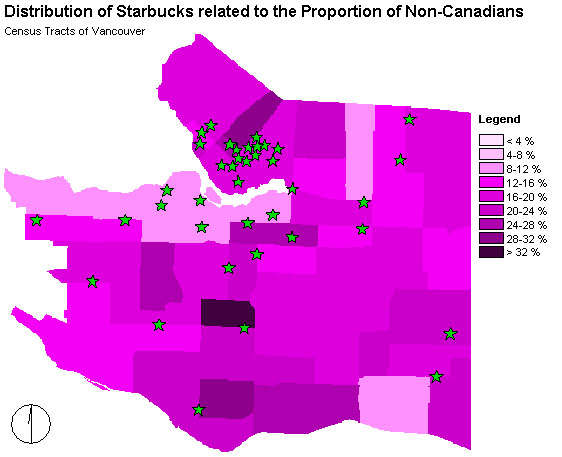
In detail, there are:
Starbucks
|
Proportion of Non-Canadians
in %
|
0
|
< 4
|
0
|
4-8
|
5
|
8-12
|
7
|
12-16
|
17
|
16-20
|
5
|
20-2 |
4
|
24-28
|
0
|
28-32
|
0
|
> 32
|
The agglomeration of 'Starbucks' related
to the Proportion of Non-Canadians concentrates on proportions
between 8 and 24 % of Non-Canadians. The peak seems to be
at the proportion of 16 and 20 %.
In my further analysis I will consider this
relation.
5. The Distribution of 'Starbucks' related to the Main Group
of Persons per Household
The map below shows the different Main Groups
of Households related to the Census Tract
1996. The more darkly the blue, the more people living in one household
for this area. The colors in green implicate
two main peaks of Groups of Households in that area.
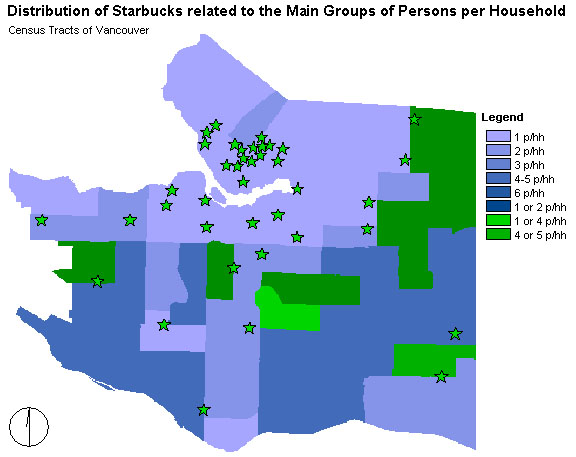
In detail, there are:
Starbucks
|
Main Groups of Persons per
Households
|
30
|
1
|
8
|
2
|
0
|
3
|
0
|
4-5
|
0
|
6
|
0
|
1 or 2
|
0
|
1 or 4
|
1
|
4 or 5
|
As the table shows the absolute main concentration
of 'Starbucks' is in areas, where there are single households.
A few 'Starbucks' are located in tracts with two persons in one household.
This means the higher the size of a household dominating a tract the
less 'Starbucks' there are. It seems to implicate that most of the
consumers of 'Starbucks' are persons living alone.
As a consequence this factor will be an important
criterion to look at.
6. The Distribution of 'Starbucks' in
relation to the Rate of Unemployment
The map below shows the different Rates
of Unemployment related to the Census Tracts 1996.
The more darkly the pink, the higher the
Rate of Unemployment.
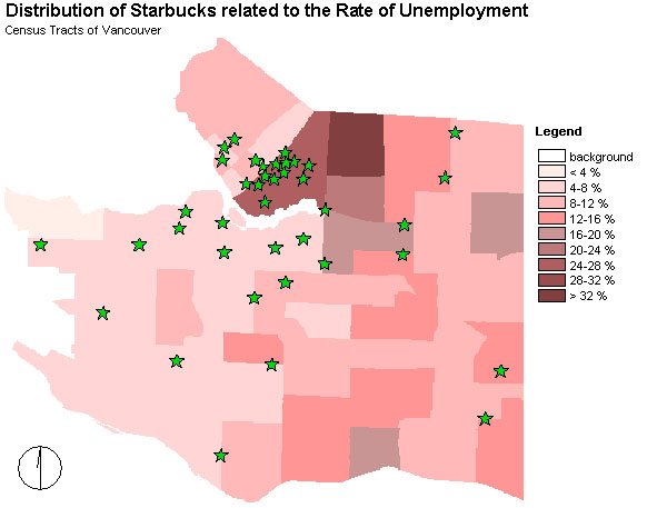
In detail, there are:
Starbucks
|
Rate of Unemployment in %
|
0
|
< 4
|
15
|
4-8
|
7
|
8-12
|
4
|
12-16
|
2
|
16-20
|
0
|
20-24
|
11
|
24-28
|
0
|
28-32
|
0
|
> 32 |
The table shows two peaks of the distribution
of 'Starbucks' related to the Rate of Unemployment: fifteen 'Starbucks'
are in areas with a low Rate of Unemployment, this means below 8
%. Another peak with eleven 'Starbucks' is in an area, where the Rate
of Unemployment is quite high with 24-28 %. In a common sense a lower
Rate of Unemployment would implicate more money to consume coffee.
Therefore, it would explain the decision of 'Starbucks' choosing
its locations.
The second peak could be explained with the
location of this area: it is in Downtown, where many people are homeless
and without work. But other more positive factors like a high population
density during the day could compensate this factors.
At least, this is why I chose a low Rate of Unemployment
as a determing factor of the locations of 'Starbucks'. Knowing that
there is a second peak this factor lost weight in its importance.
7. The Distribution of 'Starbucks' related
to the Income
The map below shows the different
numbers of Average Income related to the Census Tract 1996.
The more darkly the red, the higher the Average Income in this tract.
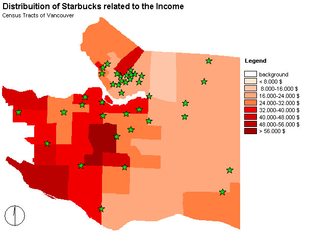
In detail, there are:
Starbucks
|
Average Income in $
|
0
|
< 8.000
|
0
|
8.000-16.000
|
21
|
16.000-24.000
|
9
|
24.000-32.000
|
8
|
32.000-40.000
|
0
|
40.000-48.000
|
0
|
48.000-56.000
|
1
|
> 56.000
|
As the table shows, most 'Starbucks'
are placed in areas with an Average Income of 16.000-24.000 $.
Fewer, but also some 'Starbucks' are in areas, where the Average
Income is between 24.000 and 40.000 $.
This could implicate people having fewer money can't afford money
for this kind of coffee. And maybe people earning more money don't
want to buy their coffee in a 'fast-beverage-company'.
In the following I will pay more attention
to the tracts with an average income between 16.000 and 24.000
$.
8. The Distribution of 'Starbucks'
related to the Proportion of the Service Sector
The map below shows the Census Tracts of
1996 having different Proportions of the Service Sector.
The more darkly the red, the higher the Proportion
of the Service Sector. Because the Proportion of the Service Sector
is high in general, I chose small group units.
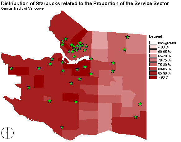
In detail, there are:
Starbucks
|
Proportion of the Service
Sector in %
|
0
|
< 60
|
0
|
60-65
|
0
|
65-70
|
1
|
70-75
|
3
|
75-80
|
14
|
80-85
|
16
|
85-90
|
5
|
> 90
|
The table shows that a high Proportion of the
Service Sector seems to influence the decision of 'Starbucks' locating
a company. Most of the 'Starbucks' are in areas with a Proportion
of Service Sector between 80 and 90 %. Nearly the whole western part
of Vancouver has such a high rate and furthermore, there is the main
area having 'Starbucks'.
For my final analysis this factor
will be of important weight.
9. My final analysis
As I have written in the previous paragraphs,
I chose eight criteria which I decided to be important creating
my final map. This map should show the different areas of Vancouver
and evaluate them for locations of 'Starbucks'.
The implications are evaluating the suitability
for the existing 'Starbucks' and the suitability for new ones.
My final question was: Where does it make sense to
built new 'Starbucks'?
I tried to explain, why I chose the enumerated
criteria and what the sense of each of them is. Furthermore, I
mentioned how important they will be for my final analysis. But I
also have to say that the weighting of each criterion is very subjective.
Probably other people would have chosen other weightings.
But being aware of this fact, the criteria
and their weightings will give an overview - and this is what I
wanted to do.
I paid attention to to the following parts of each criterion:
- Population Density: higher than 7.000 p/sqkm
- Main Groups of Age: between 30 and 40 years
- Proportion of Non-Canadians: between 12 and
28 %
- Main Groups of Persons per Household: 1 p/hh
- Rate of Unemployment: less than 12 %
- Income: between 16.000 and 24.000 $
- Proportion of the Service Sector: between 80
and 90 %
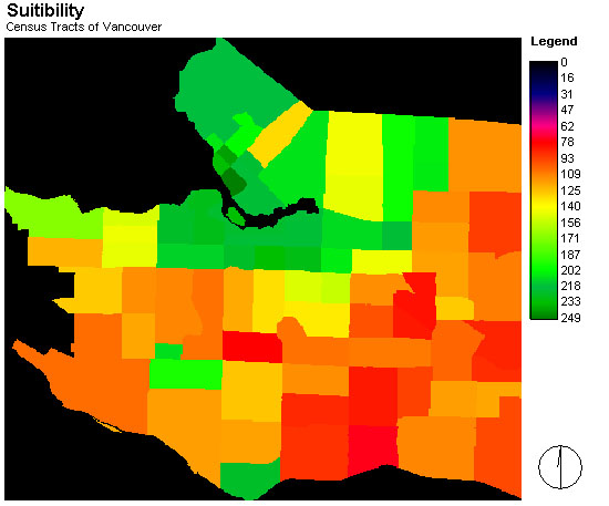
After using the Multi-Criteria
Evaluation, where I determined the importance of each criterion
for a location of 'Starbucks', I got the map below.
Every value higher than zero shows the suitability of an area
for a location of 'Starbucks'. Starting with one, a value of
255 means a high suitability. In general, areas drawn in green are
most suitable, followed by yellow, orange and red. Remarkable is that
there are no areas with a very low suitability in colors of pink,
blue and black.
After I created this map I created a new one choosing three
categories to label the suitability called most suitable, suitable
and less suitable.
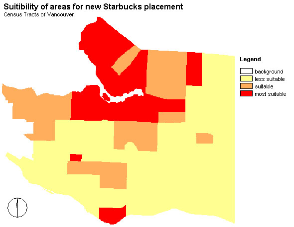
In detail, there are:
Starbucks
|
Suitability
|
3
|
less
|
8
|
medium
|
27
|
most
|
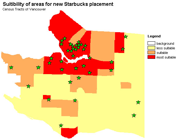
Looking at the distribution of 'Starbucks' it is obvious
that most of them, 27, are placed in areas most suitable.
But nevertheless, there are areas in the far north, which are
most suitable and where no 'Starbucks' is placed. Another preferable
areas could be on the eastern part near Downtown, although or maybe therefore
there are lots of homeless.
As a conclusion I can say that people have the highest
opportunity enjoying the coffee of 'Starbucks' in areas with a high
proportion of the Service Sector, high Population Density, medium Income,
medium proportion of Non-Canadians, medium Average Age and a low Rate
of Unemployment and Persons per Households.
Moreover, it is a big plus to live in areas, where there are
more men than women...
