Team project done with:
Gertie Han
Melvin Wong
Thought Process
The premise of this project was to practice layouts for professional magazines. We were in teams of three and had to practice using white space, text, and images to create five pages of black and white layout. Our team discussed a few possible topics but we ended up choosing a fashion magazine.
My topic was:
Bridal Fashion Magazine
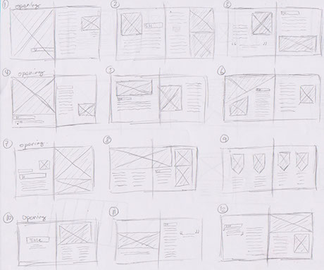
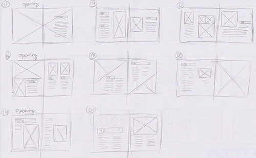
I began making sketches by making sketches of possible magazine layouts which later I picked a few to look over with my team mates.
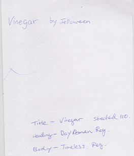
Each member chose a few possible fonts and discussed it with out teacher. He gave us some suggestions and we ended up deciding on the following fonts.
Testing & Redesigning
After looking through each team members first rough layouts. I picked out a few from each members to put together as a possible final product. Our teacher gave us critique and gave us suggestions written on our test layouts.
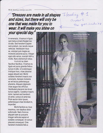
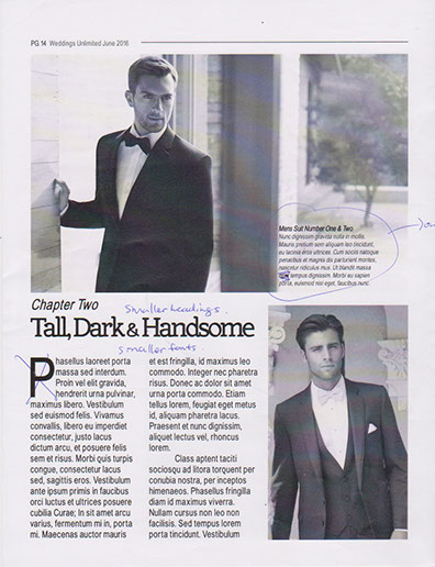
The following are a few photos of critique we had during our first test layouts. Not all layout pages are present as we did not make changes to them.
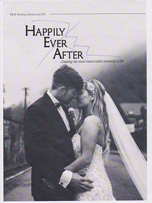
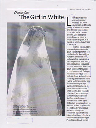
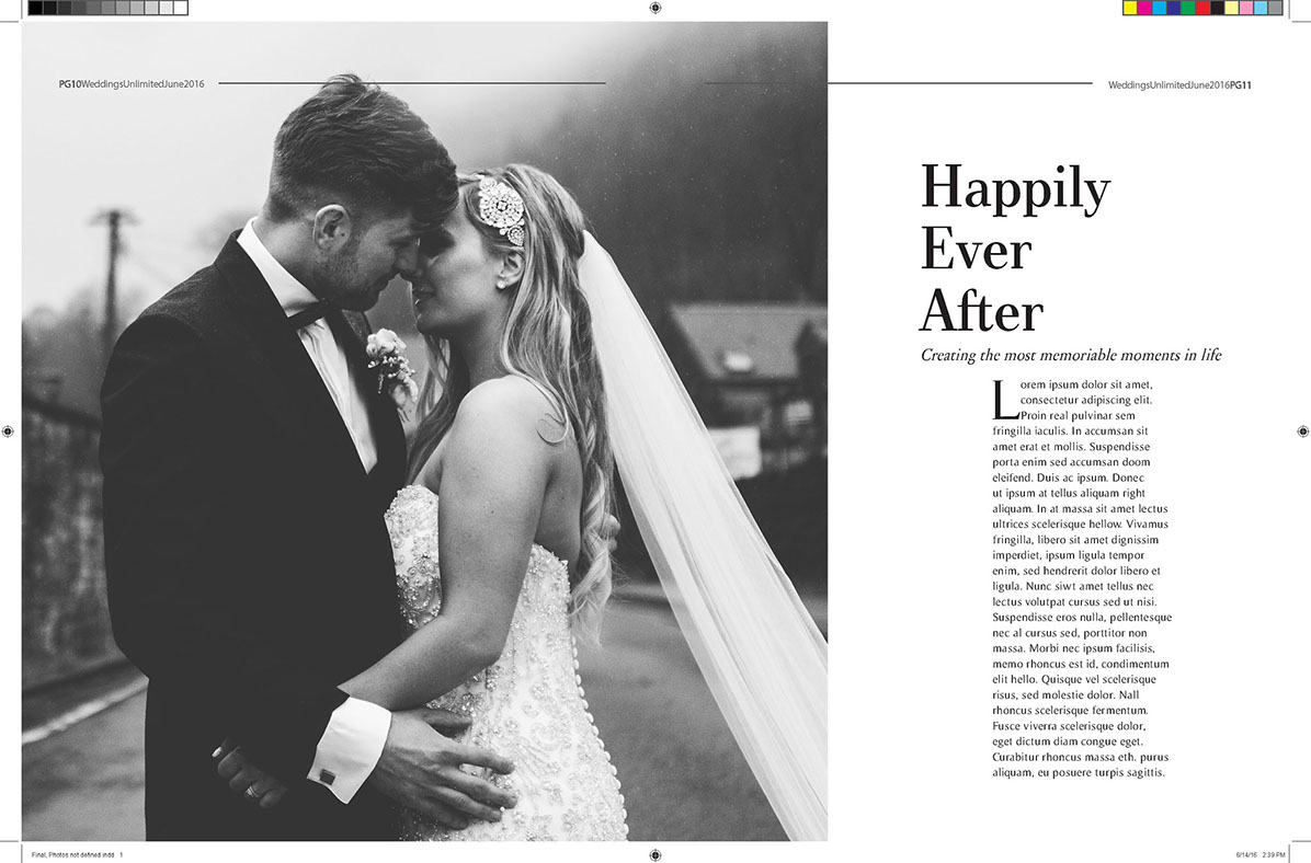
I decided the title should be on the right page so my team switched "The Girl in White" on to the next page and replace it with the layout photo on the right made by my team mate Melvin Wong.
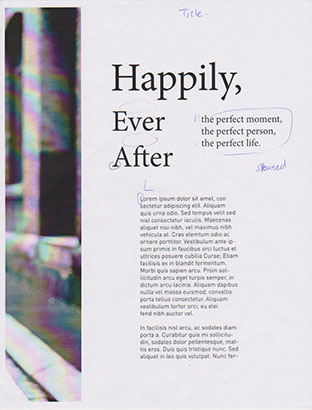
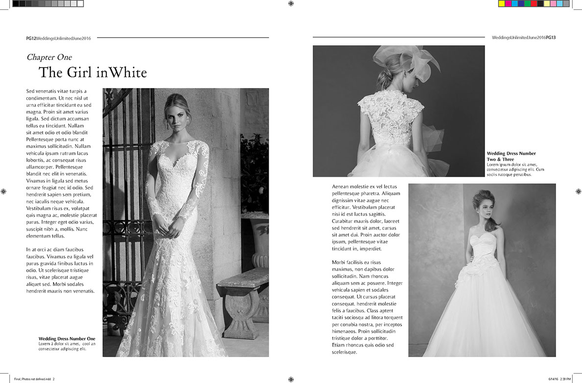
Instead of the quote, I put "Girl in White" here for first heading and topic of the magazine. The quote was too crowded and the whole page didn't have enough white space.
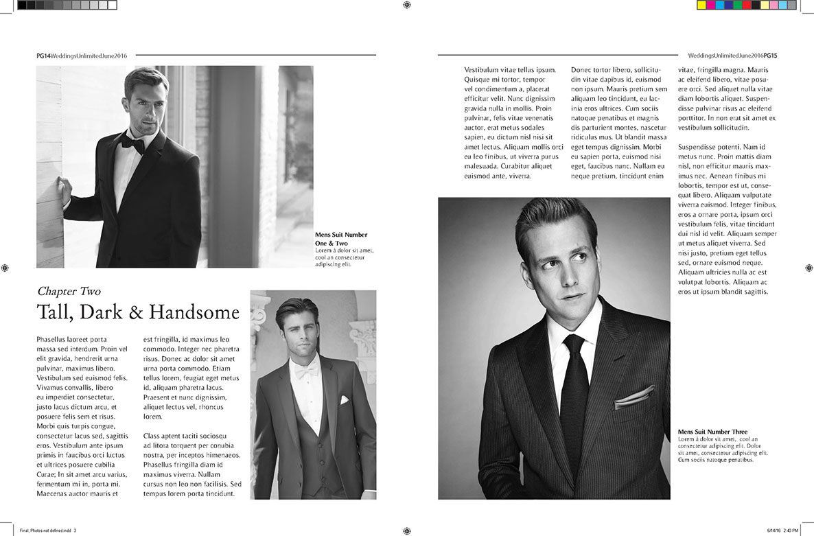
The next heading was called "Tall Dark & Handsome". The title was too large and we had to make all the fonts smaller as it was a size 14. We also had to decide whether to put the foot notes in photos or outside. I decided that we should move them outside as some photos have complicated backgrounds to put text over.
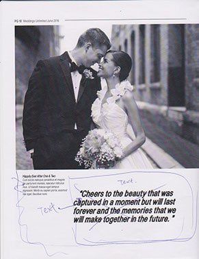
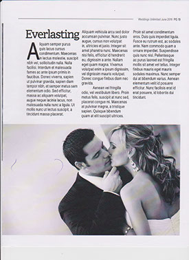
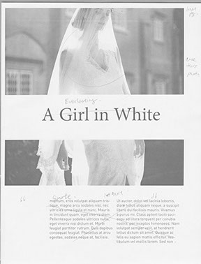
The quotes were not doing a good job and seemed too random. So I decided to move the text from the next page "Everlasting" on the page with the quote.
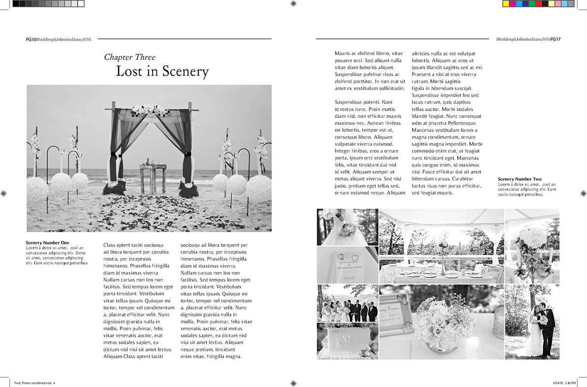
We decided to put the layout on the very right onto the "Everlasting" page. The last page was made by my team mate Melvin Wong.
Final Design
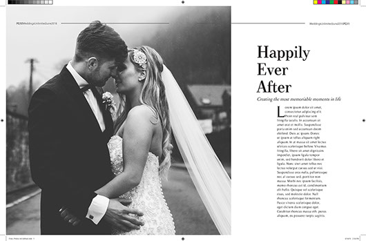
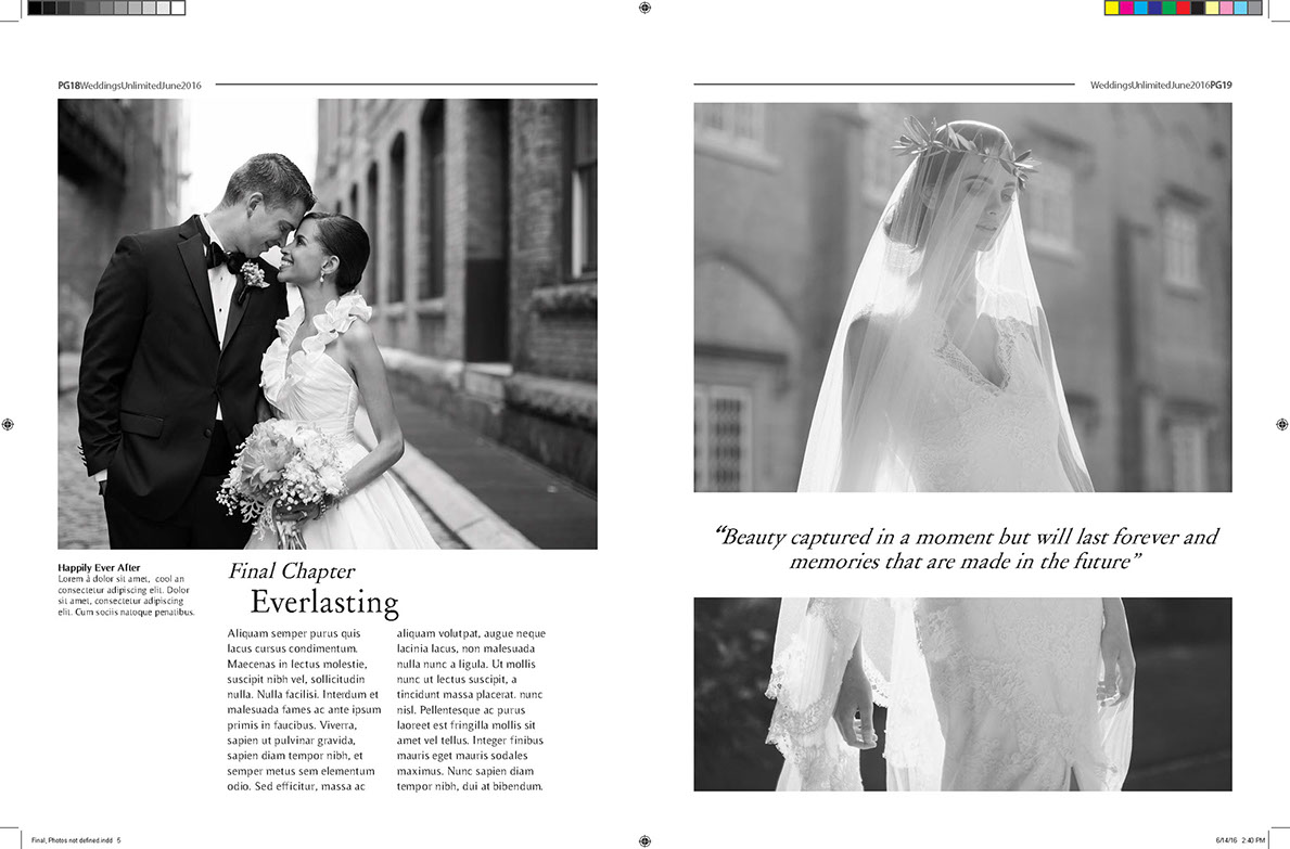
Here are the final five page layouts me and my team have created. It was a difficult process as we had to make it look like one singular design but made by three different people. I have learned how the details really matter in design and even picking a font can take hours. My teacher's key take away from our final project was that we shouldn't be too ridged and should have made a few photos bleed off the side of the page. Overall, I have learned a lot from this project and I will continue to develop my layout skills.
