Thought Process
The premise of this project was to create an App icon for an App that is odd and wouldn't exist in the real world. We had to use the topics given and create an icon that conveys its function immediately when seen.
My topic was:
An App that locates endangered trees
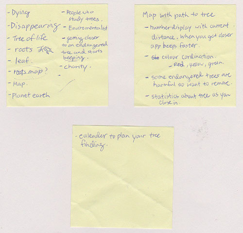
I started with taking notes on words or phrases that came to mind when thinking about this topic. I had a really difficult time at this stage as I found it hard to use words to come up with a design idea and I have never done this before. It turned out to be great practice and I learned that I was very literal when thinking up ideas.
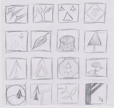
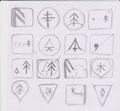
After sketching out possible ideas, I found it easier to move away from the literal interpretations of trees and signs and create more abstract shapes. The transition of the sketches can see the progress into more simplistic trees.
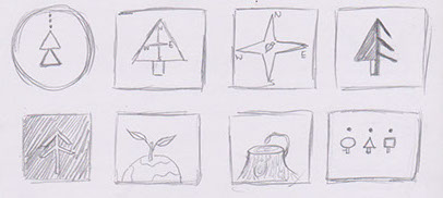
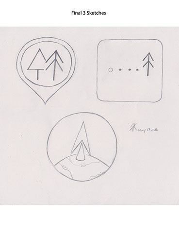
I chose a final three sketches as what I will continue developing and ended up choosing the first shape as I believed it conveyed the meaning of locating and finding a tree. The minimal tree at the front with branches is a symbol of dying or disappearing soon when compared with the fuller shaped tree beside it. The icon also had to work in different sizes and still be visible.
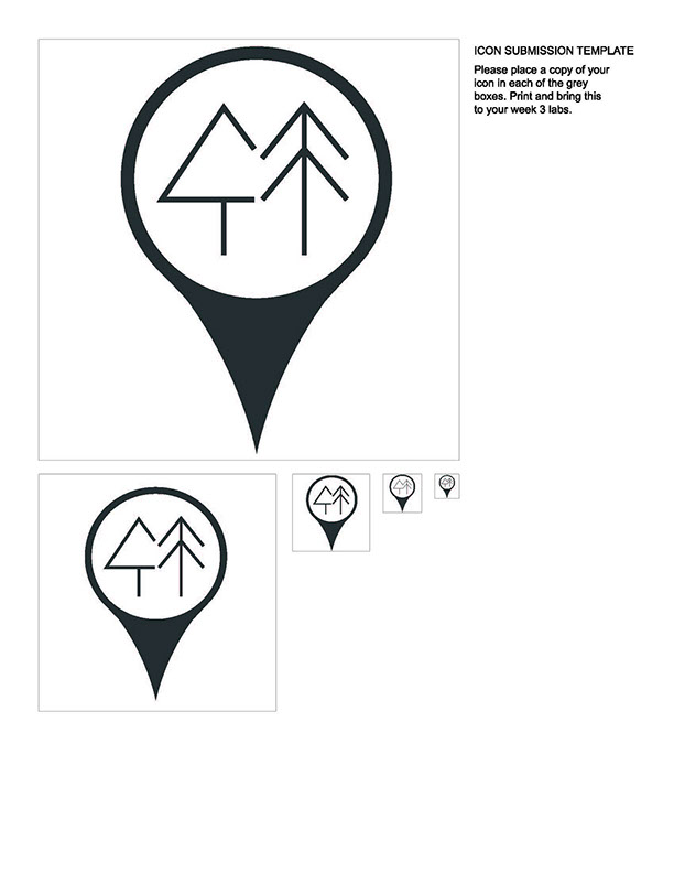
Testing & Redesigning
After critiques and evaluations, I received some critiques about my design. It was a bit too symmetrical with the circle in the middle being too large. Additionally, we had to add colour to our design which was difficult as I wanted a colour to attract users attention.
I began with trying to make the shape look 3D but it turned out looking like a glass ball or raindrop. So I didn't go with that look.
I also moved one of the trees forward to relieve the symmetry as well as rounded the bottom of the point to make the whole icon look softer.
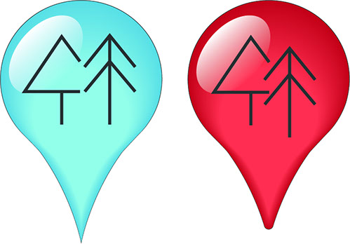
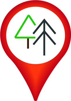
Bring back the circle in the middle really help the shape look more like a locater but the colour looked tacky if it had a gradient so I decided with a flat colour. I rounded the tree at the back and gave it a green colour to show that it is healthy and alive while the tree in the front is like an opposite.
The red and orange colours gave it a really nice contrast but I felt that people may mistaken this App's function is to locate forest fires. So the colour needed to be changed.

Final Design

-crop-u1324.jpg?crc=3992790979)
Here is the final App icon I have made. I decided on a nice light blue colour similar to Twitter's bird colour as blue attracts the attention of consumers. Blue is also a nice contrast to the green tree in the middle.
The icon should convey that it is used to locate endangered trees. By using the word "endangered" and "forest" as a combination, I named this App:
-crop-u1344.jpg?crc=3885613189)
Back to top

-crop-u581.jpg?crc=211945735)