Dynamic Filter Component
The Dynamic Filter Component groups AEM pages based on tags and allows users to narrow them down through a keyword search and/or filters. This component is only available in CLF4.
When should it be used?
Use a Dynamic Filter Component if you'd like to give users control in finding content that's relevant to them based on filter set by you.
How to use a Dynamic Filter Component
Organize your tags
Before you start using the component, your AEM pages need to be tagged. Tags define the scope of what content the component will display by default and when users interact with it.
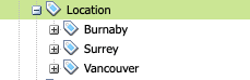
For the purpose of the Dynamic Filter Component, your tags need to be nested as follows:
- Your site tag folder
- Parent tag (used in the component to identify a filter category)
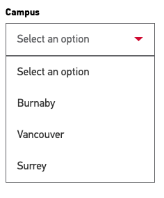
- Child tag (shows as a filter dropdown)*
- Parent tag (used in the component to identify a filter category)
When the structure is organized, activate your tags.
*Please note that all "child tags" will show by default as filter dropdowns - there is no way of excluding any of them.
Tag your pages
Once your tags are in place, add the "child tags" to relevant pages.
- For a page to be added to the pool of filterable pages, it needs to be tagged with at least one "child tag" of one "parent tag" used in the component.
- Each page can be tagged with mutiple "child tags" from the same "parent tag".
- To make the tool as useful as possible, your pages should be tagged with at least one "child tag" from each "parent tag" used in the component.
Add dates to your pages
If you're planning on using a date filter and displaying dates in results, you will need to add a date to Page Properties.
If no date is added, the component will use the last modified date.
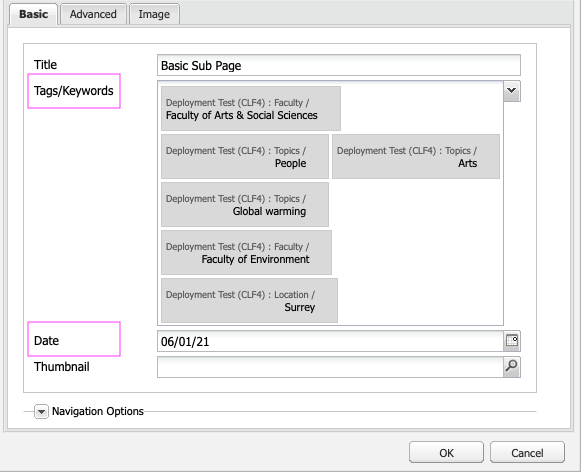
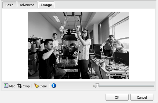
Add images to your pages
If you're planning to display your results as Cards, you will need to add images to the "Image" tab in Page Properties.
Using the same aspect ratio for all images is recommended.
Add the component to the page
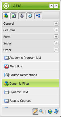
The Dynamic Filter component can be found in the "Other" section of the Sidekick.
Please note that only one Dynamic Filter component can be added to a page.
Define the scope of filterable content
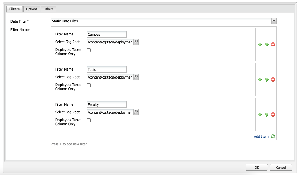
Filters tab
- Date filter* options:
- No Date Filter - no filter for dates with show, no dates will be displayed in results
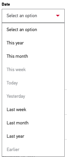
- Relative Date Filter - date filter options will display as: this year, this month, today etc., actual dates will display in the results
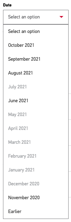
- Static Date Filter - date filter options will show the most recent 12 months, followed by "Earlier", actual dates will display in the results
- Filter names:
- Filter Name - defines the label for the filter (you can use the title of the parent tag, or use other wording)
- Select Tag Root - select the parent tag
- Display as Table Column only - if you're using the Table display for results, this option allows you to show this category as a column in a table; if ticked, this category will not appear as a filter
Please note that your Dynamic Filter can have only 6 filter categories. For example: a date filter + 5 additional filters.
Options tab
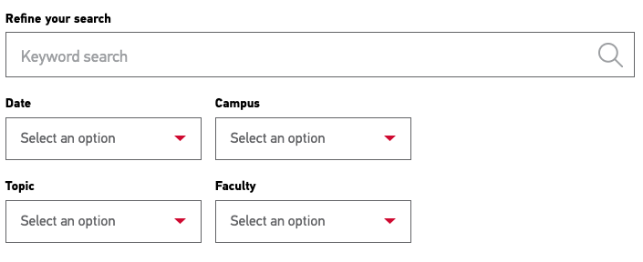
- Search Label - the default keyword search label is "Refine your search", use this field if you'd like to overwrite it
- Sort by:
- Title - will list results in alphabetical order
- Ascending Date - will list results from older to newer
- Descending Date - will list results from newer to older
- Number of Initial Results - specify the number of results shown on page load. More results beyond the specified number will show when user clicks "Show more" or "Show all"
- Display Style:
- Table View - displays results in a table with sortable columns; each filter will show as a column
- Simple List View - displays results as a list of links with dates (if selected)
- Card View - 2 Columns - displays results as cards organized in a 2-column layout. Each card displays an image, date (if selected), page title and values from up to 2 parent tags
- Card View - 3 Columns - displays results as cards organized in a 2-column layout. Each card displays an image, date (if selected), page title and values from up to 2 parent tags


Others tab
- Pre-filter By - specify one child tag of one of the filters; only items tagged with that value will display in results
- First Filter Displayed on Card - card results can display child tag values of one or two filters; choose a parent tag to use this feature; if no parent tag is specified the card will display no child tag values
- Second Filter Displayed on Card - choose a parent tag to display its child tag values; if no parent tag is specified the card will only display child tag values of one filter

